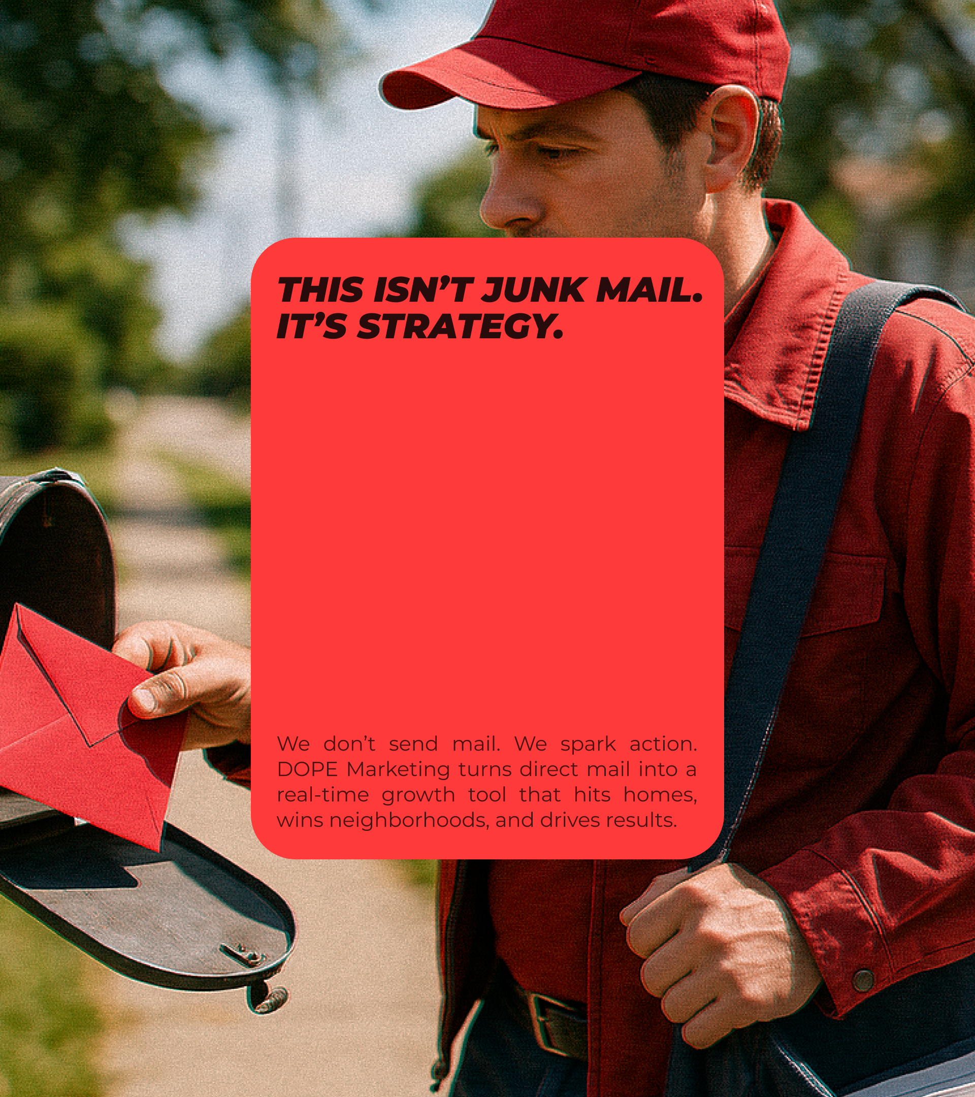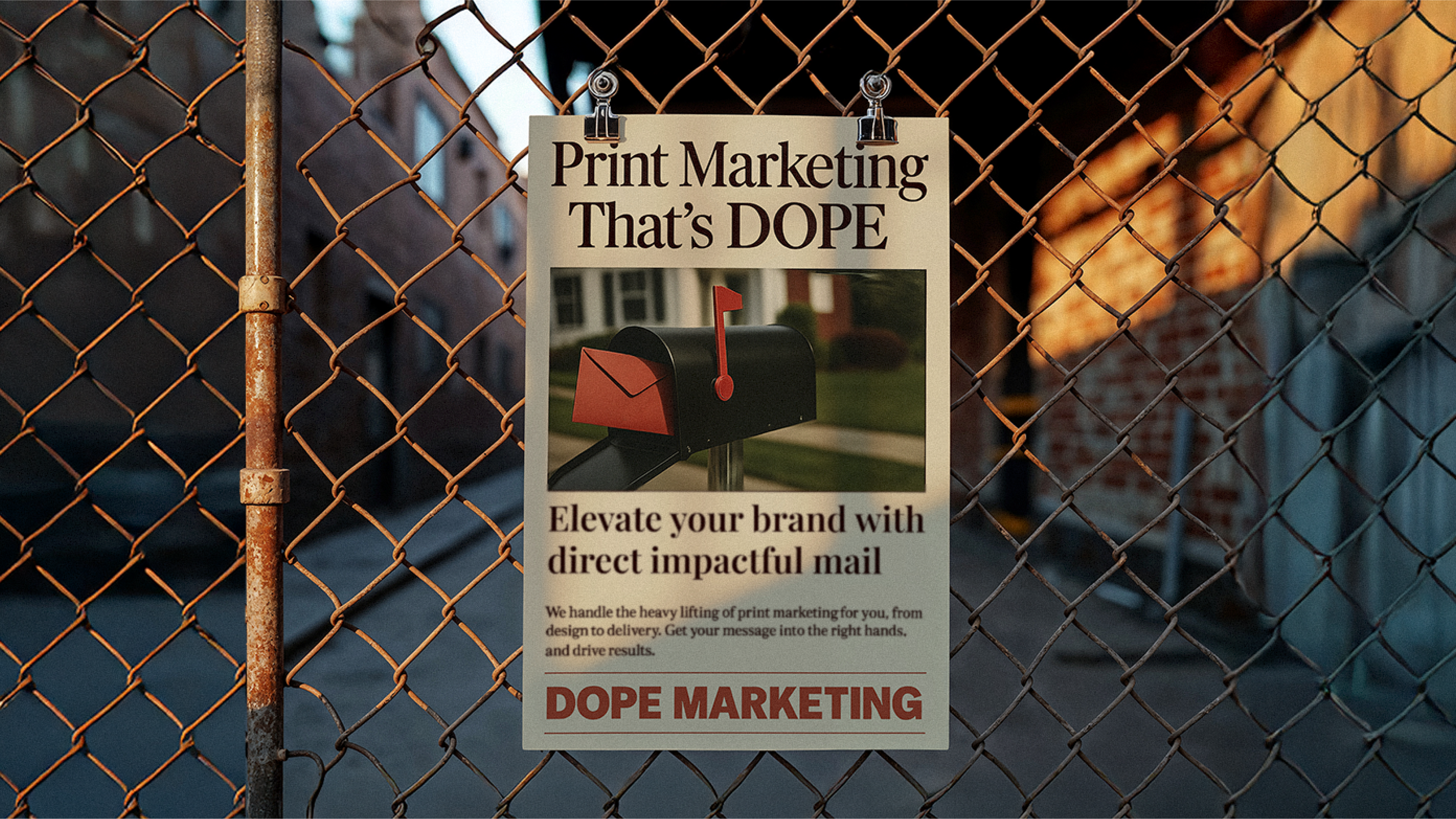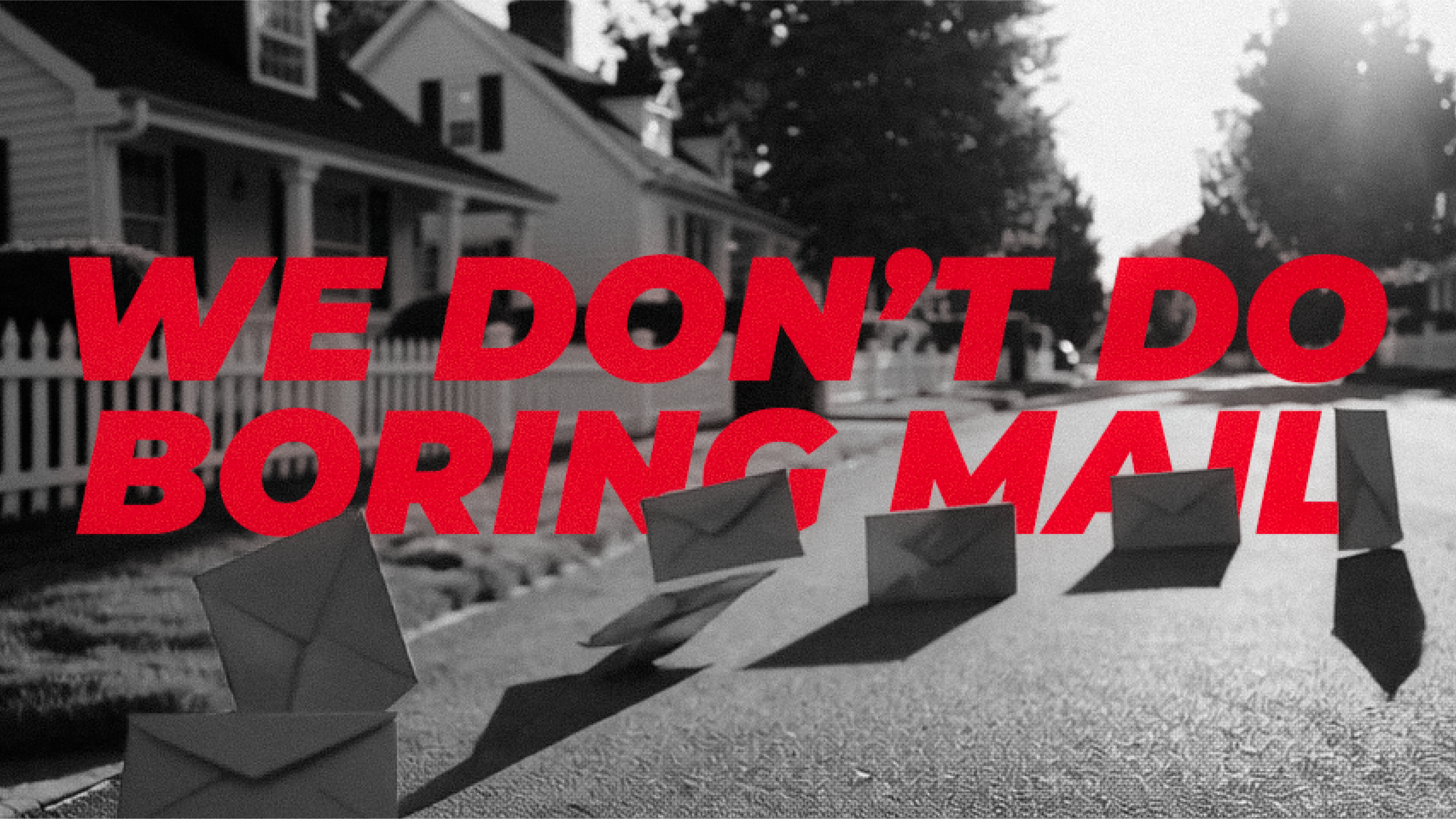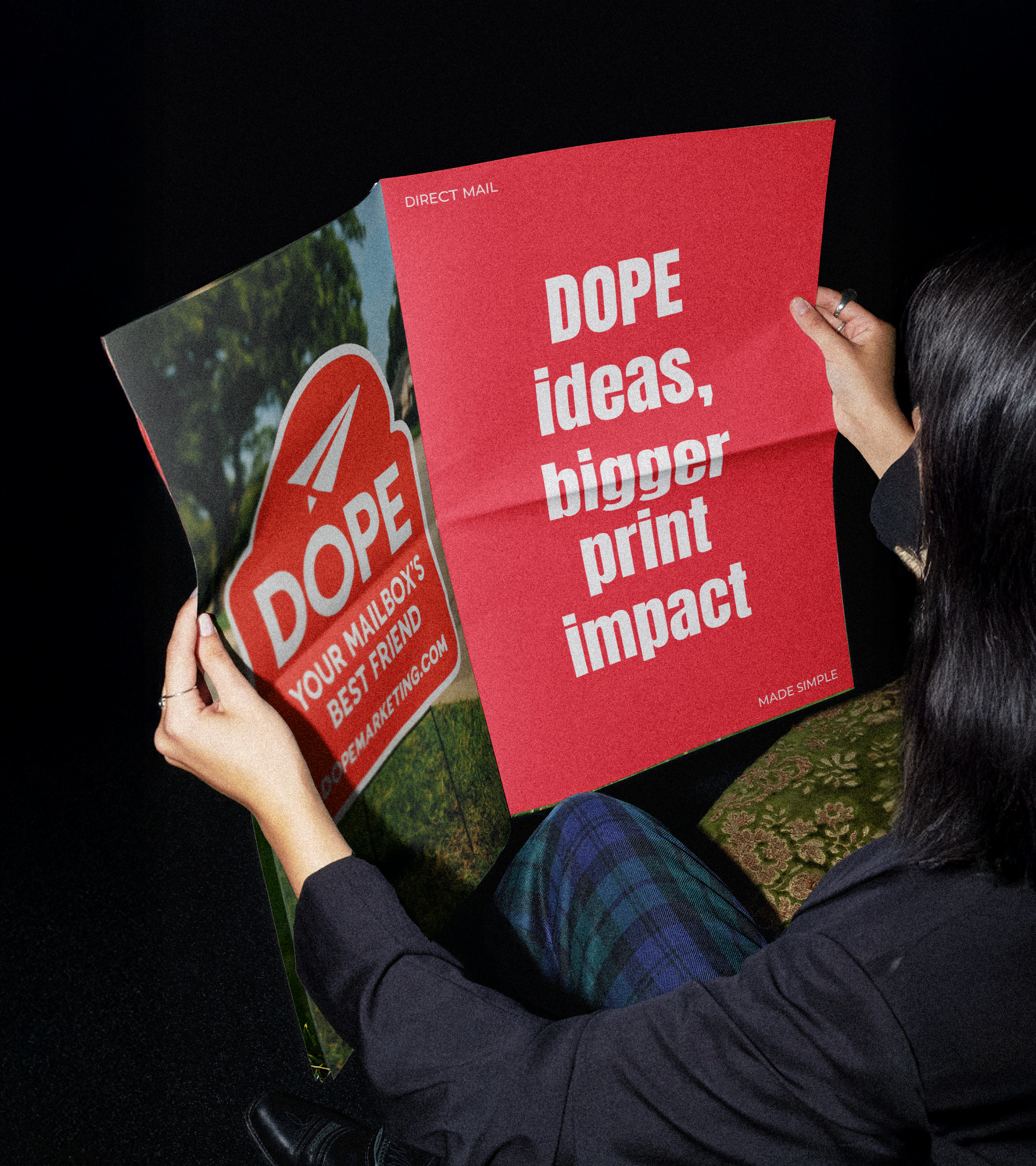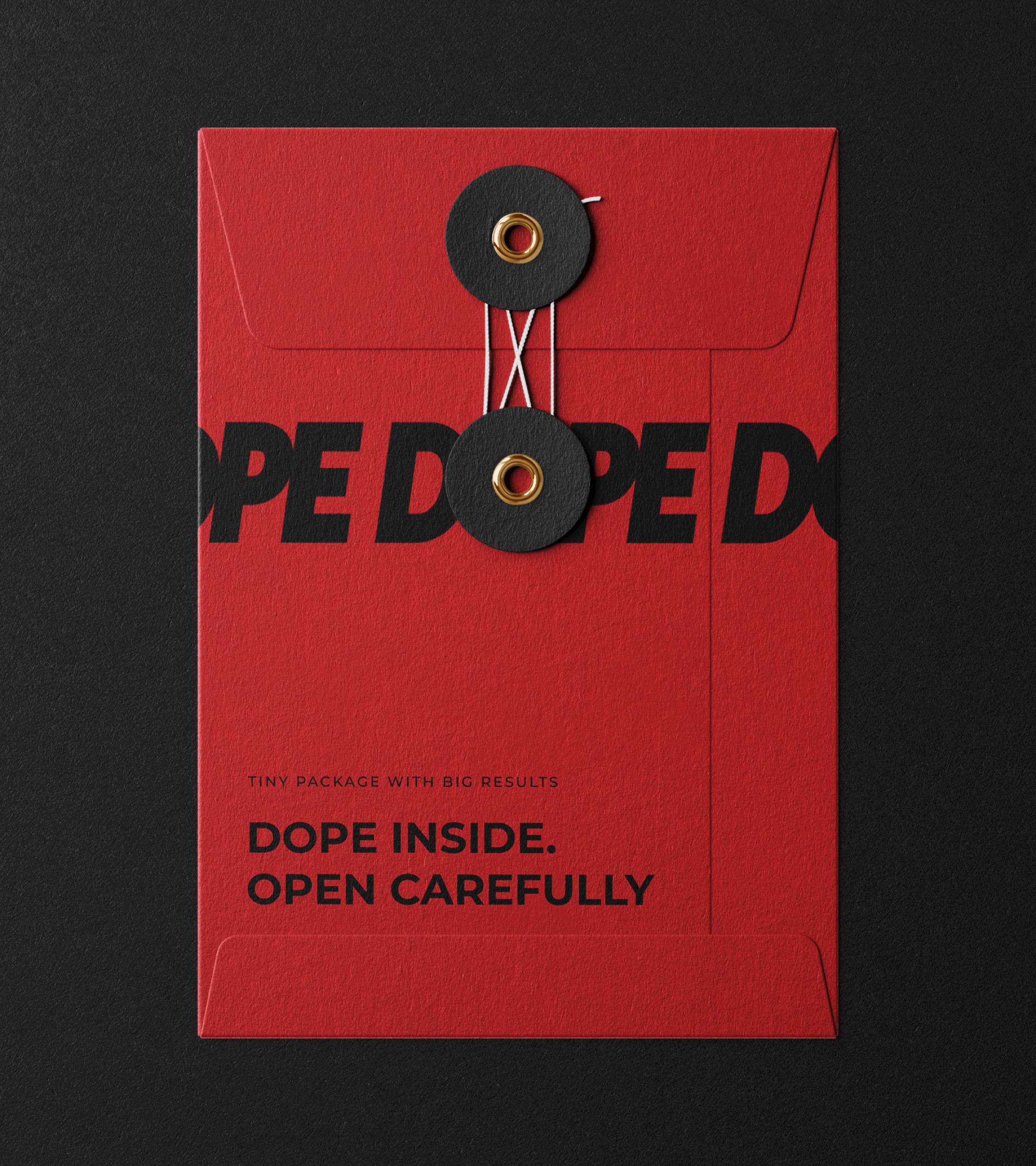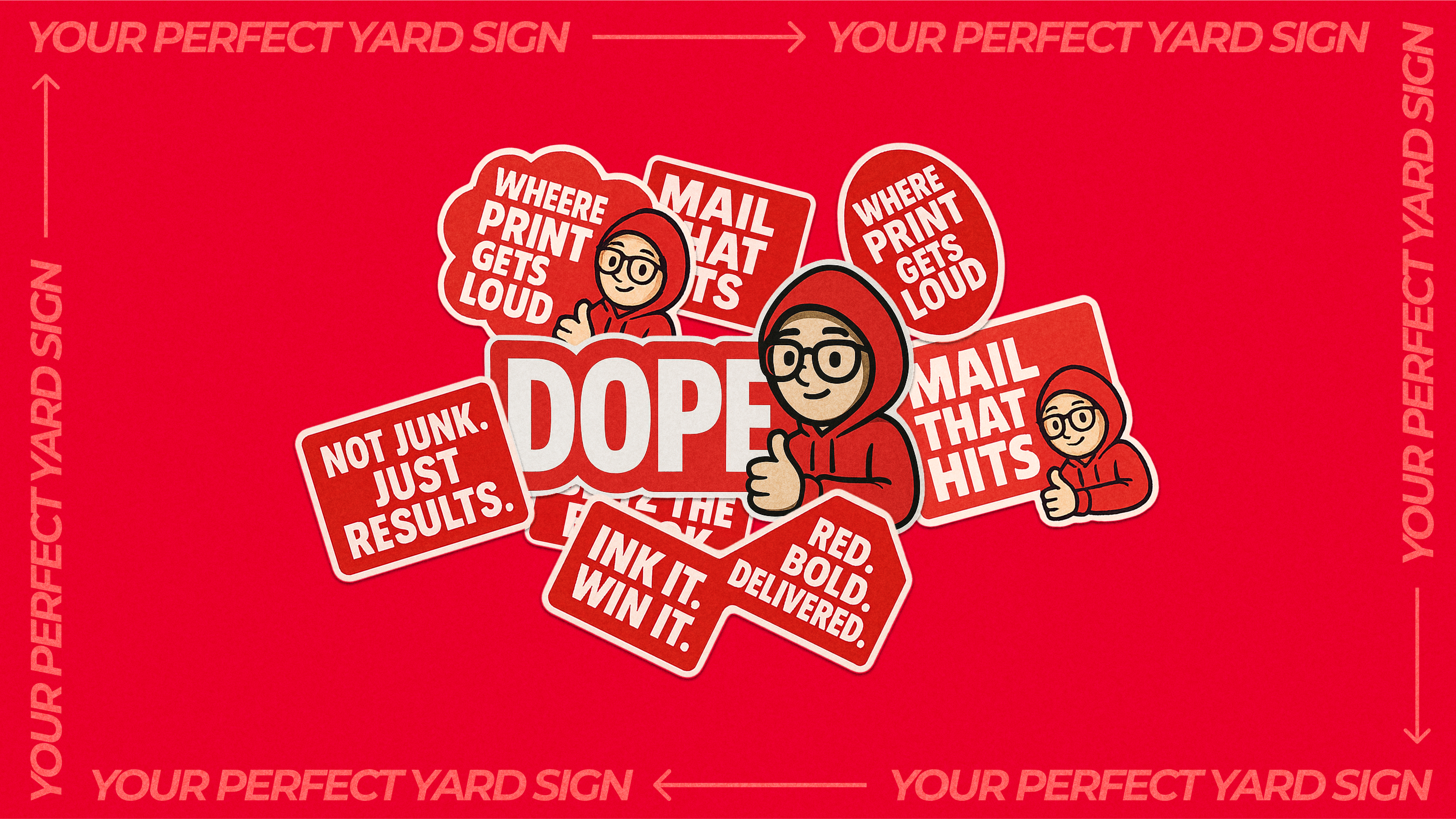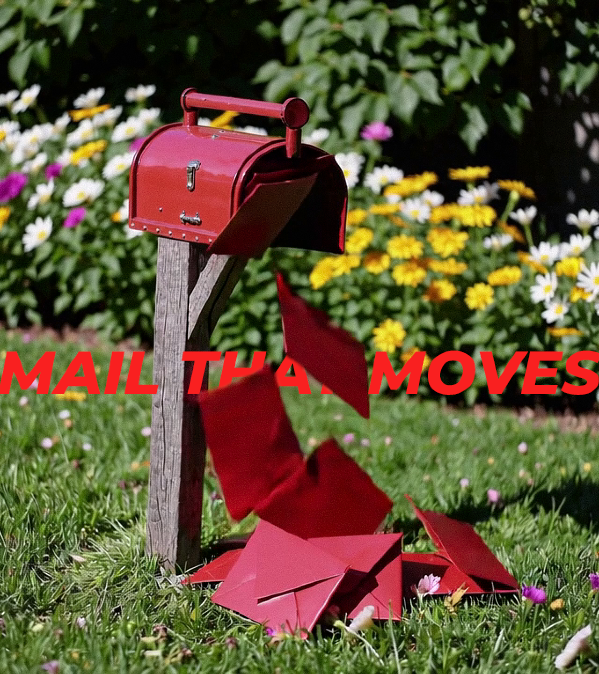
We redesigned a few key pages on DOPE’s site to improve structure, highlight important info, and create a smoother visual flow. The goal was to elevate the look and feel without changing the brand: just making what was already working feel sharper and more intentional.
The updated design helped DOPE show up stronger online, making their bold message and offerings clearer and easier to explore.