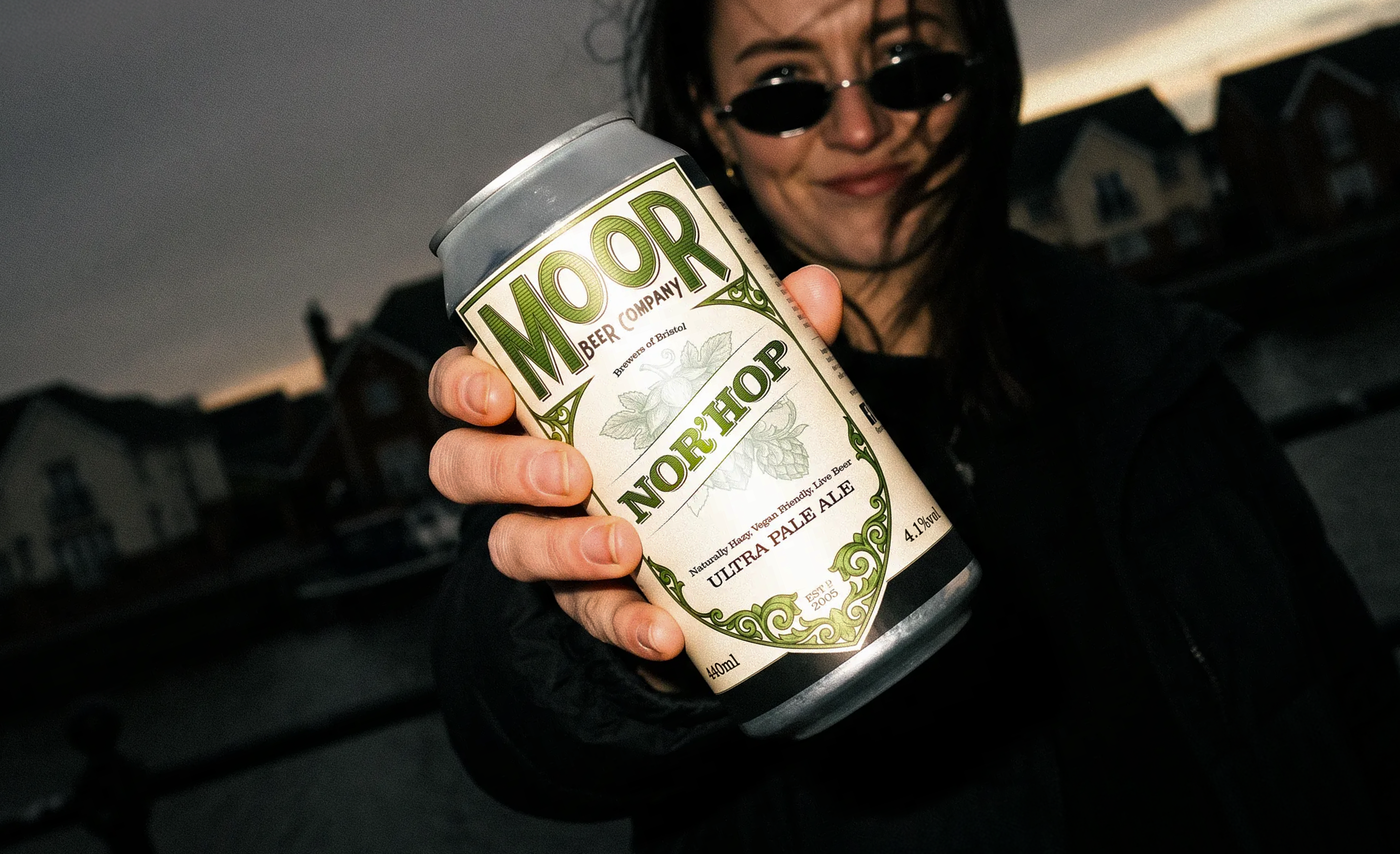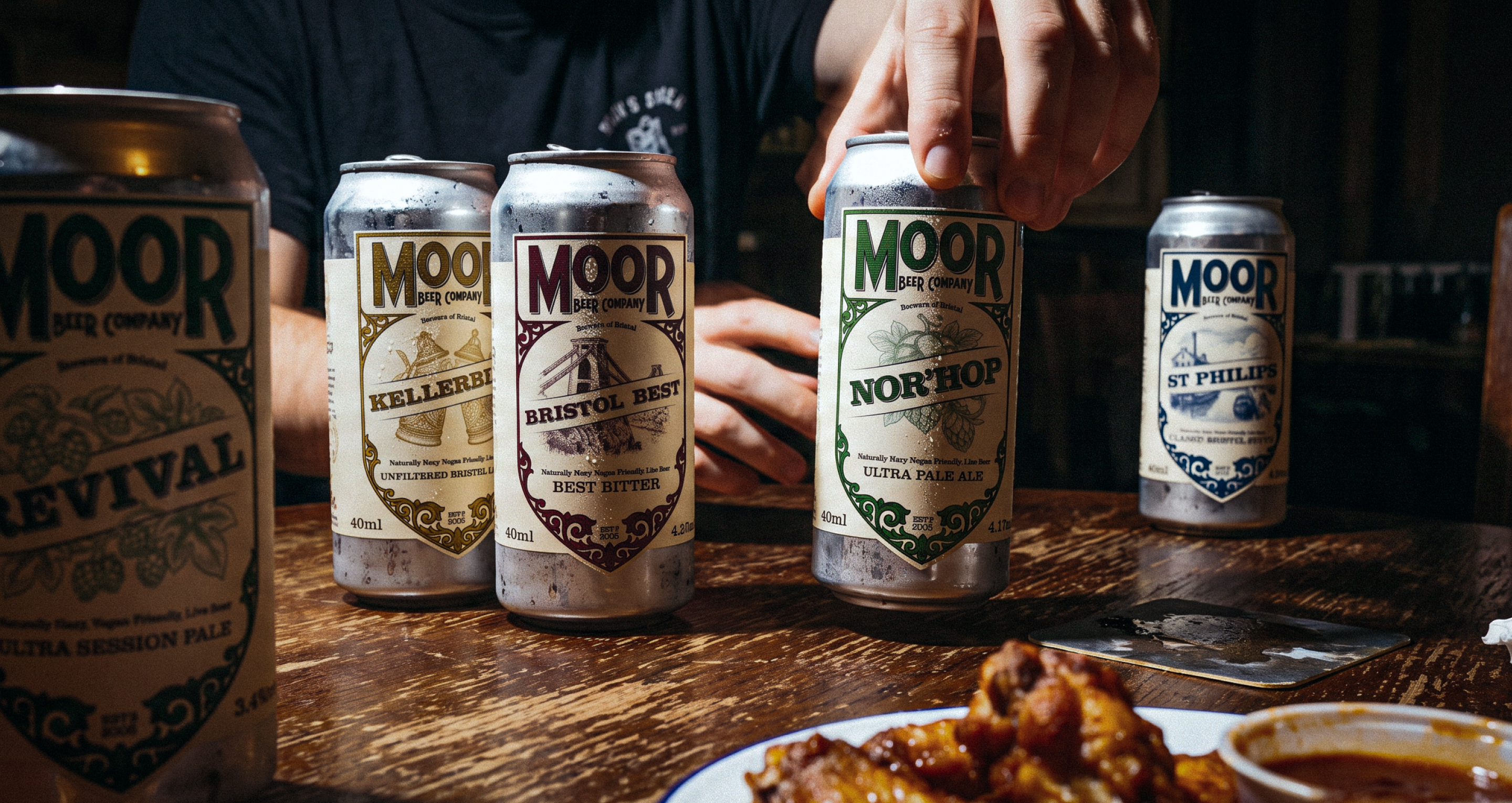
Moor Beer Company has brewed live, naturally hazy, vegan friendly beer in Bristol since 2005. We refreshed the brand and built the packaging around it, so the whole range, and what comes after it, carries the same mark across cask, keg and can.
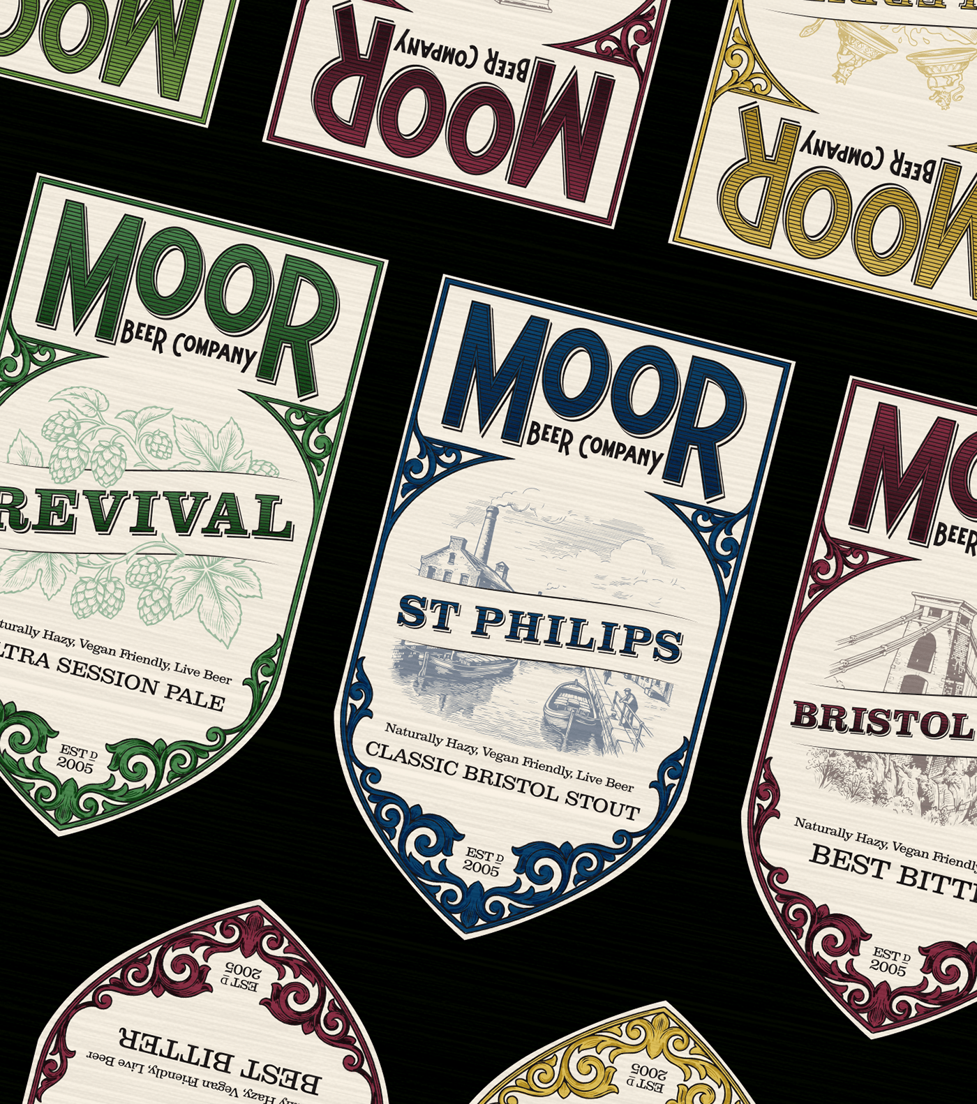
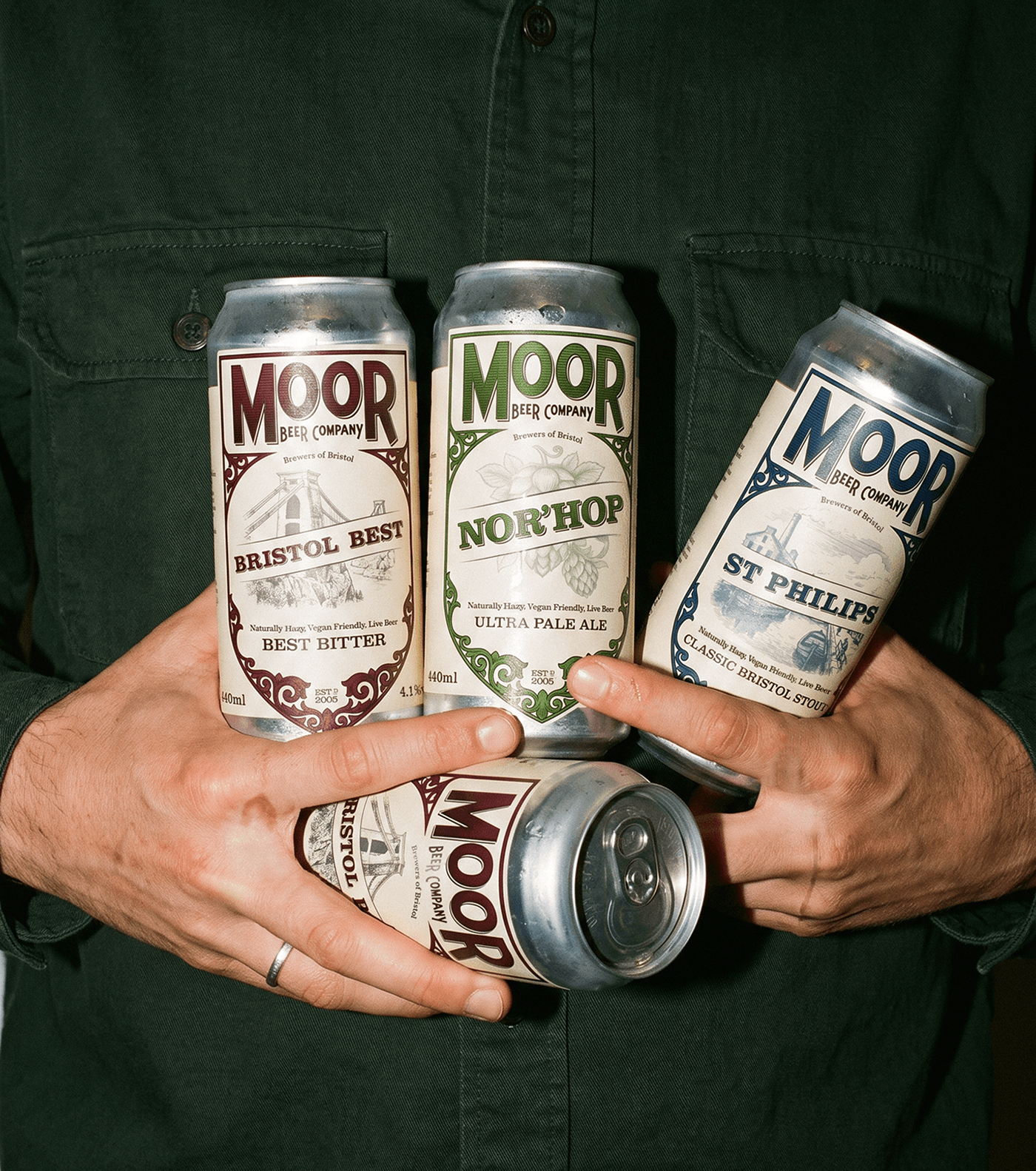
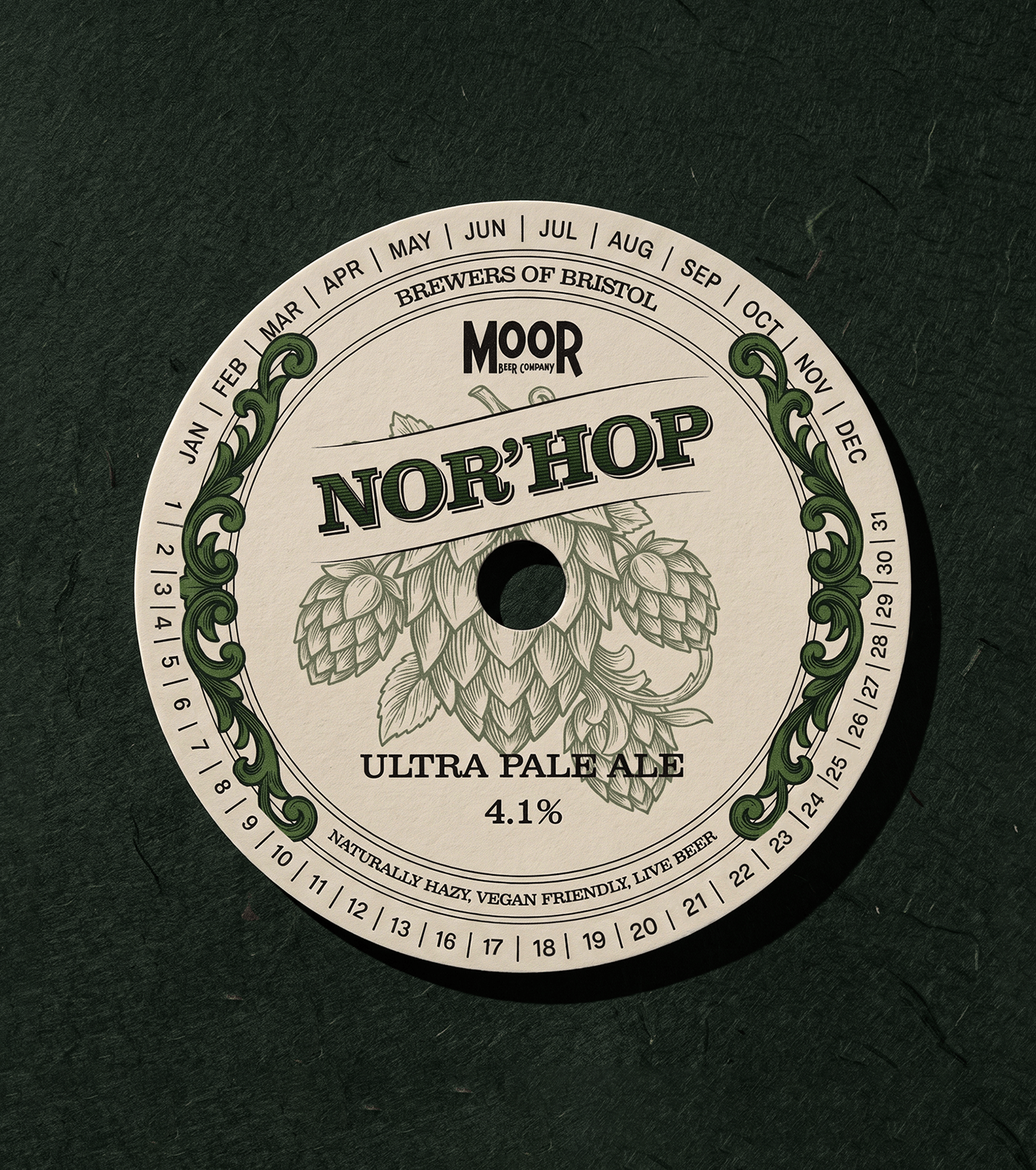
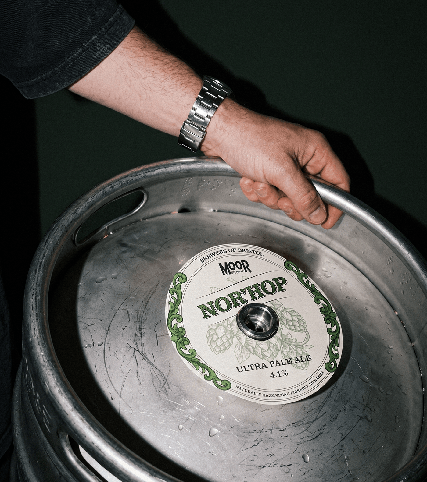
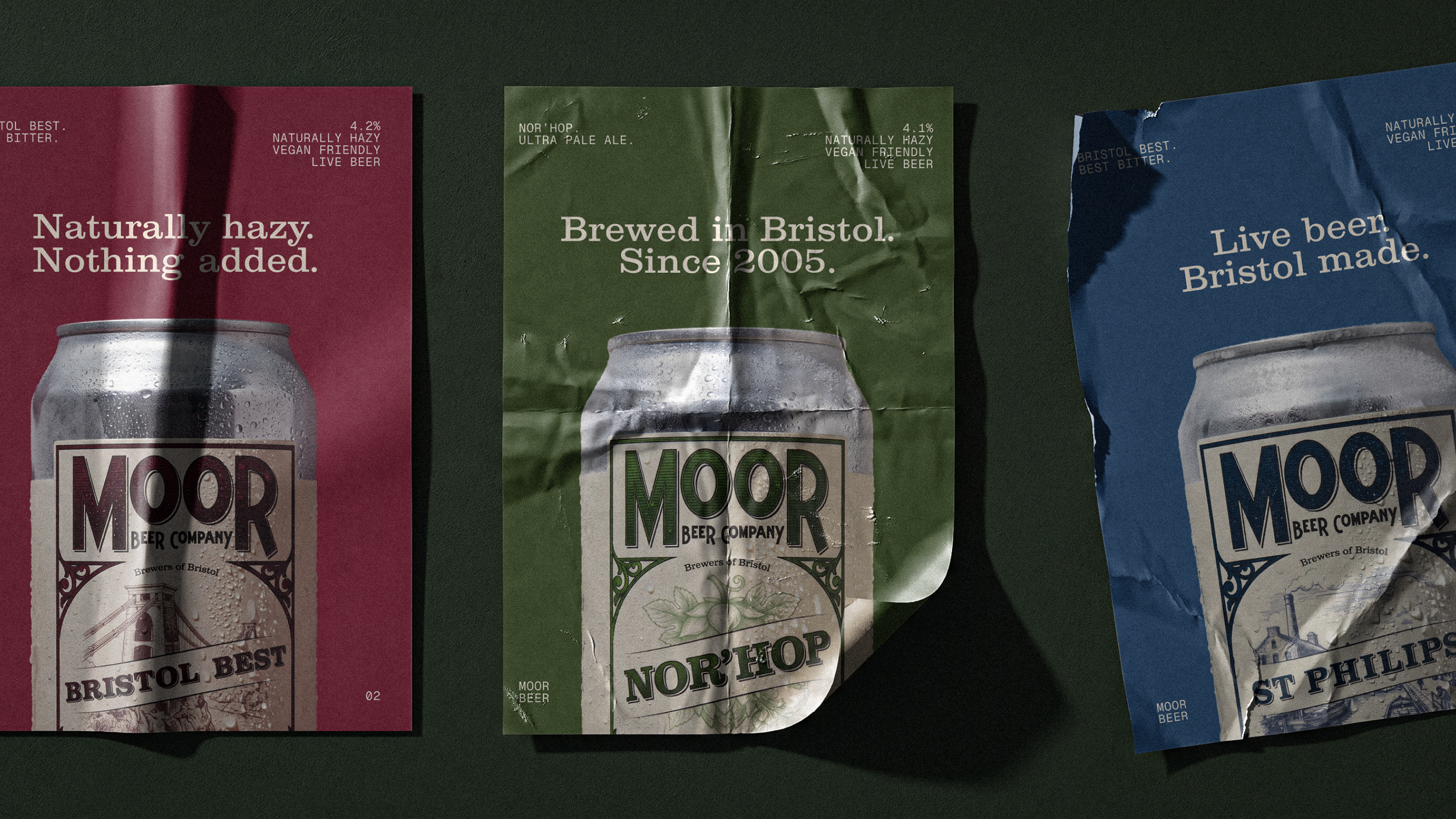
Every badge in the livery is built the same way: the frame, the banner, a picture window, the beer's name, its style and its strength. The ornament is drawn once and carried everywhere, in an engraved line that reads as well on a pump clip as it does in the hand.
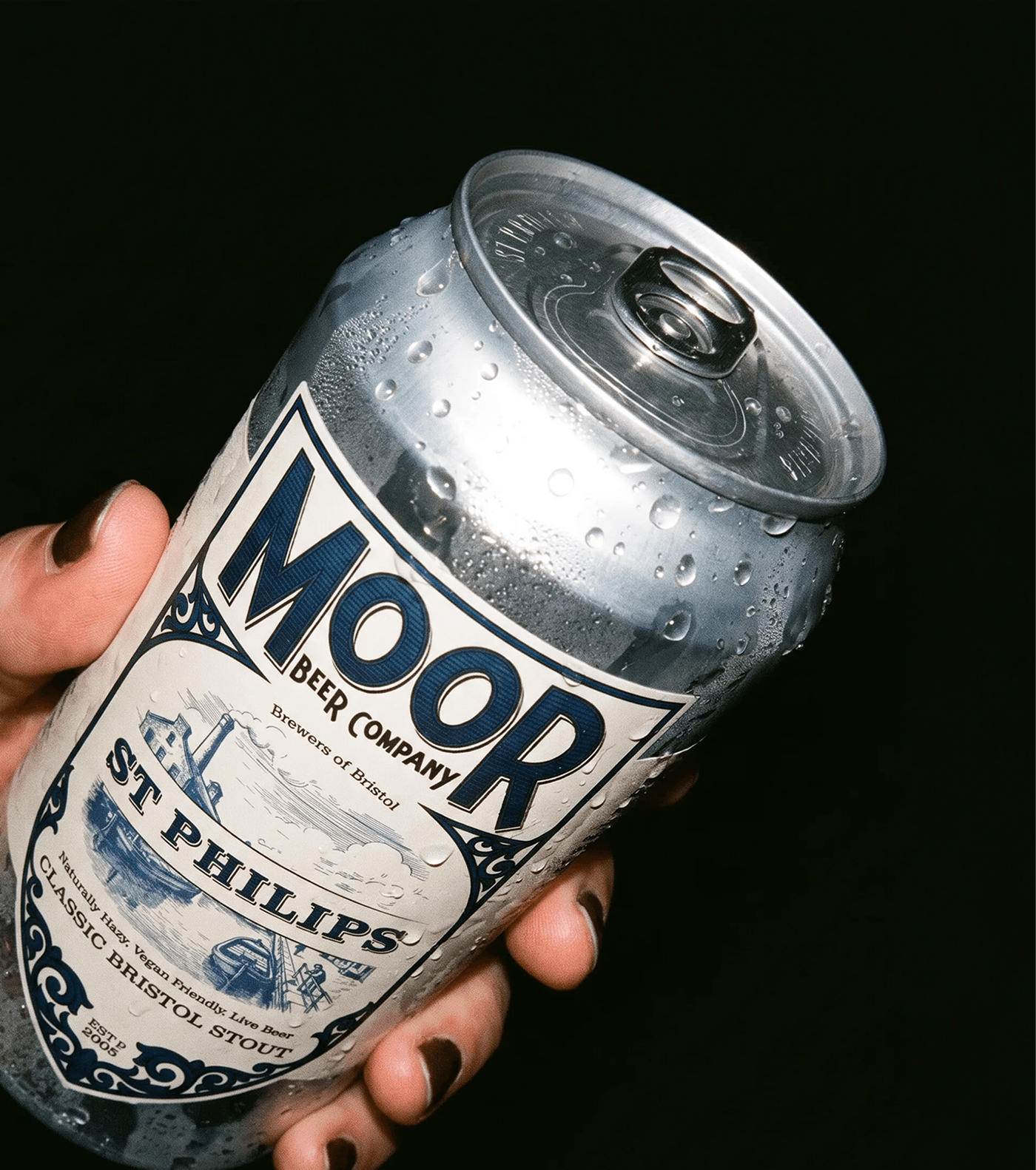
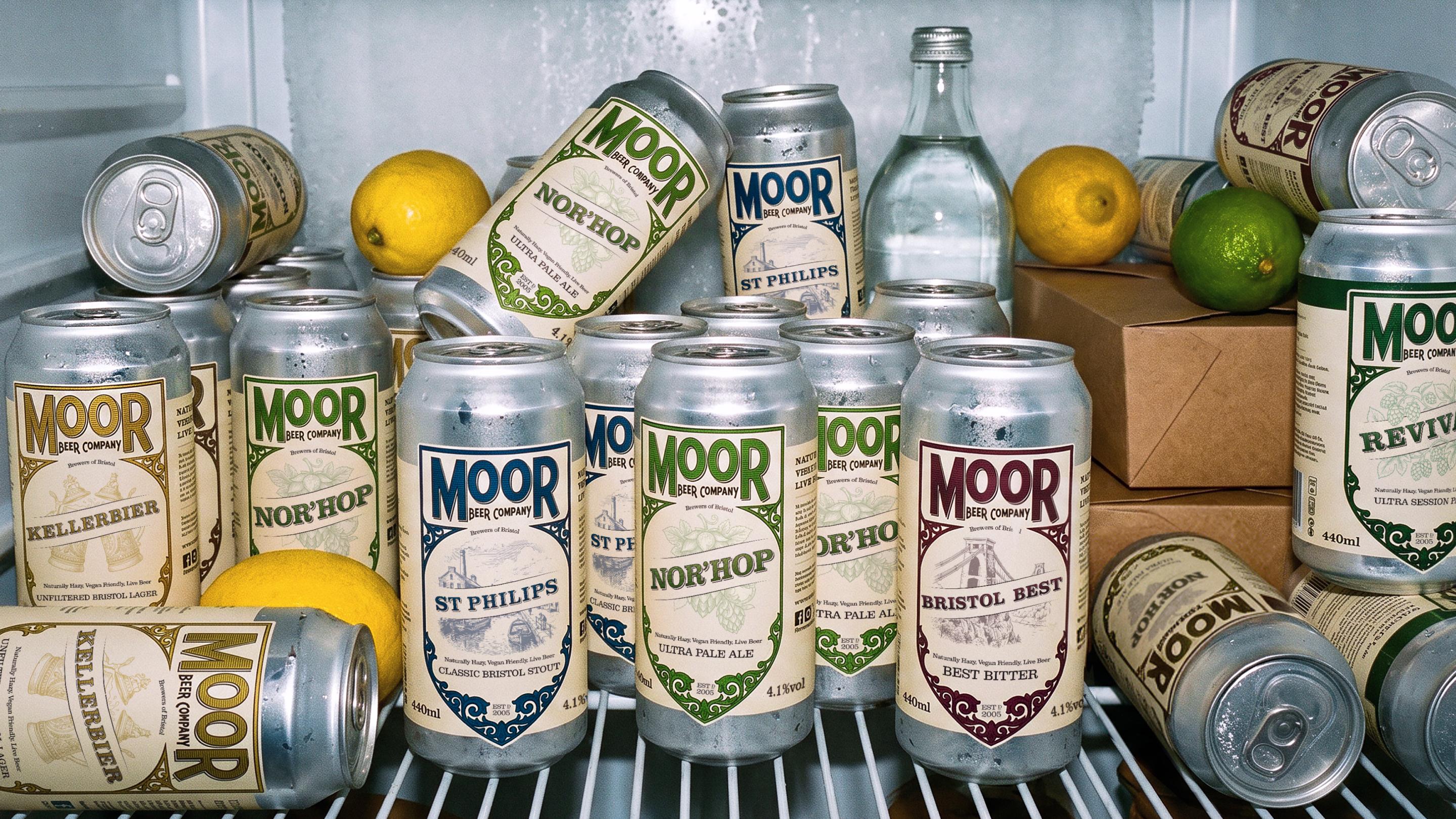
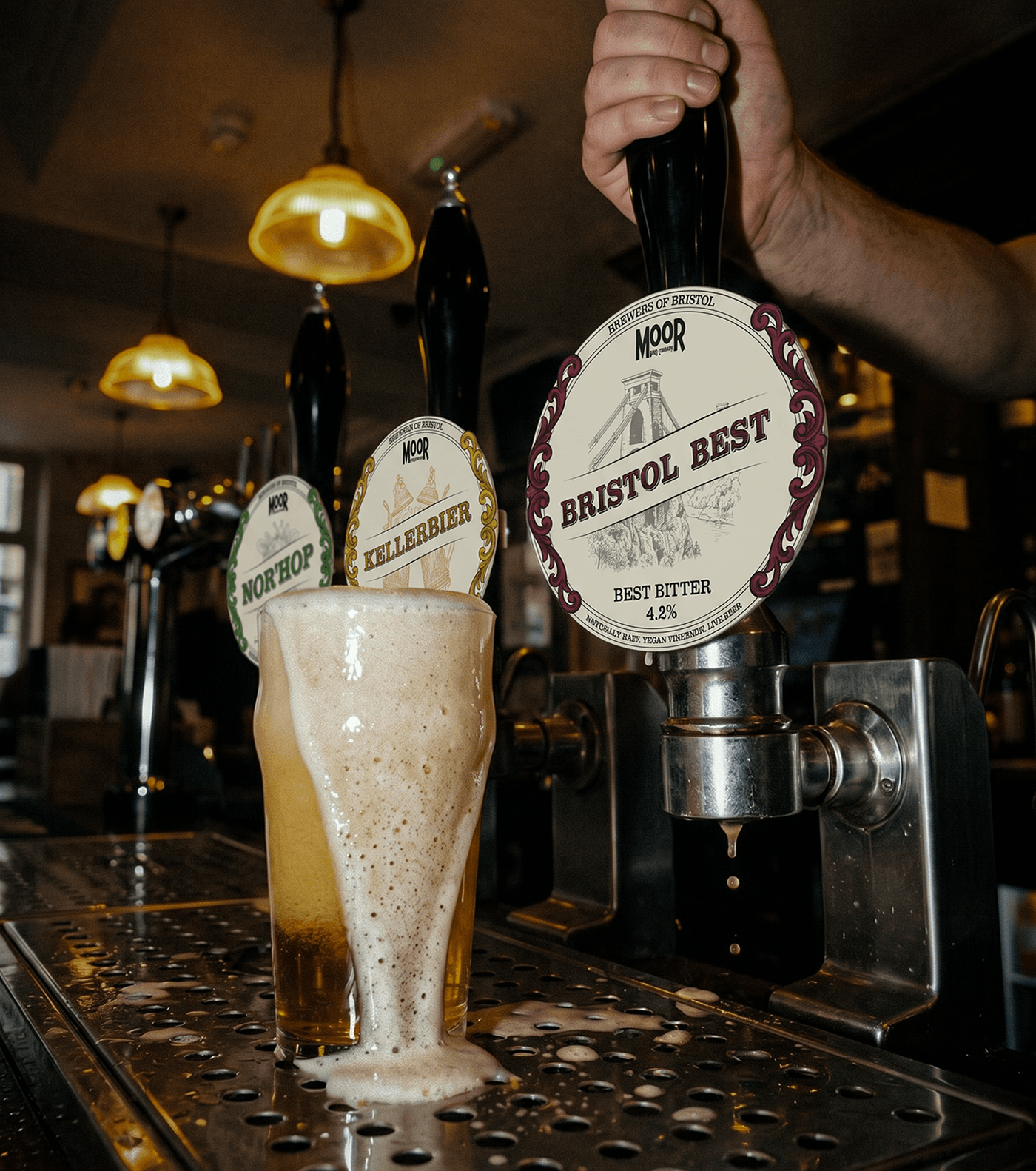
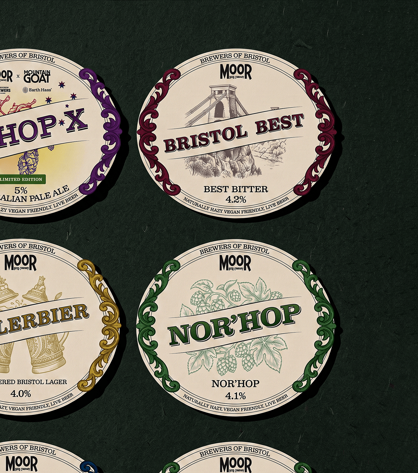
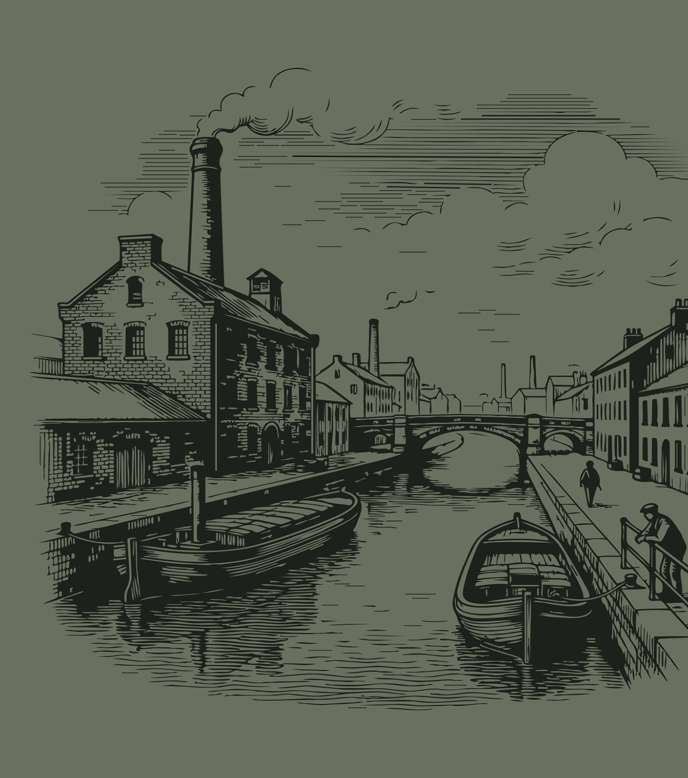
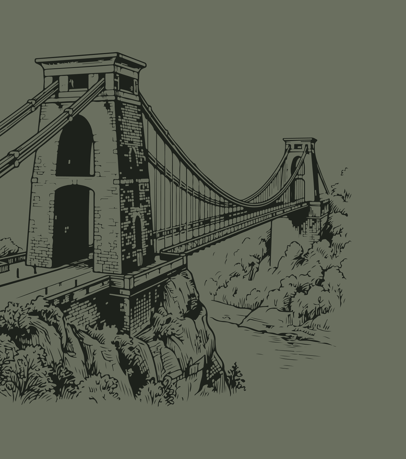
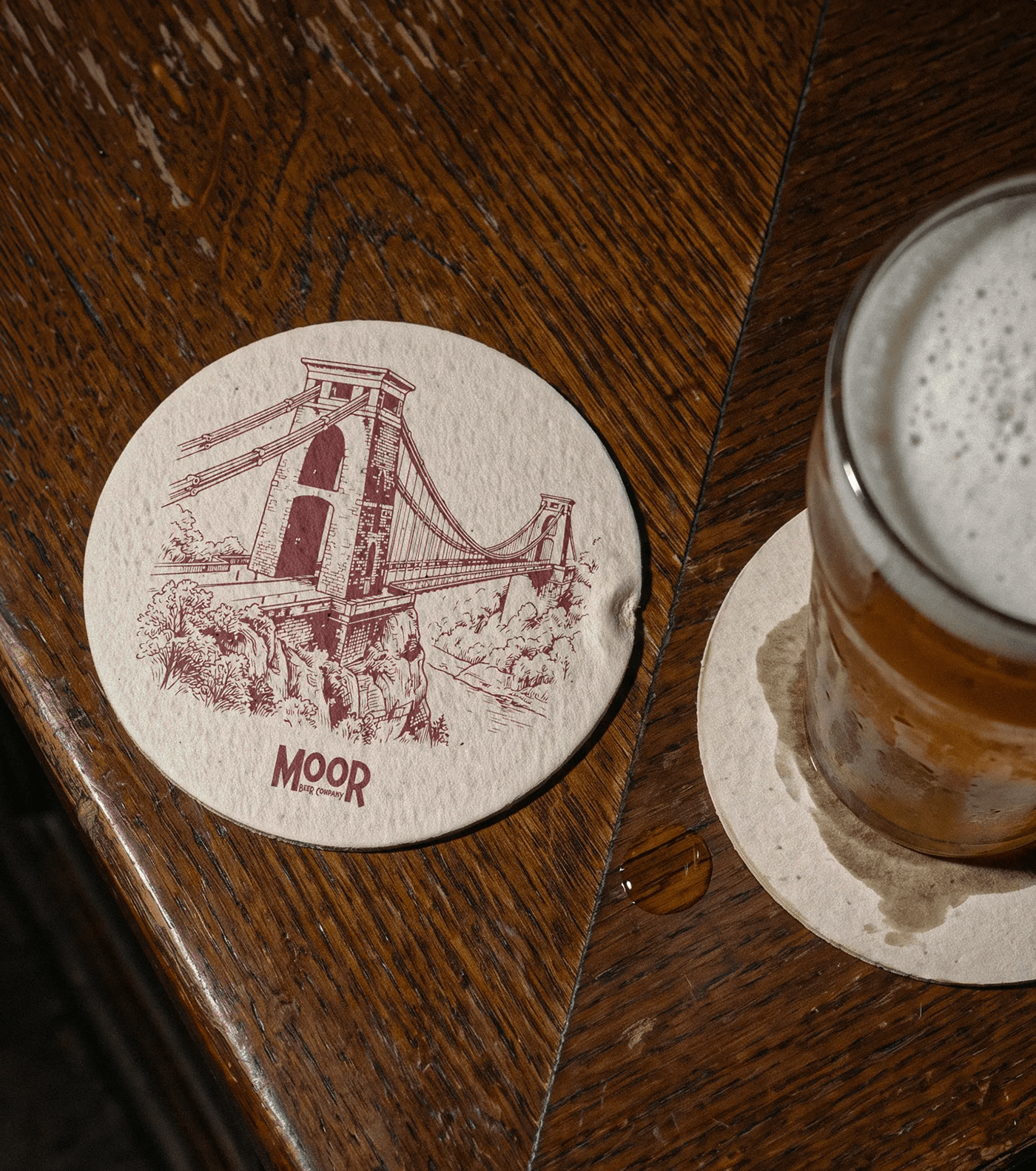
Each beer is defined by a colour and an illustration. The colour follows the style of the beer, from lighter tones for the pale ales to deeper tones for the bitter and the stout. The illustration references something specific to it, from hops and steins to the Suspension Bridge and the Feeder Canal.
A new beer only needs its own colour and illustration. The rest is already in place, so the range can grow without reworking existing labels.
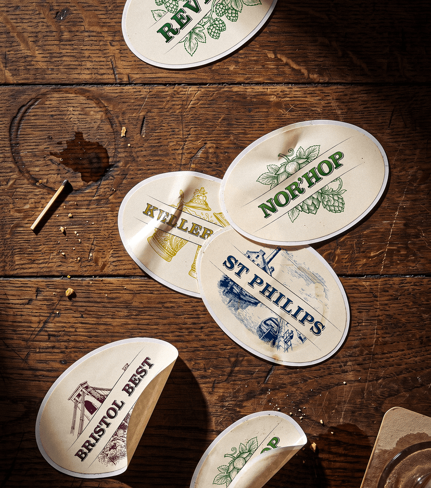
A pump clip is read across a bar, a keg badge up close on the font, a can in the hand. We set the hierarchy for each one separately instead of scaling the same artwork up and down. The pump clip carries the name, the illustration and the ABV, with nothing else competing at that distance. The keg badge keeps the same hierarchy at a smaller size.
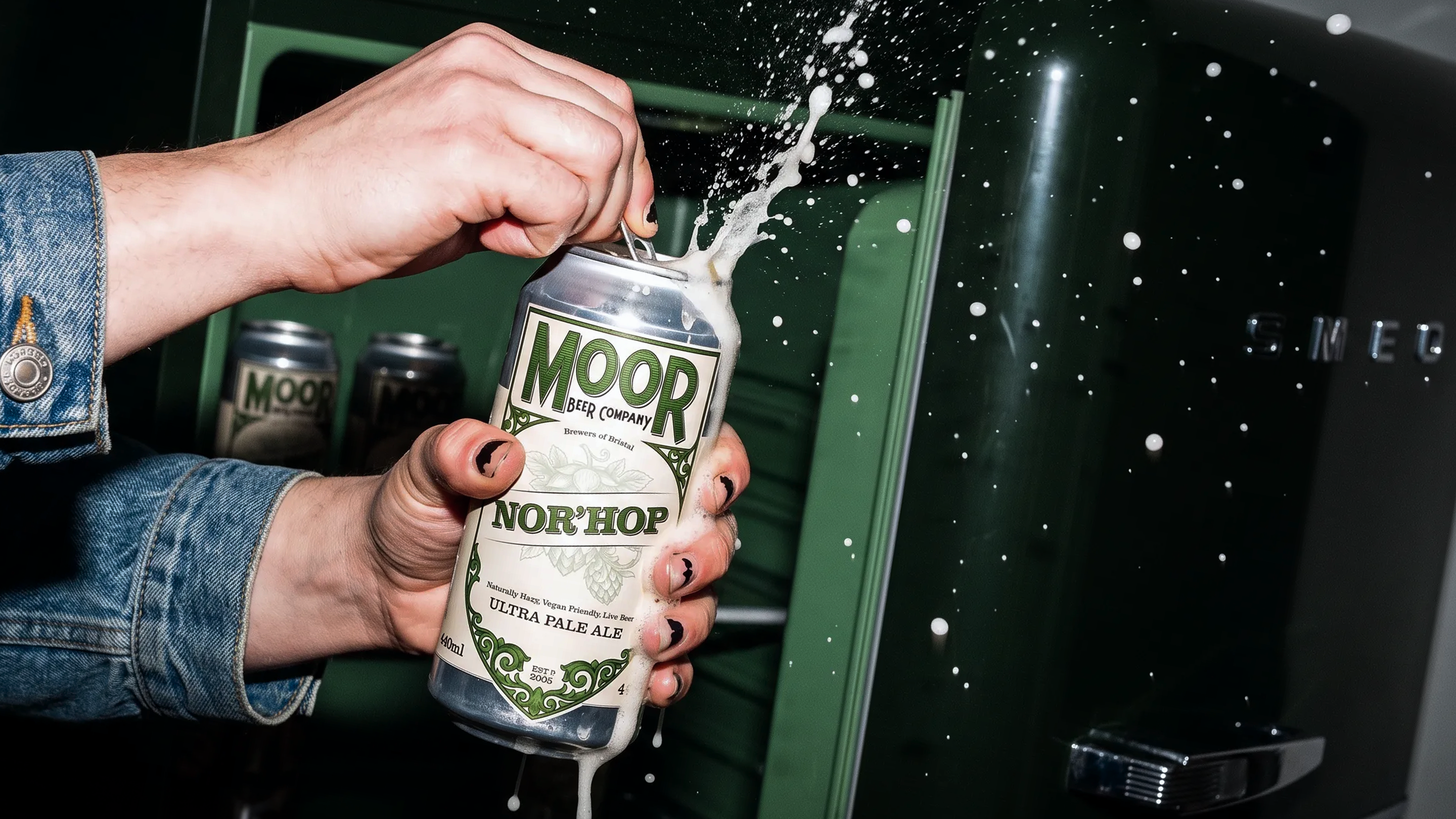
Seasonals come and go with the year, specials appear for festivals and events, and collaborations bring other breweries and hop growers onto the badge.
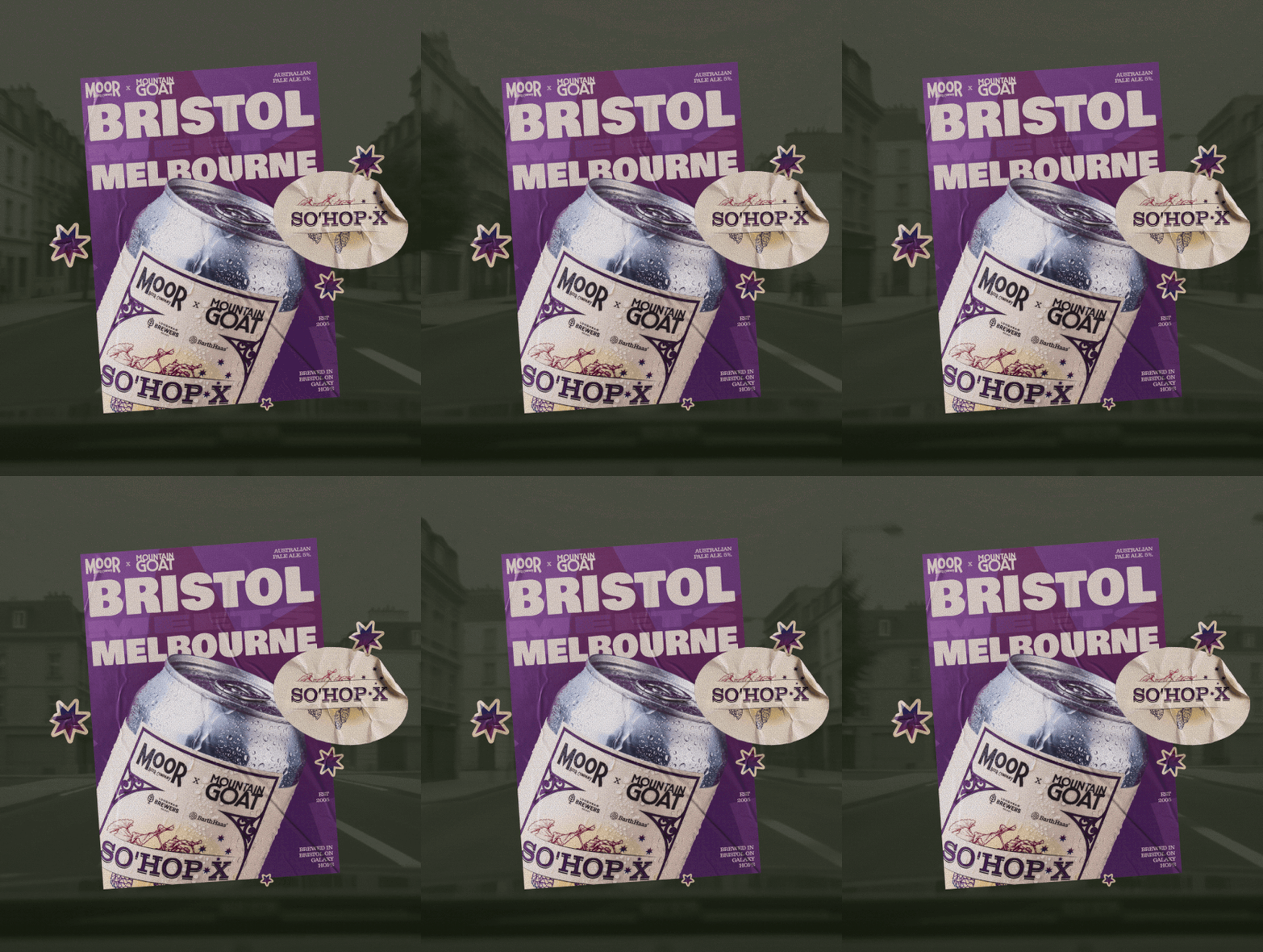
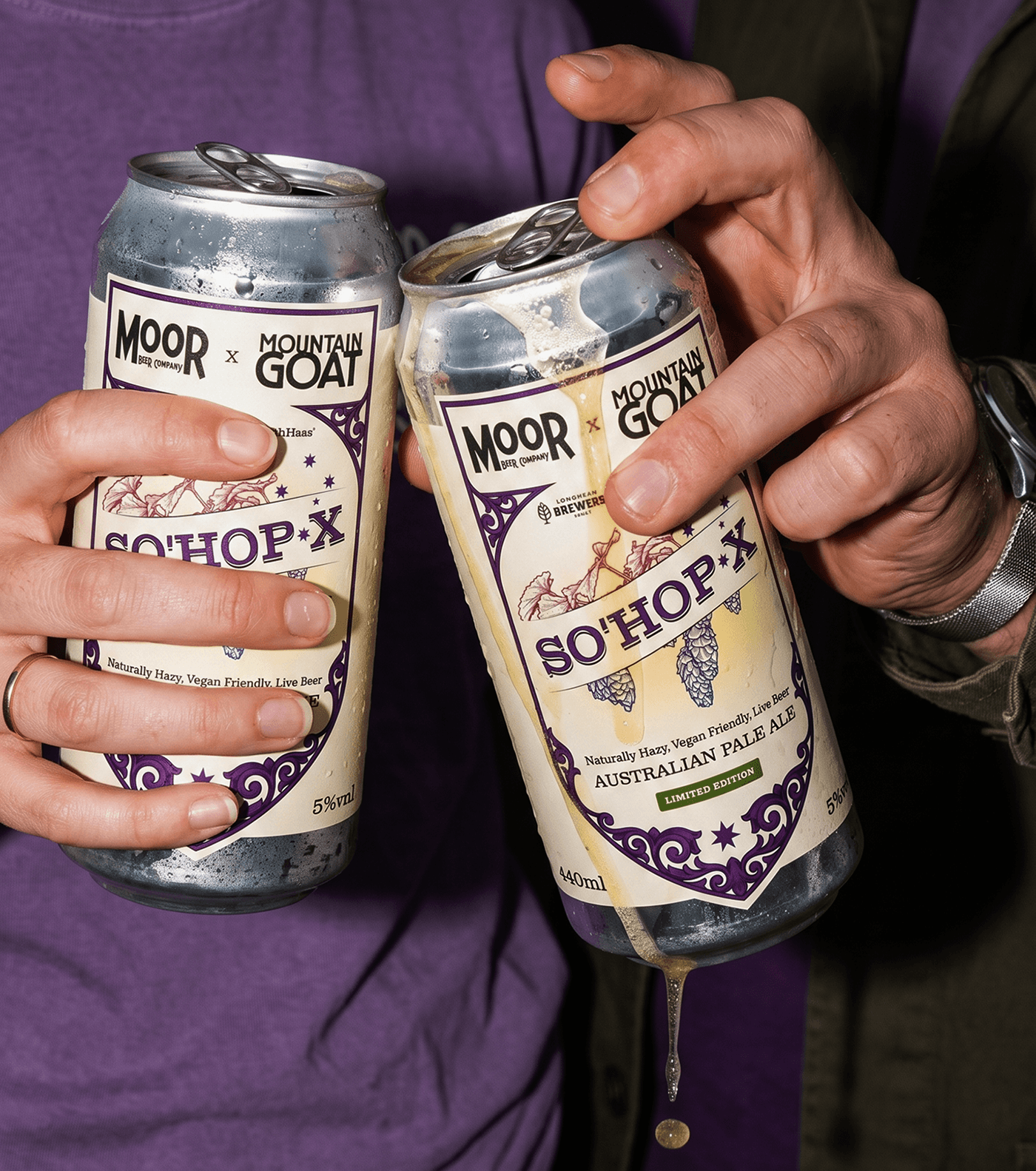
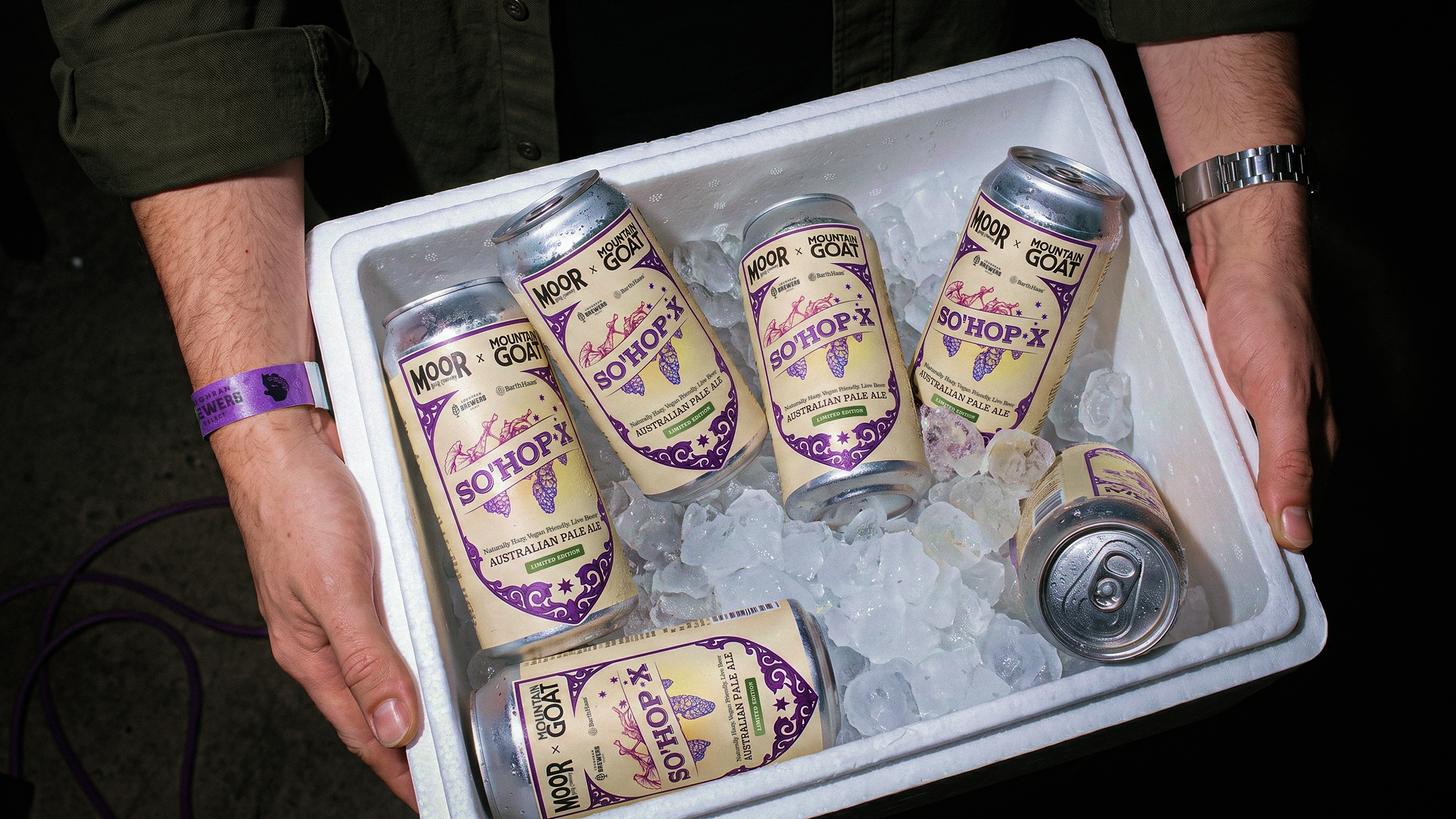
The livery is built for that pace: one base for hop-led beers, one for everything else, a seasonal mark, and a structure that takes a new name, style and colour without a redesign. For Aus Fest, a collaboration with Mountain Goat on Galaxy hops kept Moor's structure and borrowed the hop's palette.
Moor's beer travels: casks and kegs across the UK, cans further still. The brewery has stayed in one place, a taproom off the Feeder Canal in St Philips, where people drink the beer a few metres from where it is made.
The shield carries that. Name, city and year sit inside it, and it keeps its shape on a cask end, a keg font, a can and a pint glass, so wherever the beer is poured, it points back to a real room with real people in it.
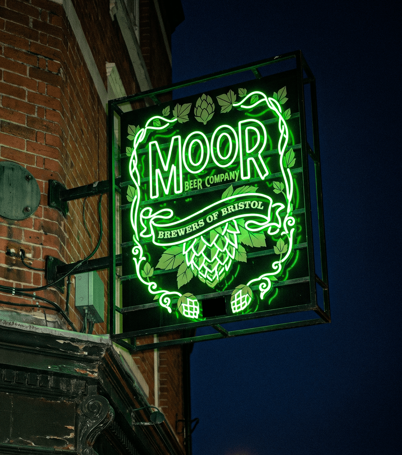
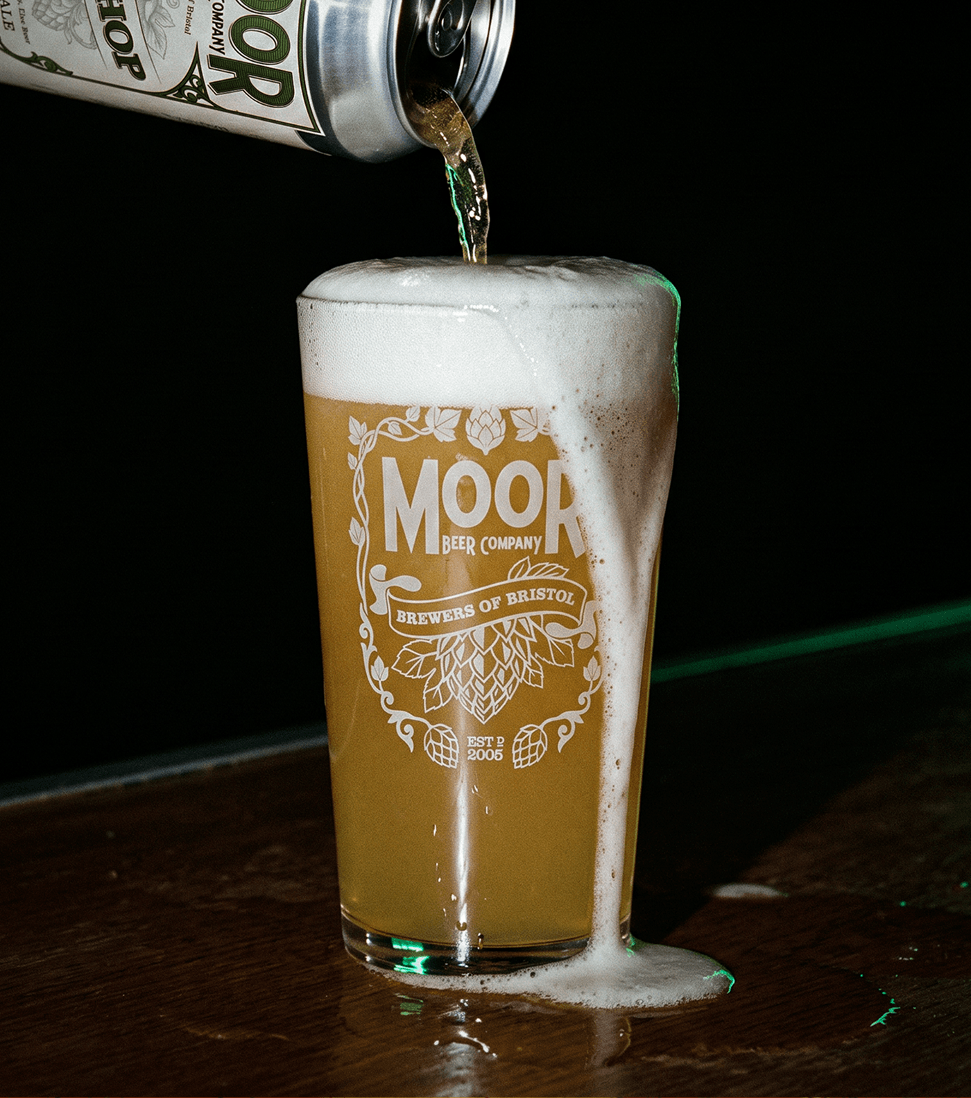
This is a beer people have been drinking for twenty years, in the taproom, in pubs across the city and now further afield. The refresh gives it a livery built to last at least as long.
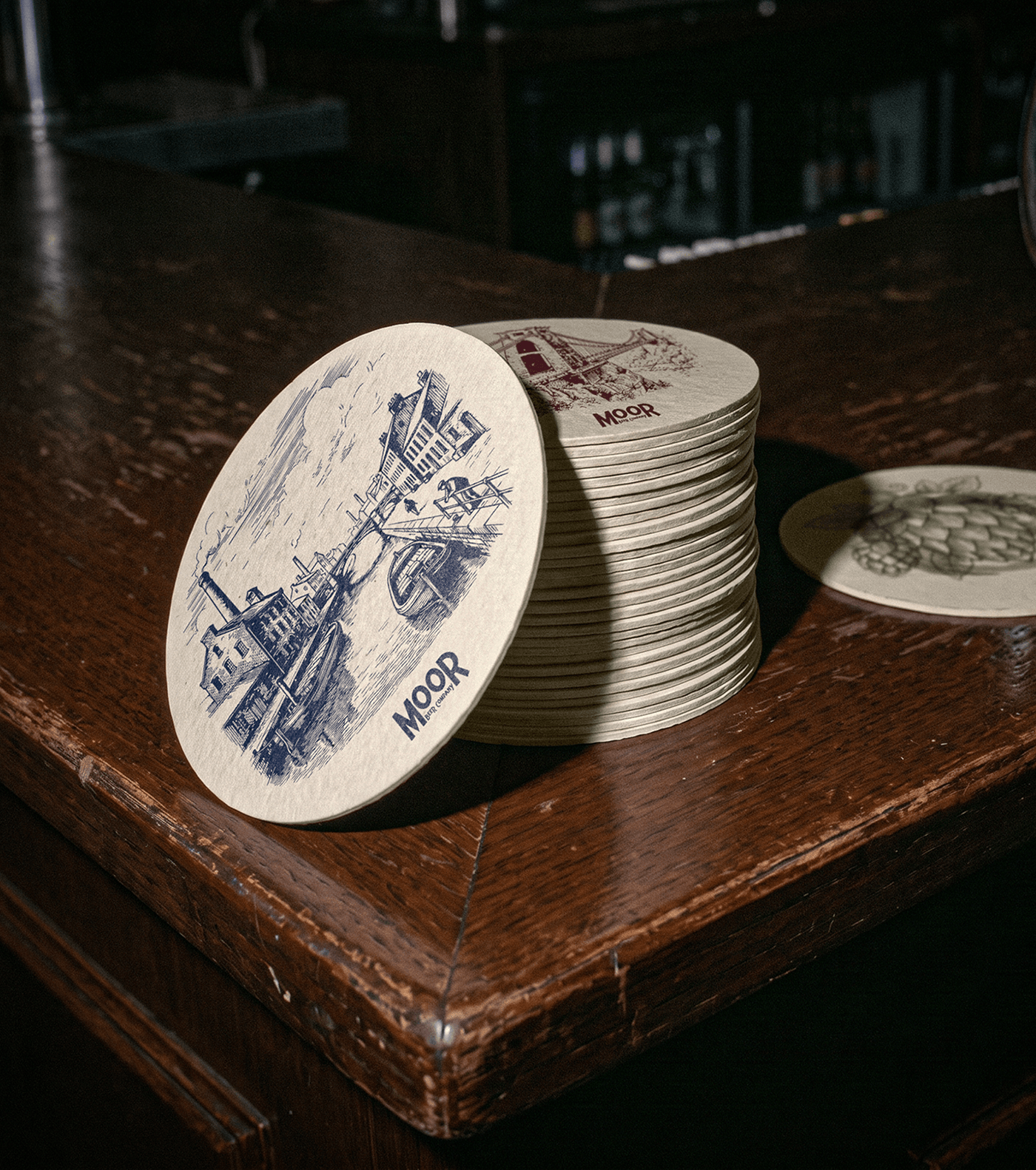
Moor Beer Company has been brewing in Bristol since 2005. We worked with them on a brand refresh and a packaging system that covers the whole range across cask, keg and can.
The work centres on a single badge format. Frame, banner, picture window and type stay the same from one beer to the next, while each beer gets its own colour and illustration, drawn from its character and from the city: hops, steins, the Suspension Bridge, the Feeder Canal. The same format carries over to pump clips, keg badges and cans, with the hierarchy set for how each one is actually seen.
The system was built to keep up with a brewery that keeps releasing. New beers, seasonal specials and collaborations such as So’Hop X with Mountain Goat go into the same format without reworking the existing labels.