WaveBye

Project Information
Wavebye’s founder approached us with a clear vision: refine and realign the brand’s identity to better reflect her aesthetic and voice.
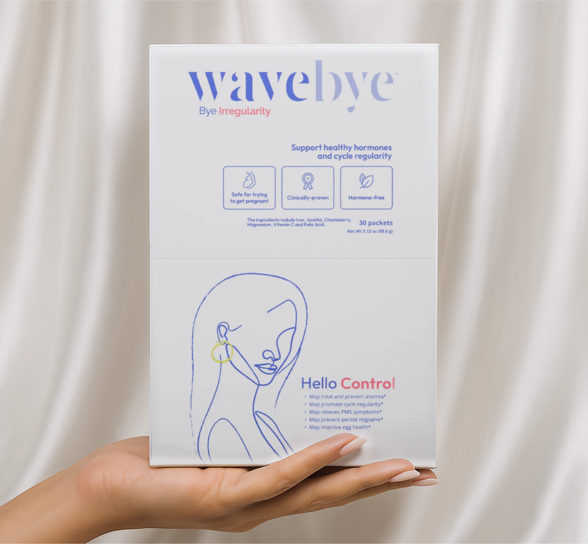
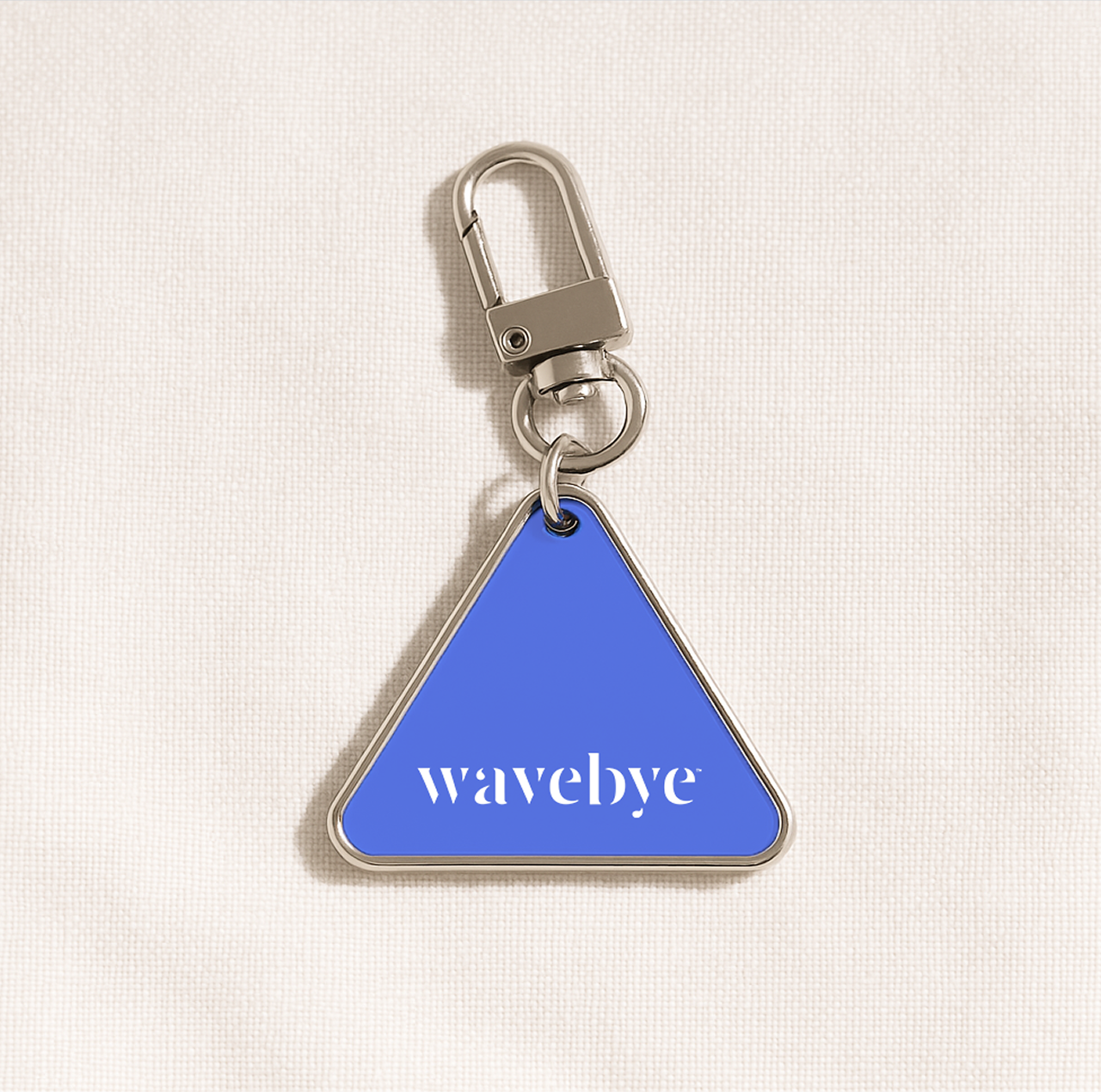
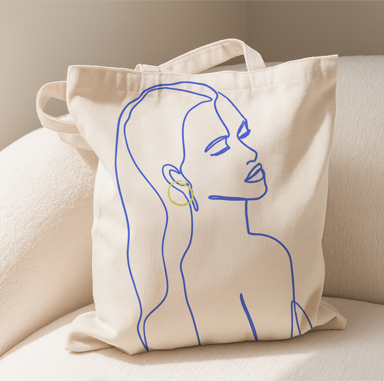
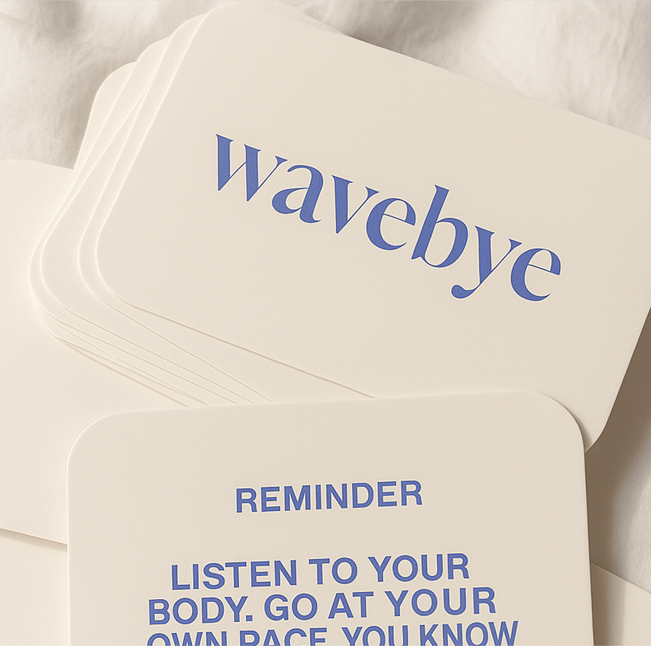
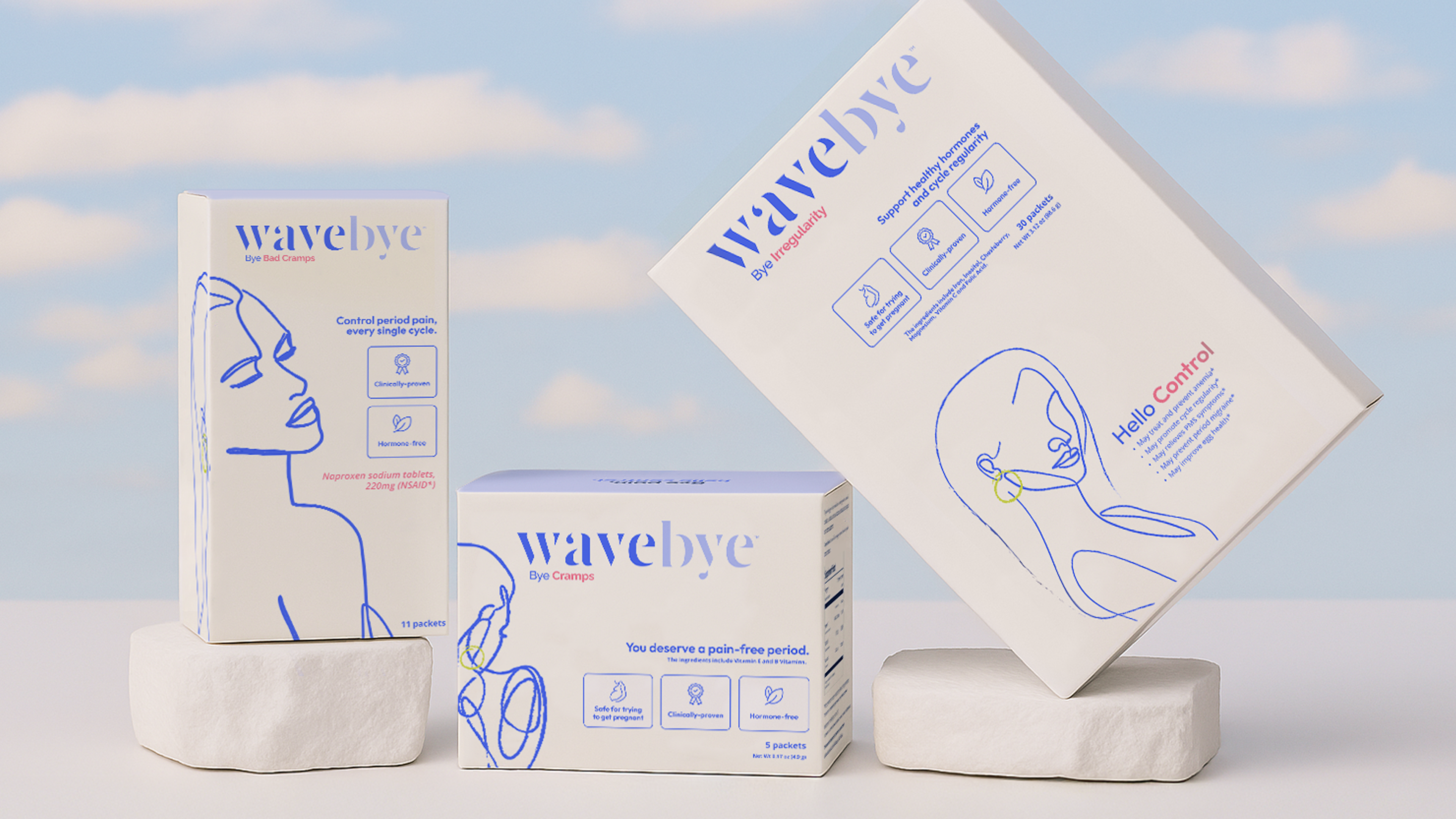
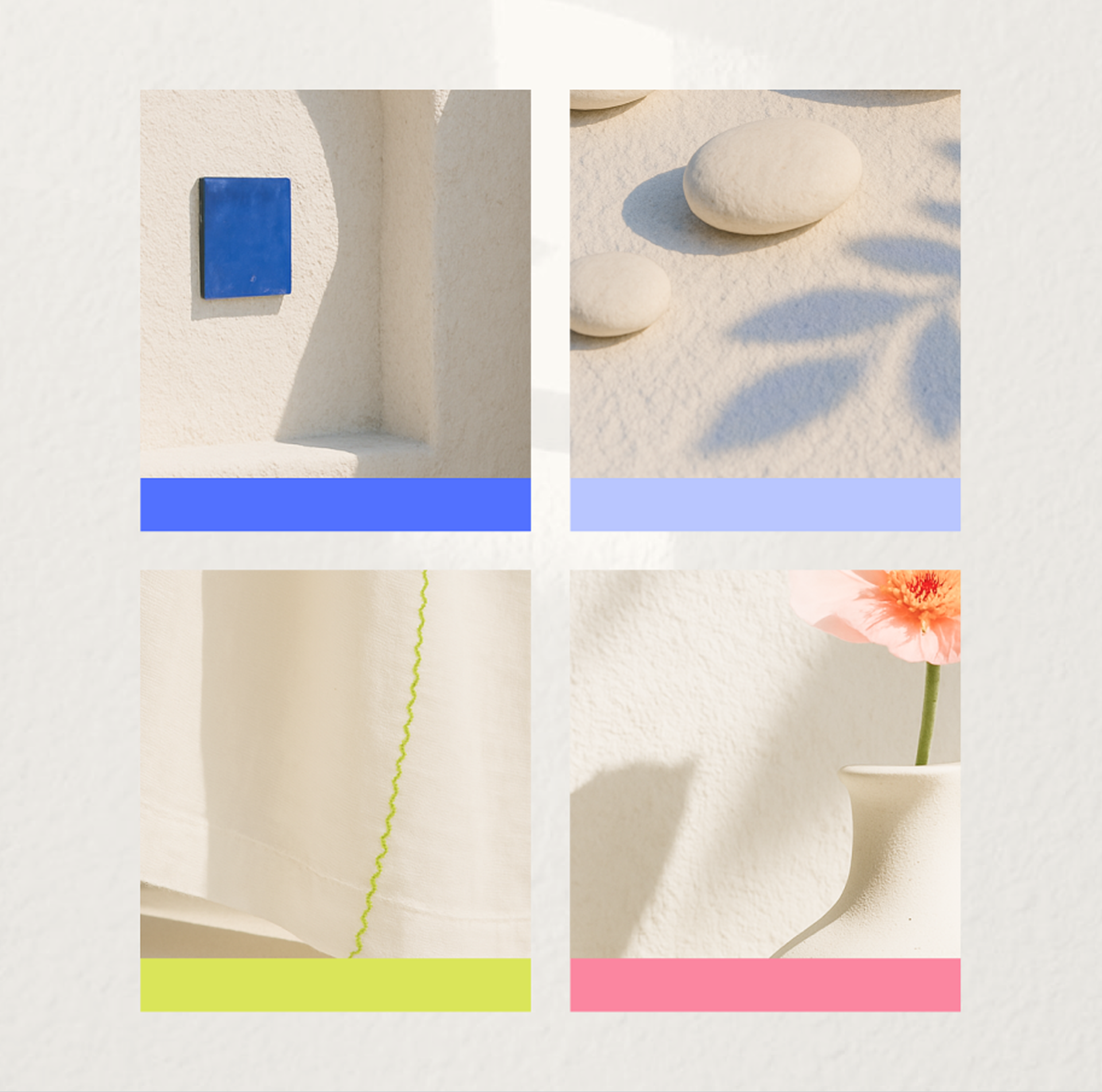
We took on the task of elevating previously developed assets, redesigning the logo for greater flexibility across packaging, digital, and lifestyle use. Alongside the brand’s calming base of blue, white, and cream, we introduced a set of bold accent colors to bring contrast, clarity, and warmth across touchpoints.
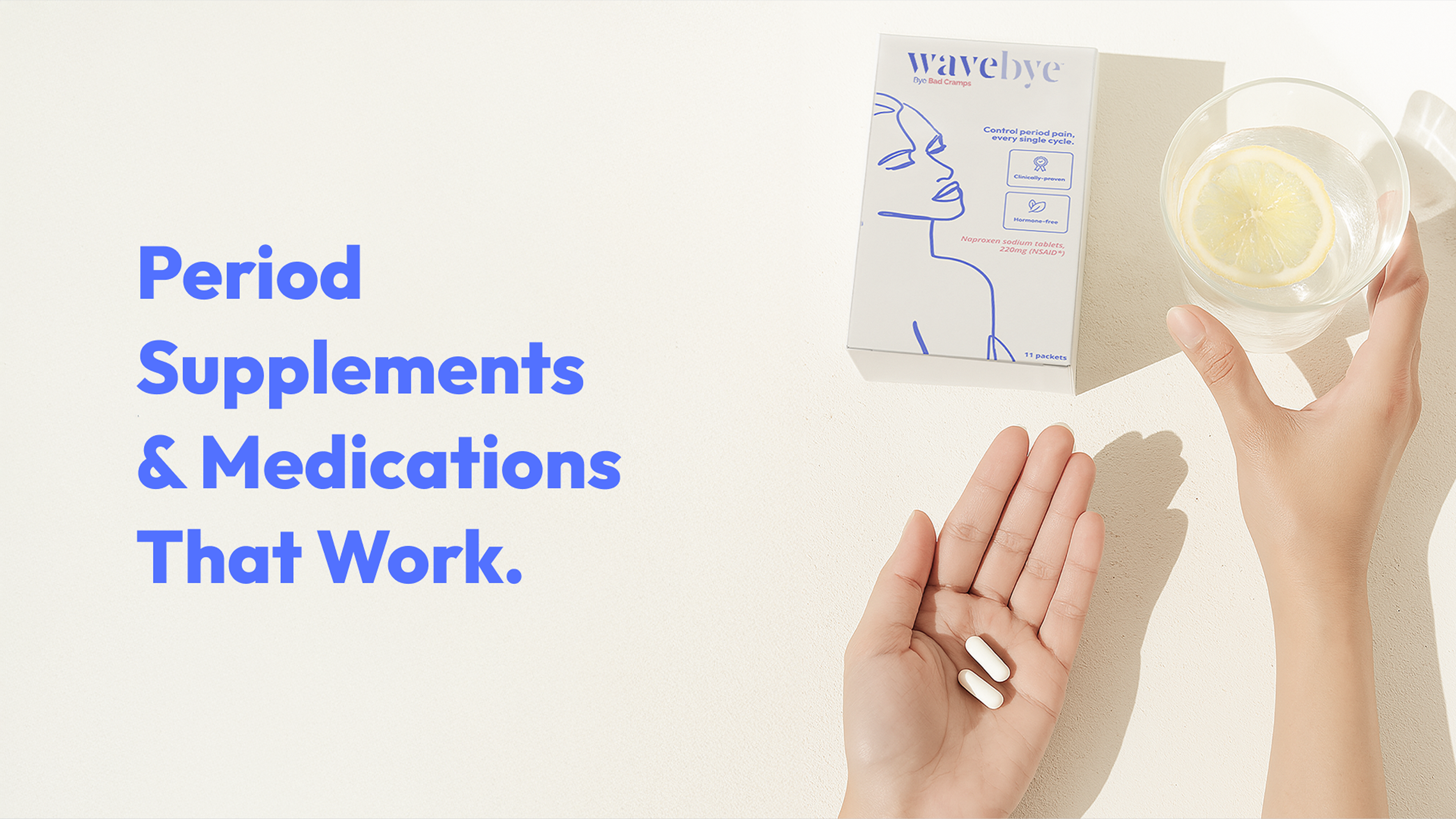
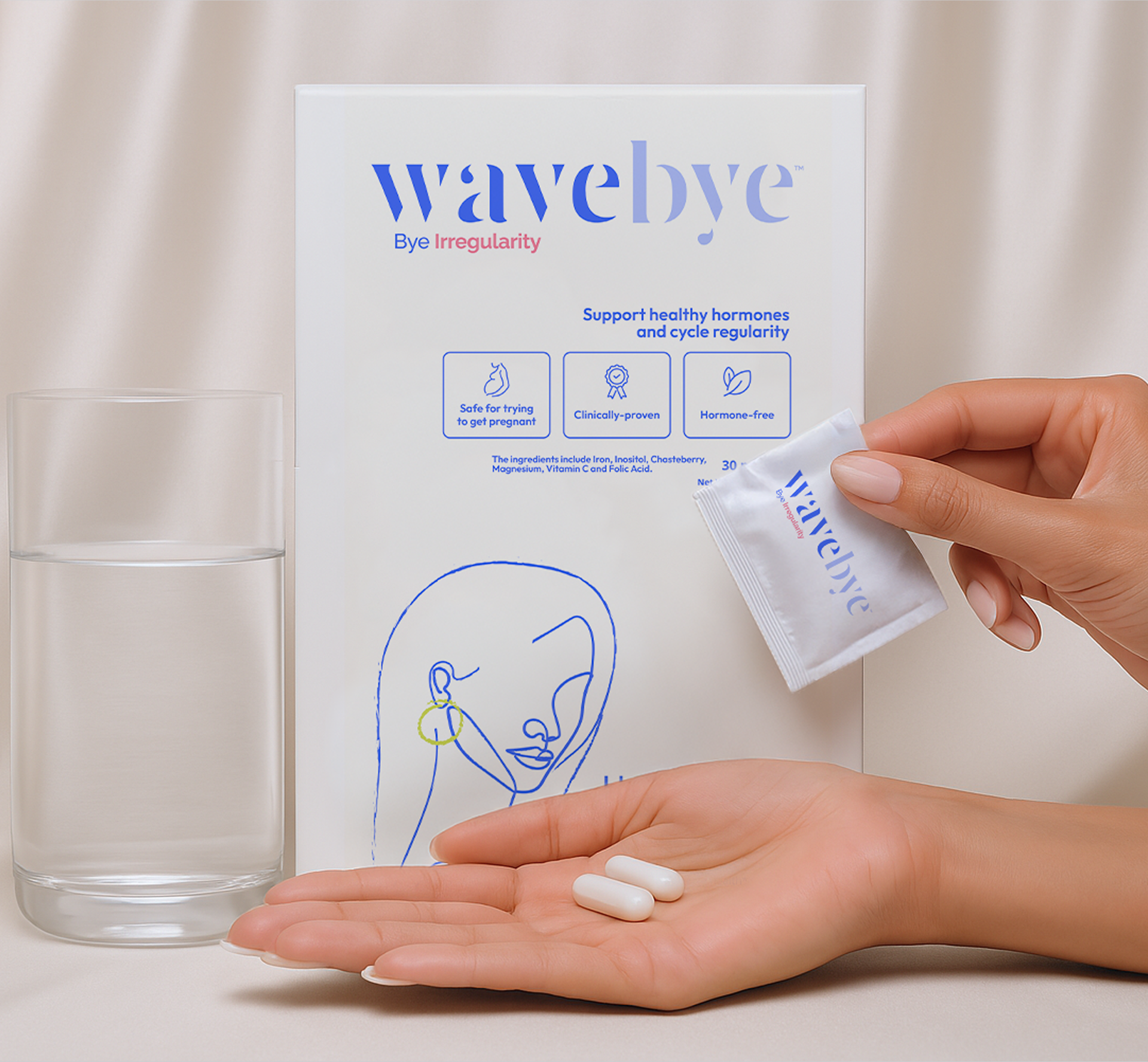
The work extended into a full brand book: defining a system of typography, illustrations, imagery direction, and tone. From packaging to lifestyle mockups, every piece was designed to support Wavebye’s mission: empowering women through evidence-based period care that feels both trustworthy and personal.