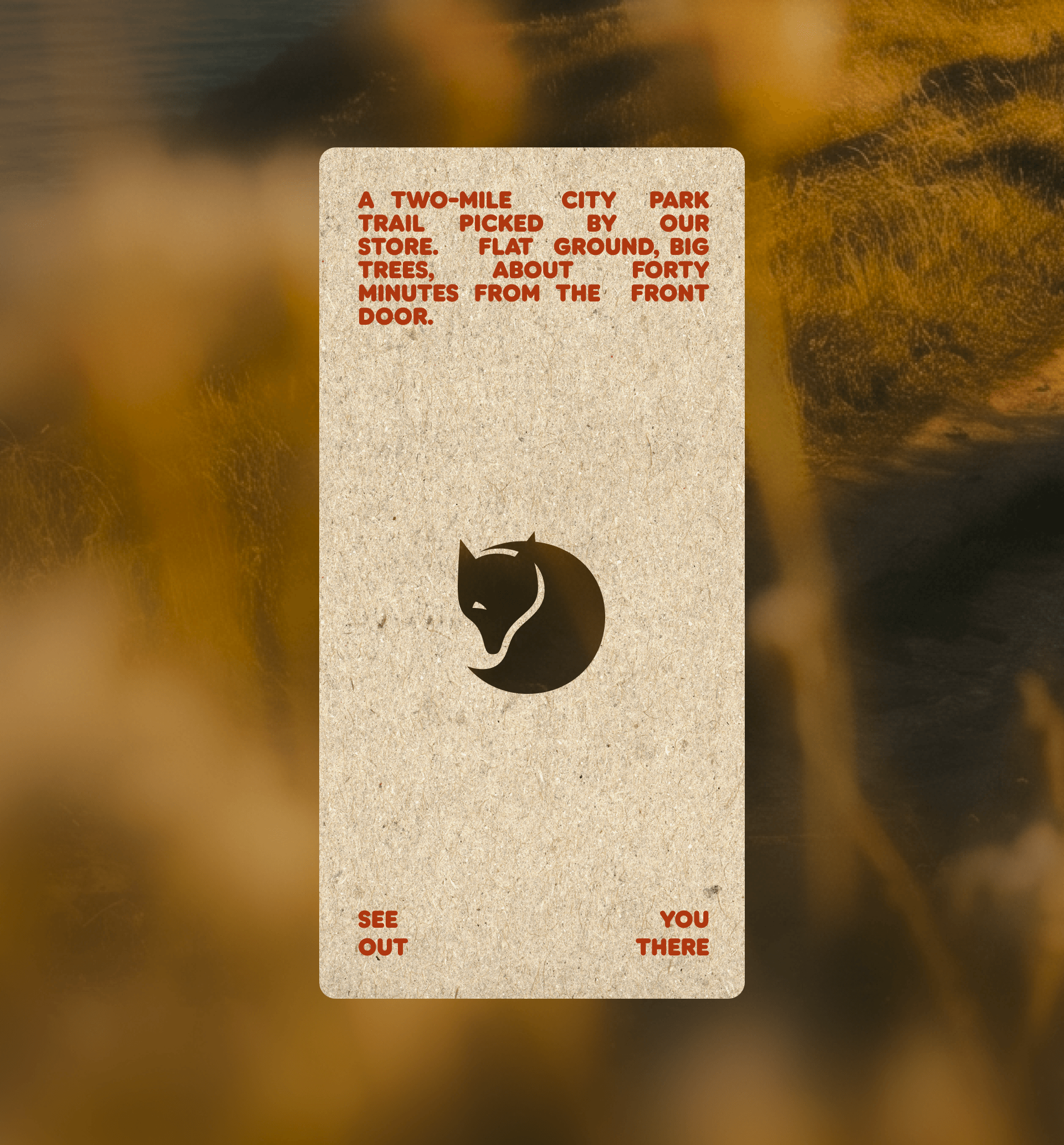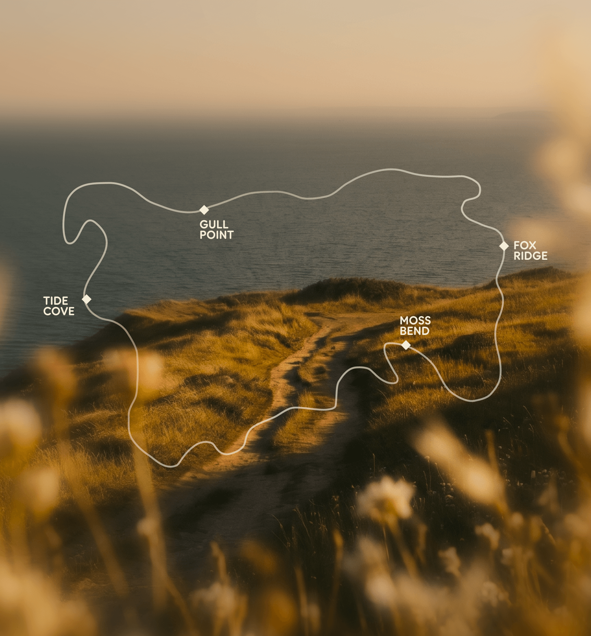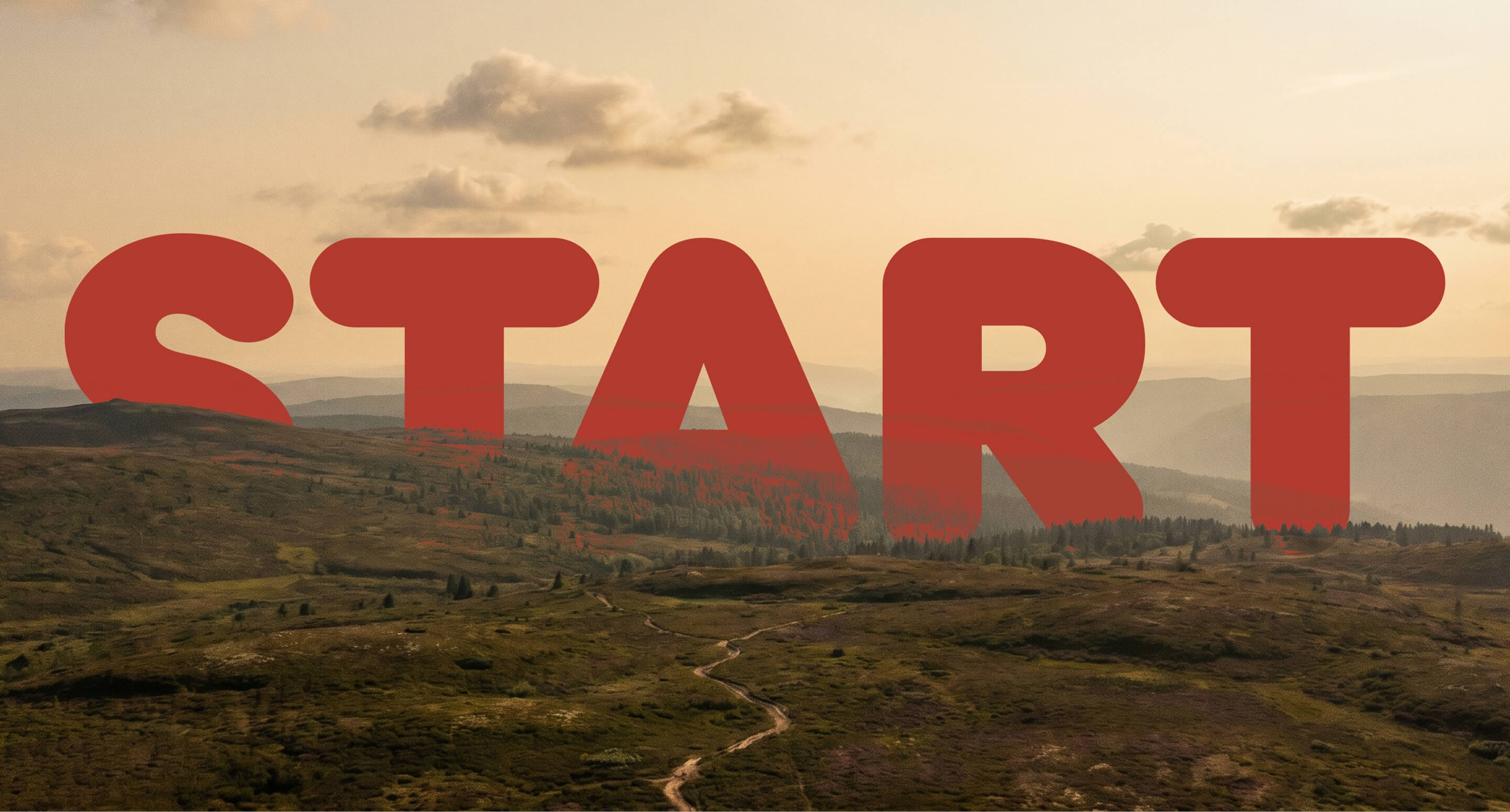
A summer-long retail campaign running across 34 stores and 340 trails, with in-store collateral, social, and editorial all needing to feel like one thing. The hero line and the patch had to anchor a system flexible enough to live on a postcard, a store sign, and an eight-page editorial without losing coherence.
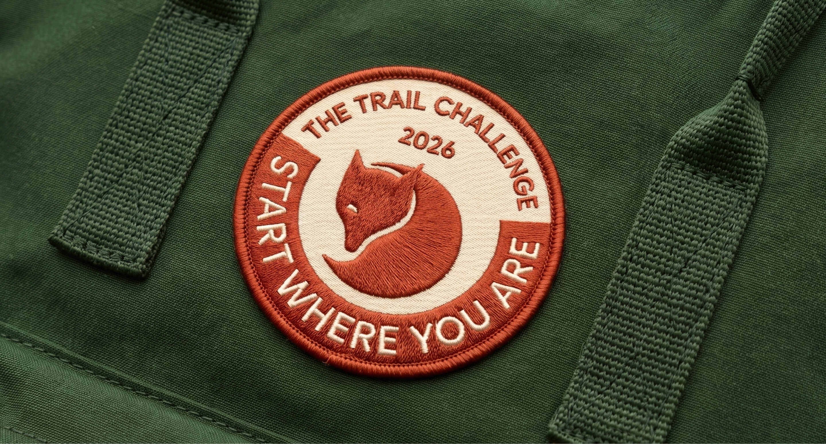
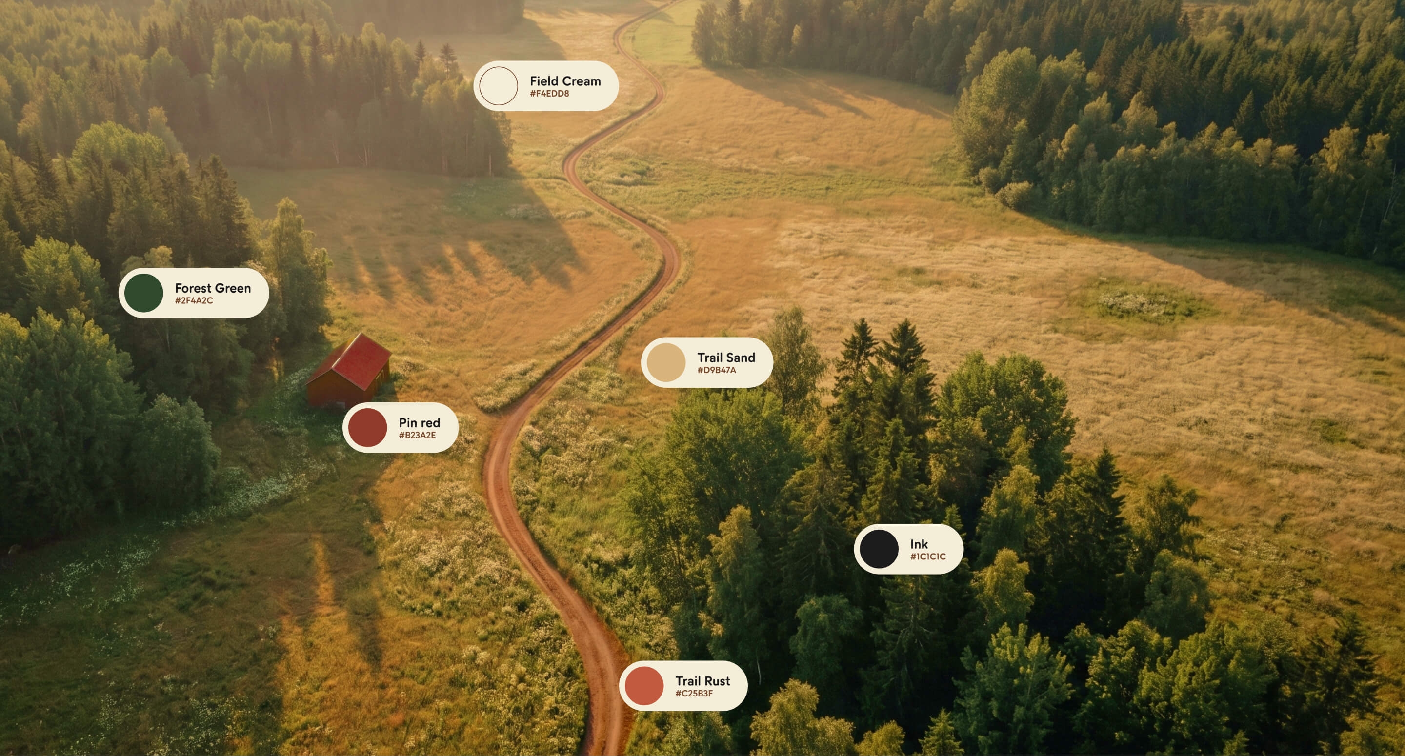
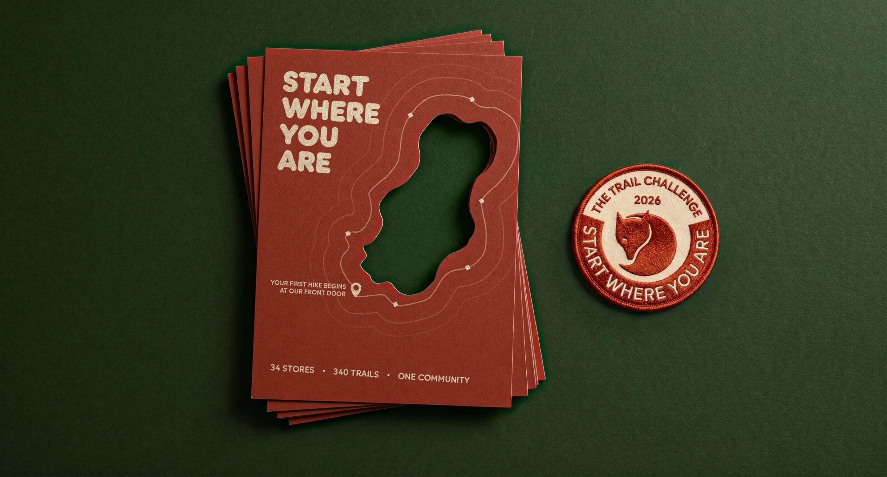
A campaign visual identity built outward from a single collectible embroidered patch. The patch defined the chromatic signature and the tactile register. A grammar of color proportion, typographic hierarchy, two graphic motifs, and an adaptive shape-callout made the system reproducible across every surface.
The team is very talented, quick, and open to feedback. I hope we will work together again soon.
Amanda Bernal
CMO, Fjällräven North America
Founded in Sweden in 1960 and present in over 40 countries, Fjällräven brought us in to design the visual identity for the 2026 Trail Challenge, the brand's summer campaign that turns its 34 North American stores into local trailheads for three months.
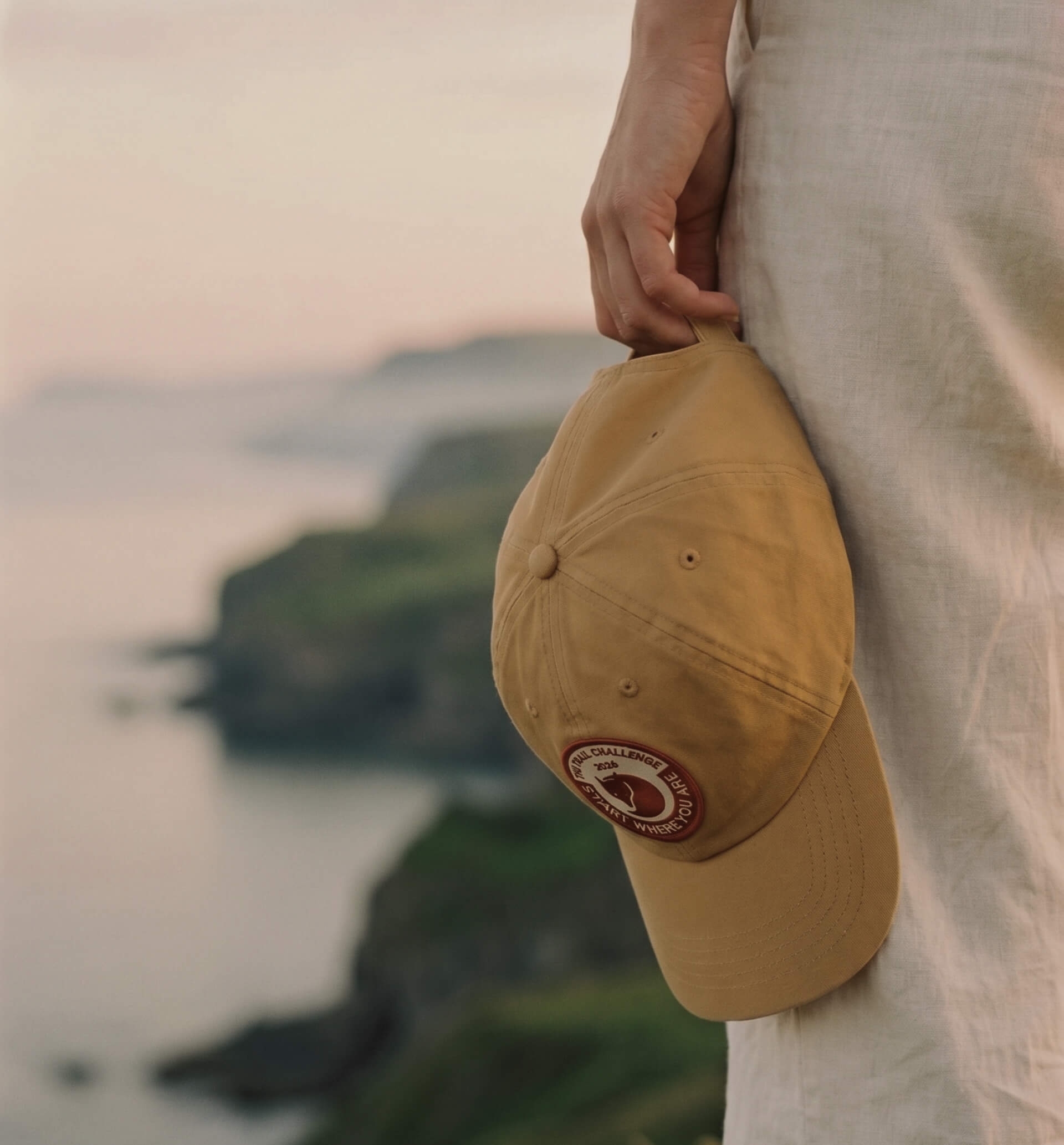
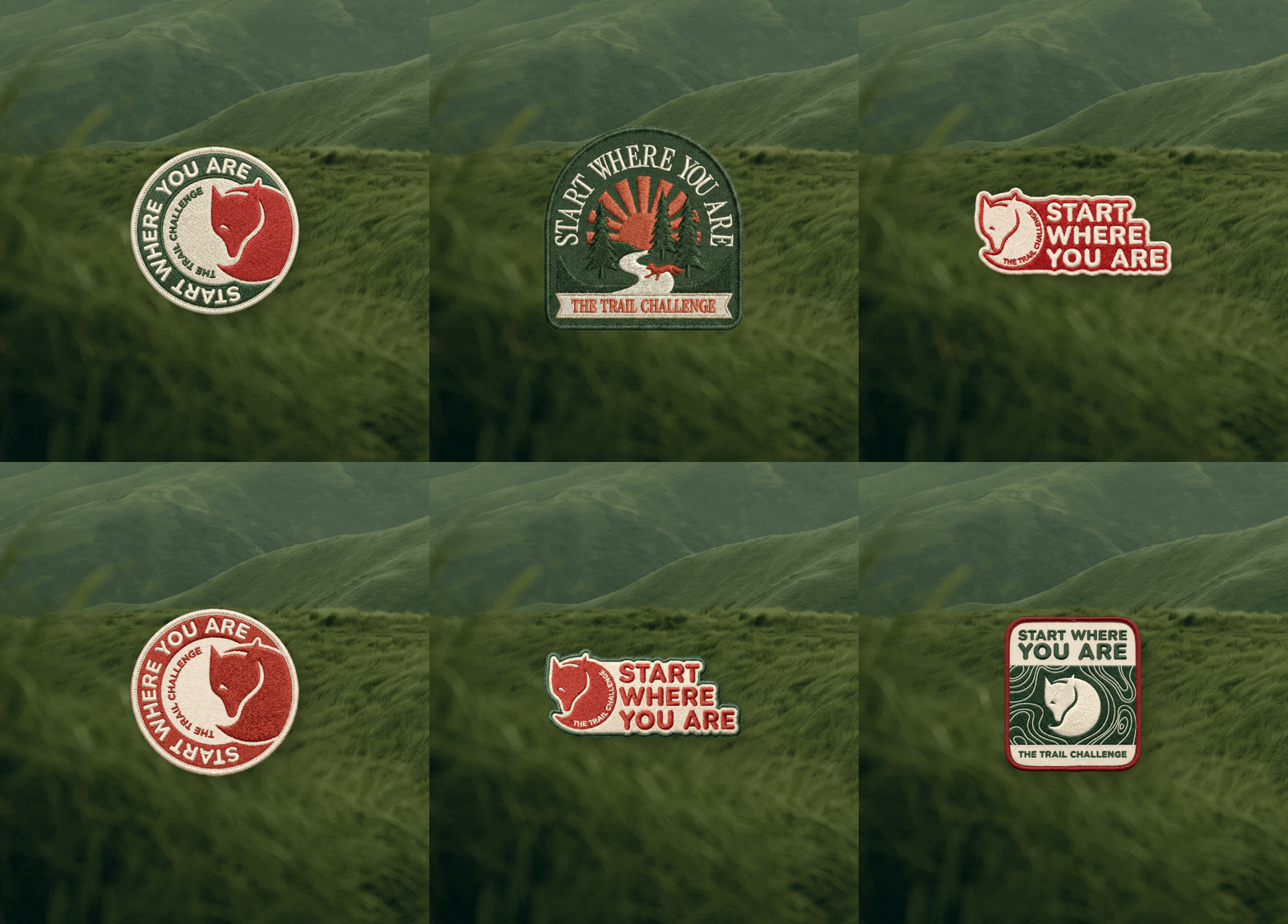
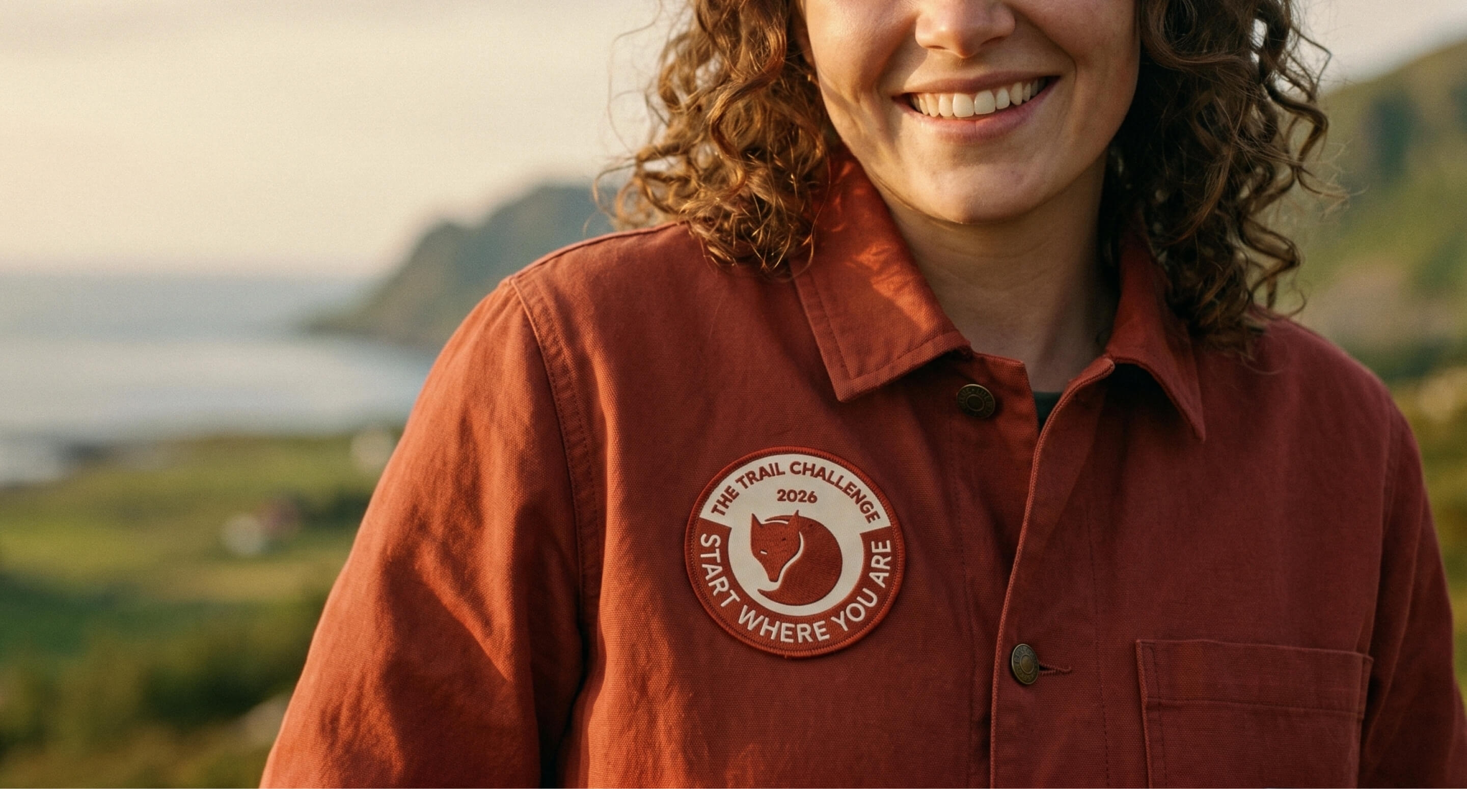
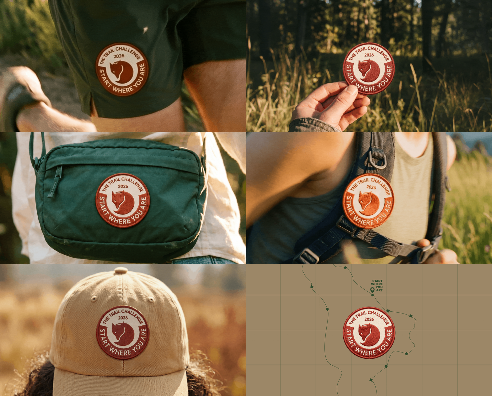
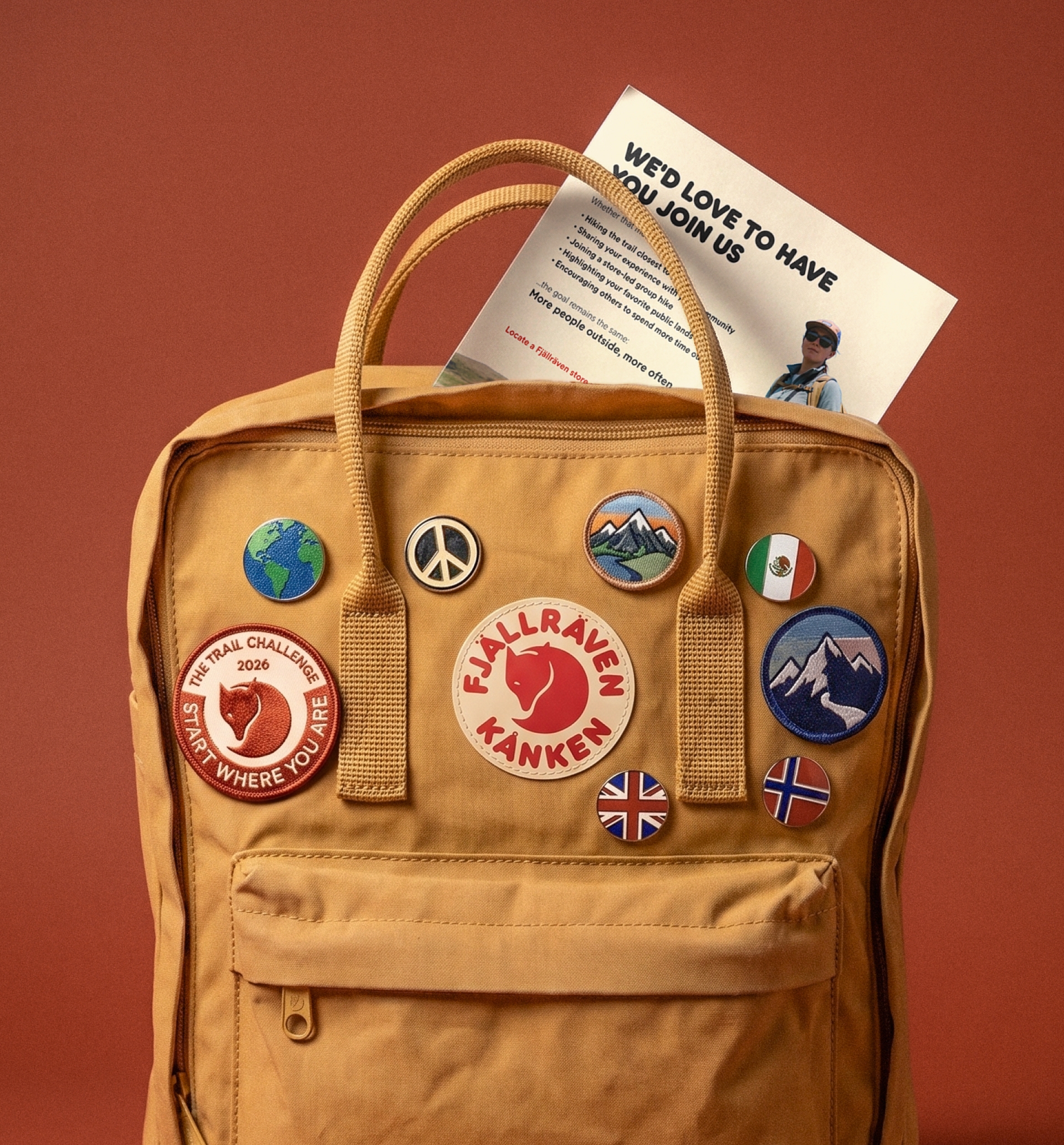
We built the system from the patch outward. Starting from a collectible, tactile object meant the rest of the system inherited its qualities. Crafted, badge-driven, slightly imperfect.
A moodboard tells you what something should feel like. A grammar tells you how it works.
We delivered the system as a set of operating rules covering color proportion, typographic hierarchy, graphic motifs, and a unified imagery treatment. Each rule is defined as a relationship, not a value: proportional, not prescriptive; which is what gives the system its range.
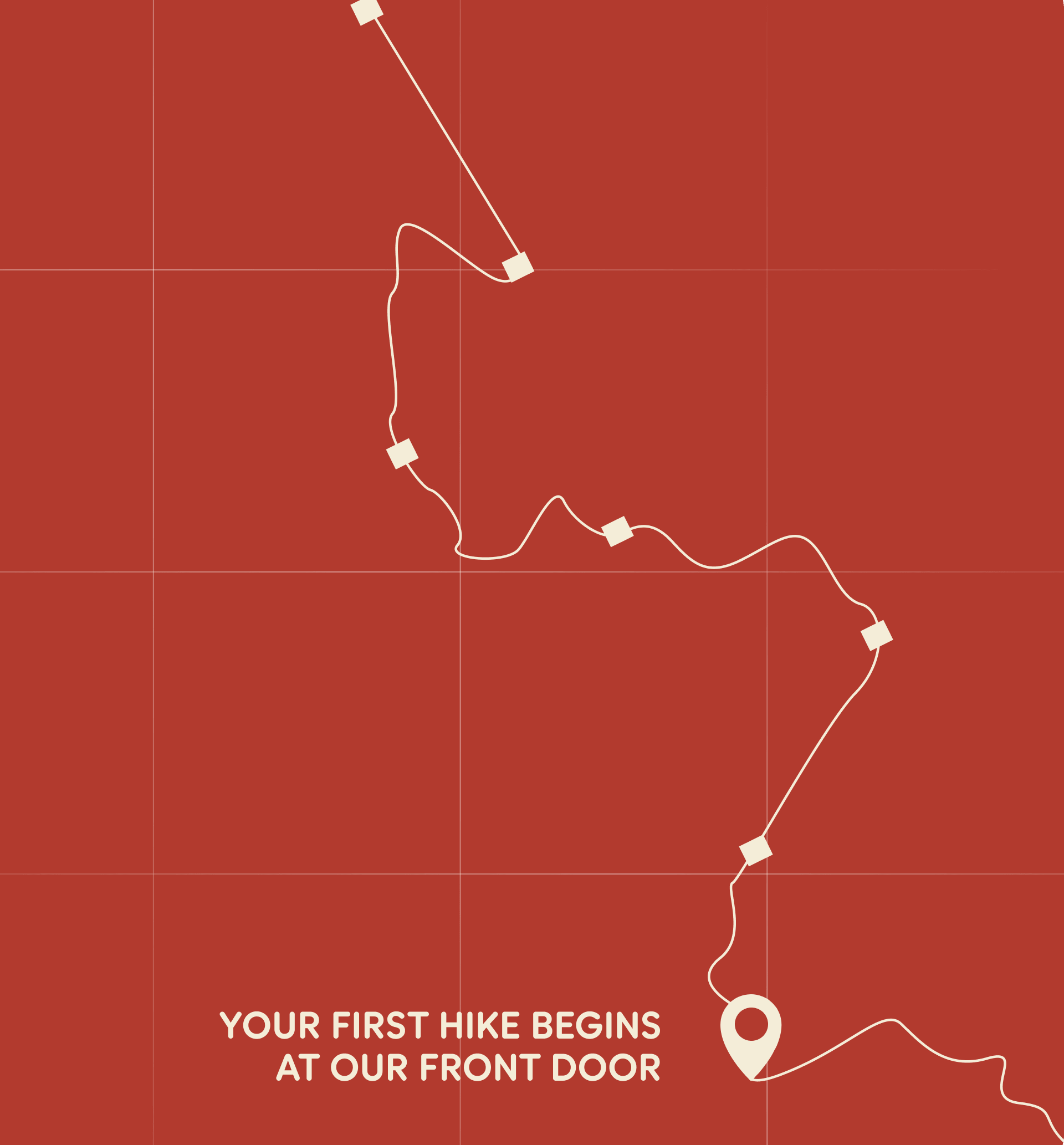
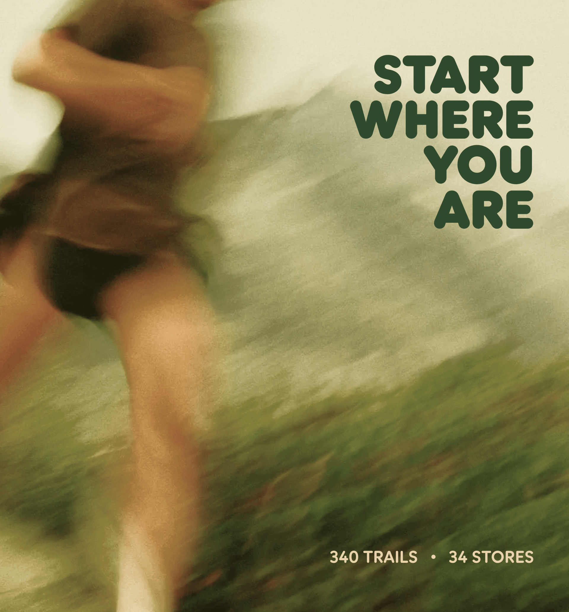
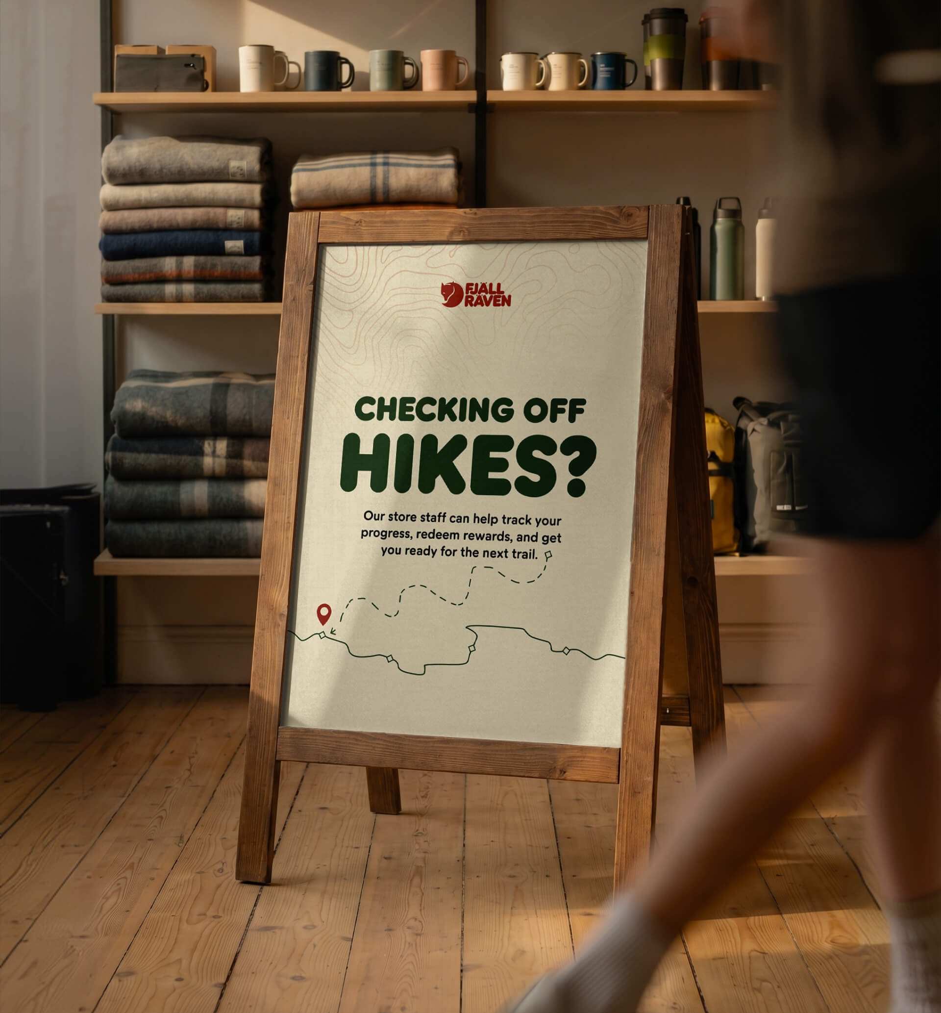
A system is only as good as its hardest application. In our case, the social posts run as nine sequential frames, each reading in under a second while carrying the campaign's full visual register. The two A-frames sit on opposite ends of the participant experience, one inviting, the other building momentum, calibrated more by copy weighting than by visual change.
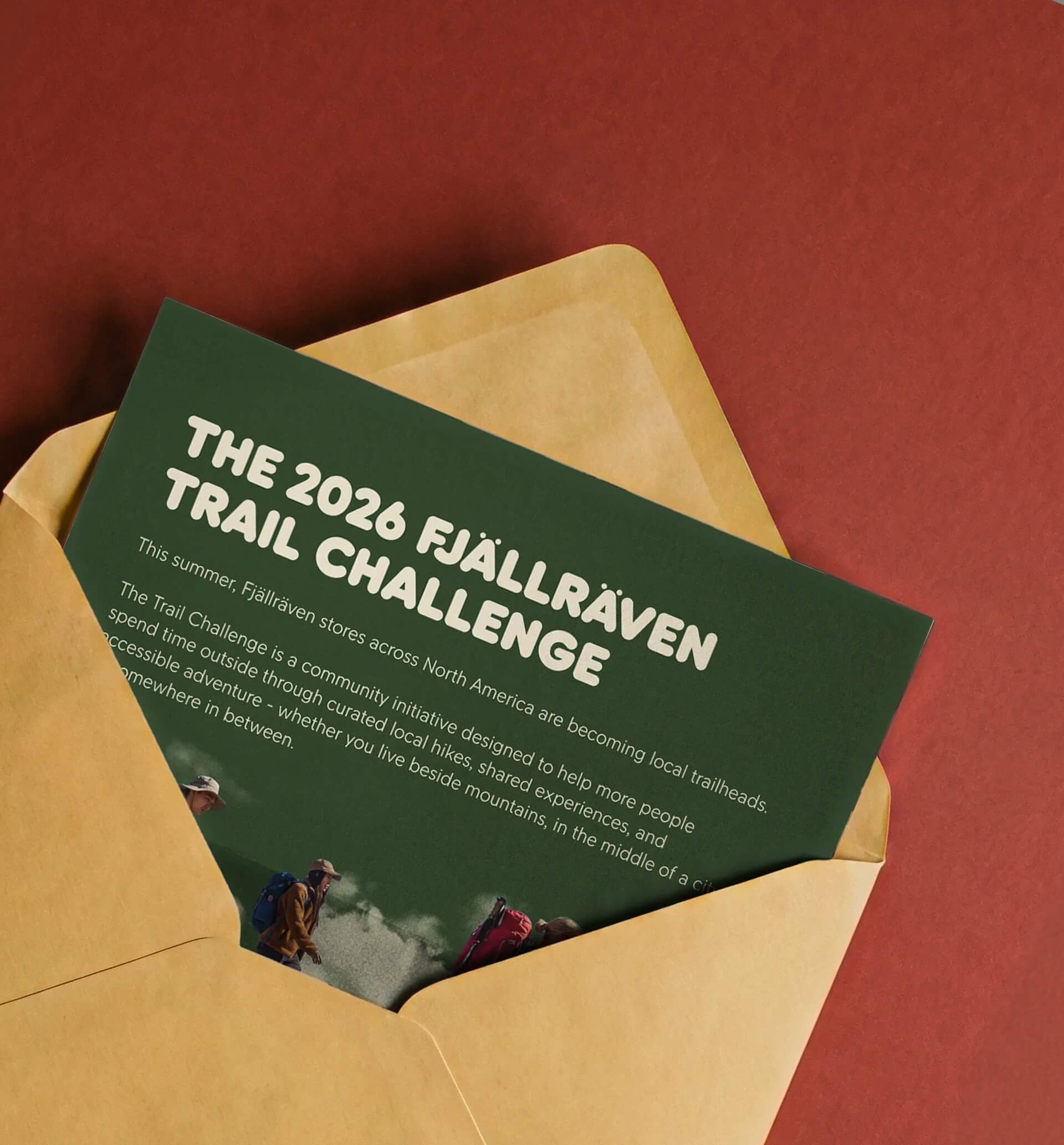
The Community PDF is the only piece in the campaign that doesn't behave like retail collateral, and that was intentional. A flyer asks to be received. An editorial asset asks to be read.
We designed the eight-page document as the second kind, paced like a magazine feature, tonally closer to journalism than to marketing. It moves through context, intention, and invitation at a reader's rhythm rather than a buyer's. The piece is meant for press, creators, and community organizers, an audience that responds to a well-made document long before it responds to a call to action.
Fjällräven, founded in Sweden in 1960 and present in over 40 countries, is one of the most enduring names in outdoor design. Their North American team brought us in to design the visual identity for the 2026 Trail Challenge, the brand's annual summer campaign that turns its 34 retail stores into local trailheads for three months, from June through August.
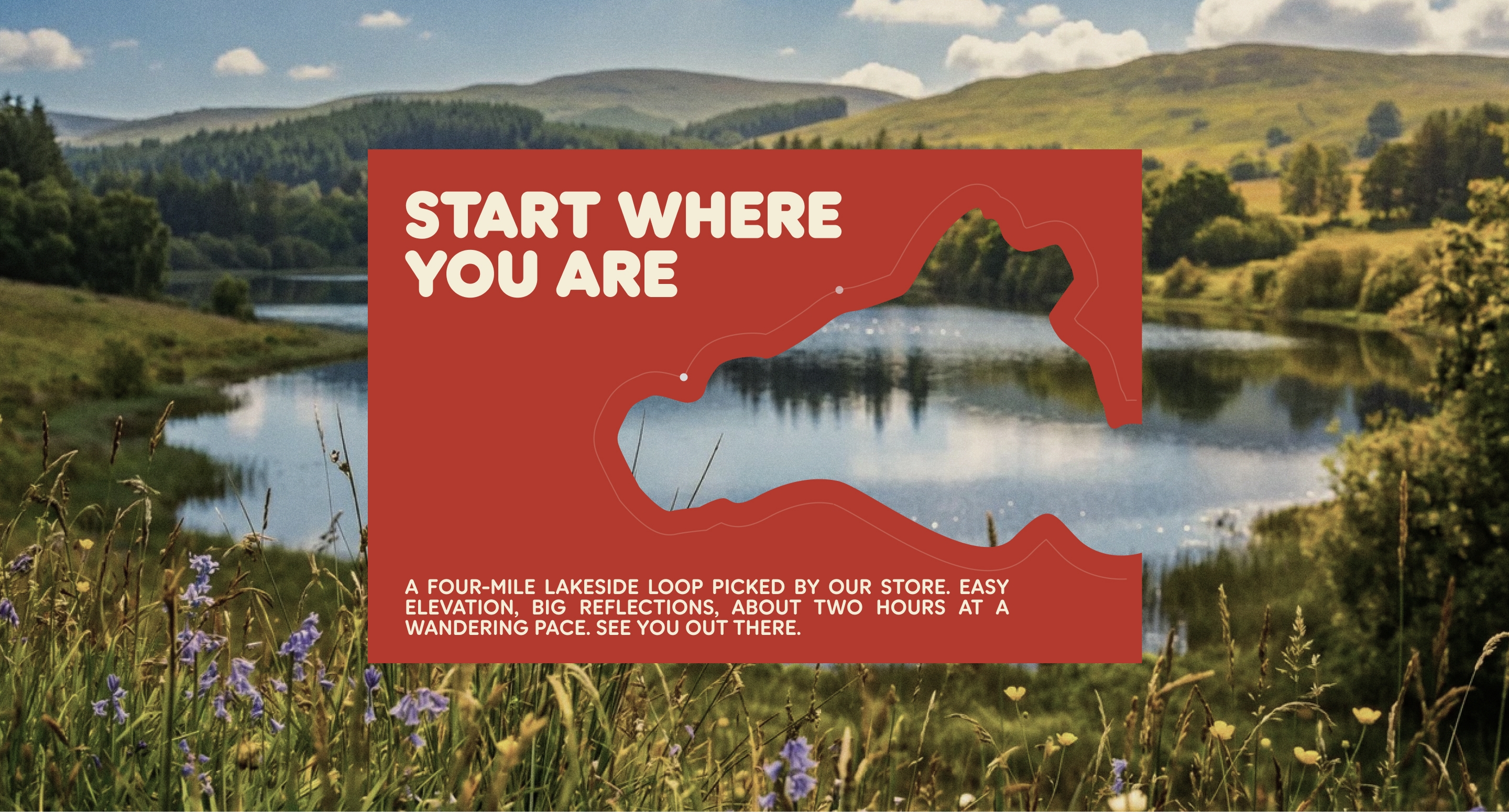
The campaign has a single throughline: Start where you are. We anchored the system on a collectible embroidered patch and built outward from there. The patch defined the chromatic signature and the tactile register; the rules made the system reproducible across every surface.
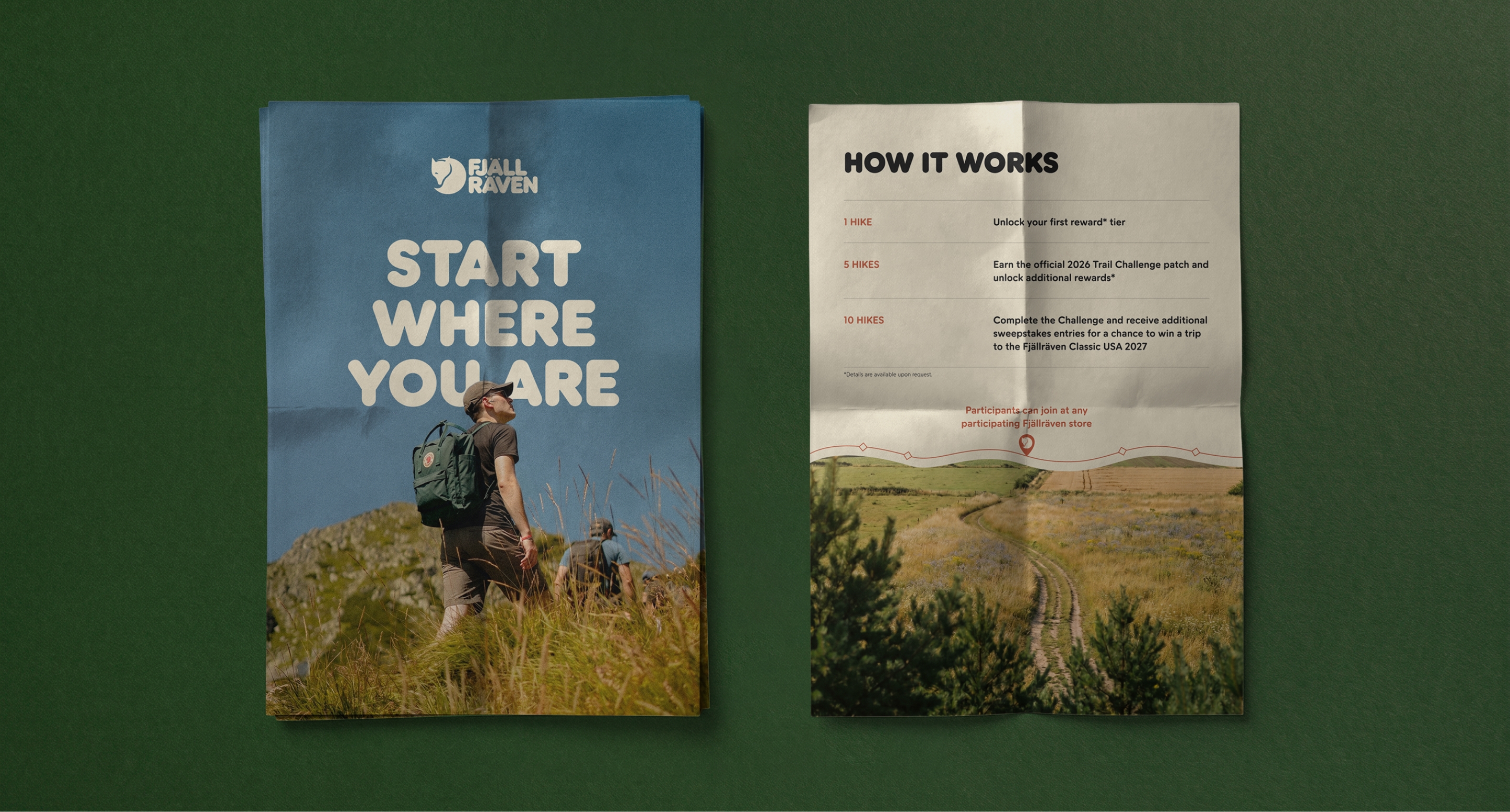
We delivered the campaign as a grammar rather than a moodboard. Color proportion, typographic hierarchy, two graphic motifs, a unified imagery treatment, and an adaptive shape-callout. Each rule was defined as a relationship, not a value, which is what gave the system its range. The same grammar produces a postcard, a store sign, and an editorial spread without collapsing the differences between them.
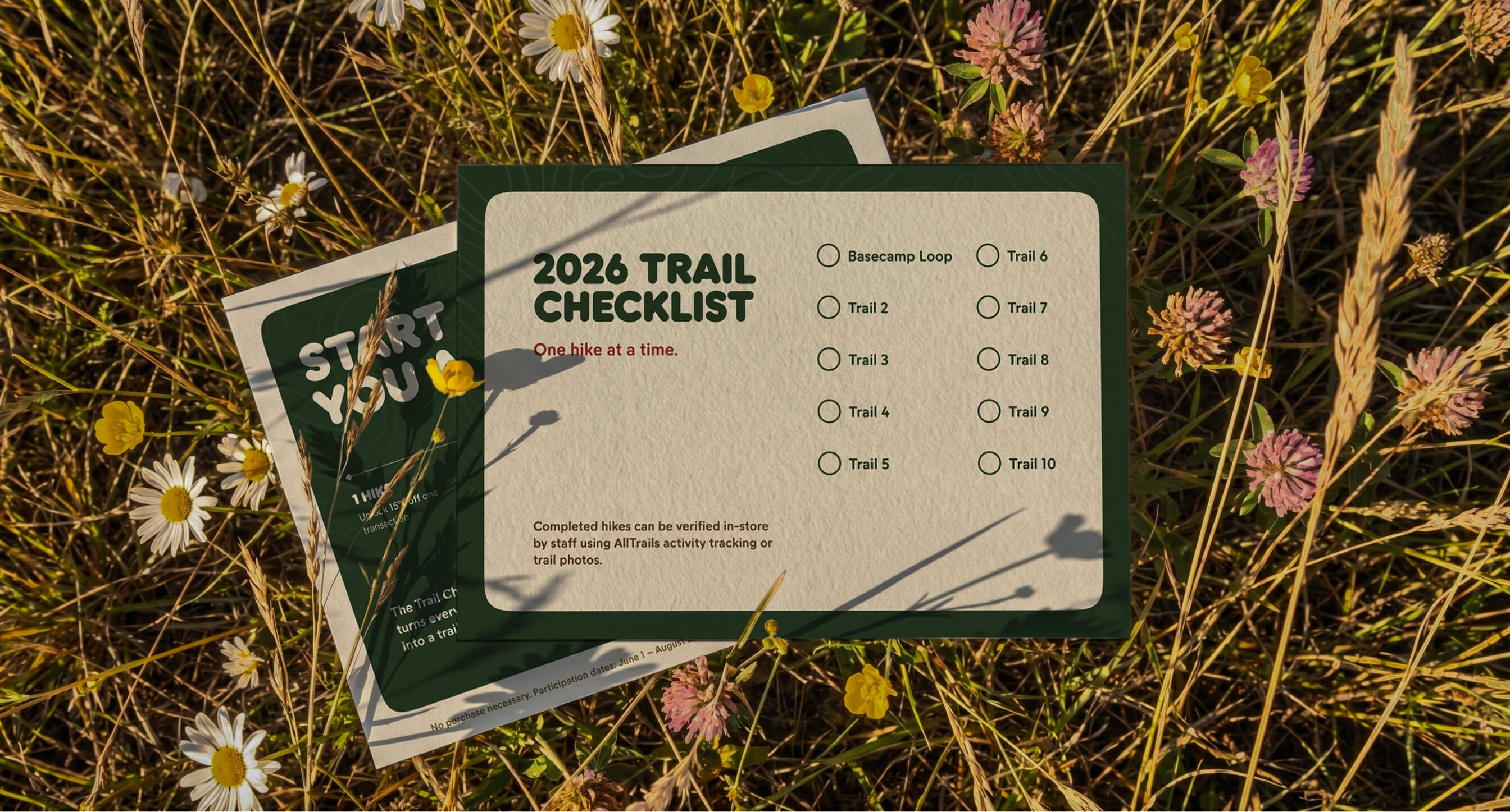
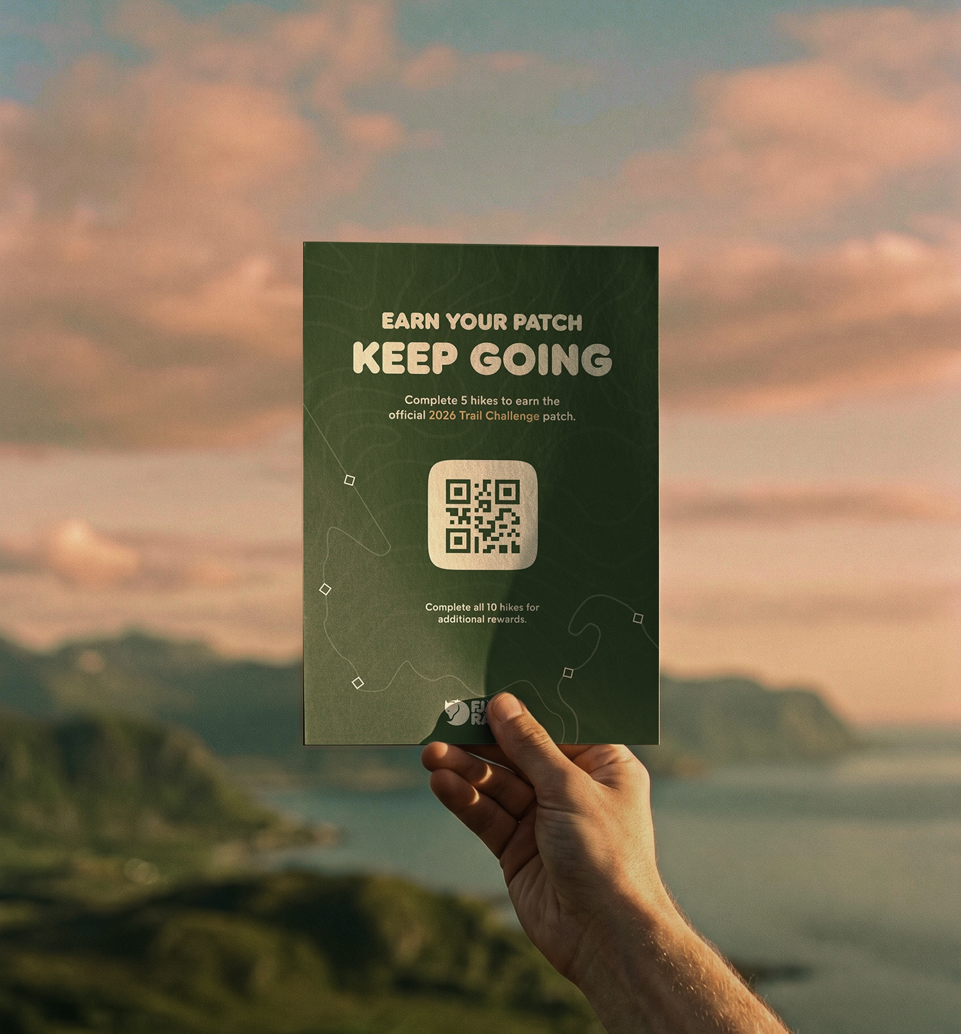
The work spans ten applied pieces: a 4x6 Nature Guide Postcard with a trail checklist on the back, a Table Top POP in three colorways, two A-frames calibrated by copy weighting rather than visual change, three social ads including a 9x16 announcement story sequence, and an eight-page Community PDF designed to read like a magazine feature rather than a flyer. The patch ties it all together.