WxRK started as a rebrand: an established Web3 platform stepping away from crypto and into a bigger question. As AI agents take over hiring, a polished CV stops meaning much. The new platform gives people a verified reputation that both humans and machines can read.
The promise is trust. The audience is enterprise buyers and tech talent who can smell a corporate brand from a mile away. Too clean, and it disappears into a category of blue gradients. Too raw, and the trust wobbles.
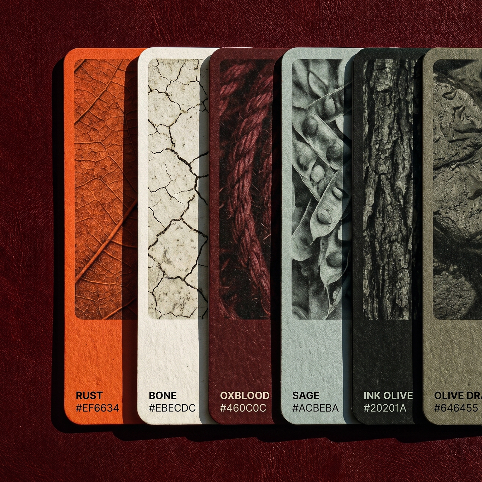
The palette: rust, bone, oxblood, sage, ink-olive. Warm and grounded, closer to workwear than to software. The opposite of cold AI blue.
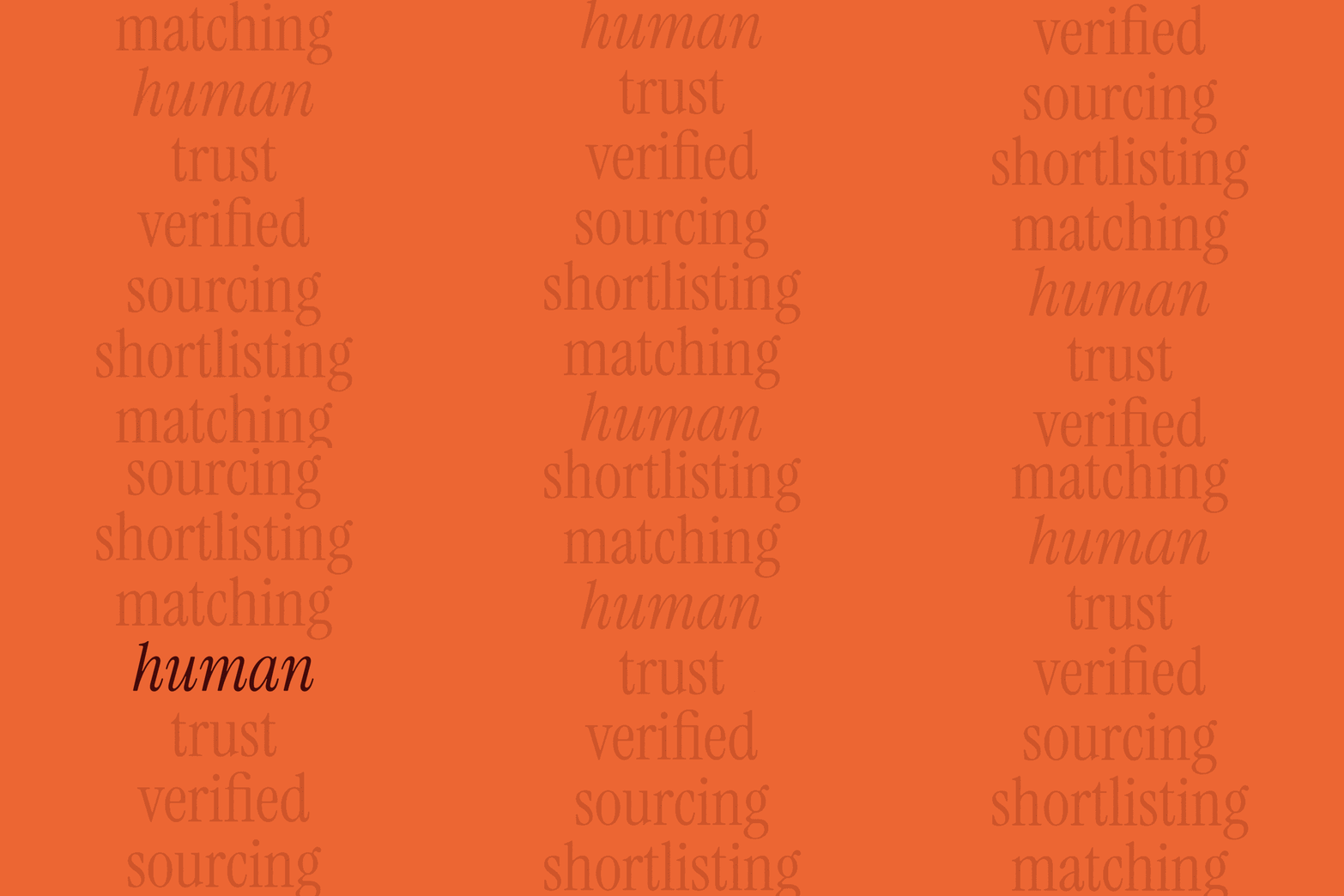
Three type voices: the serif states, the sans explains, the mono reads the data.
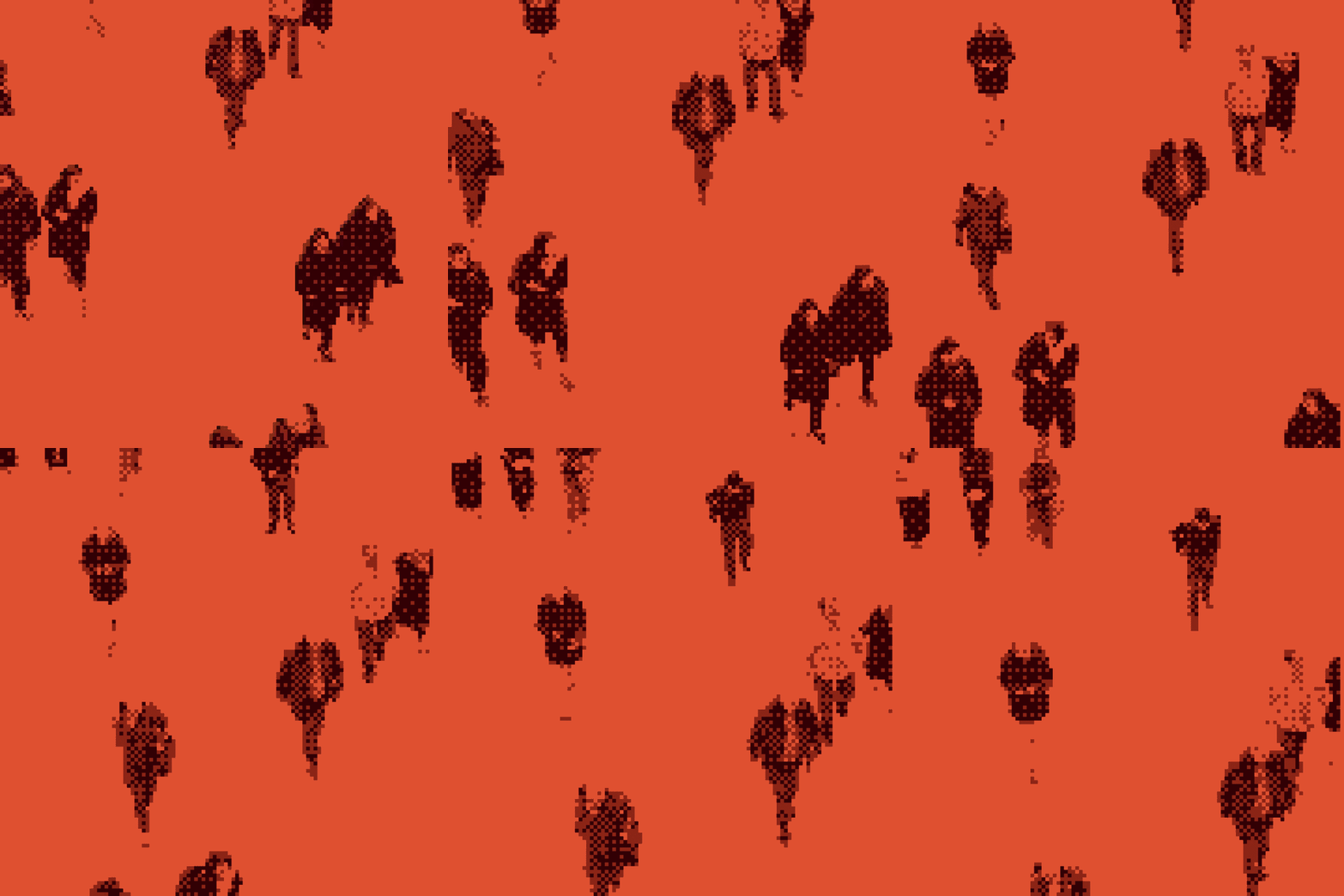
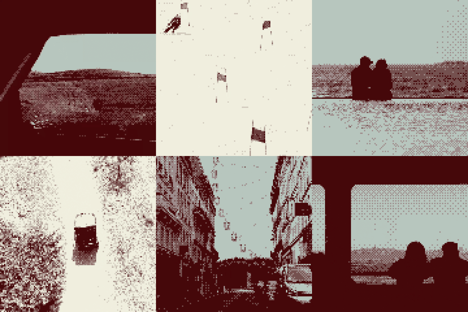
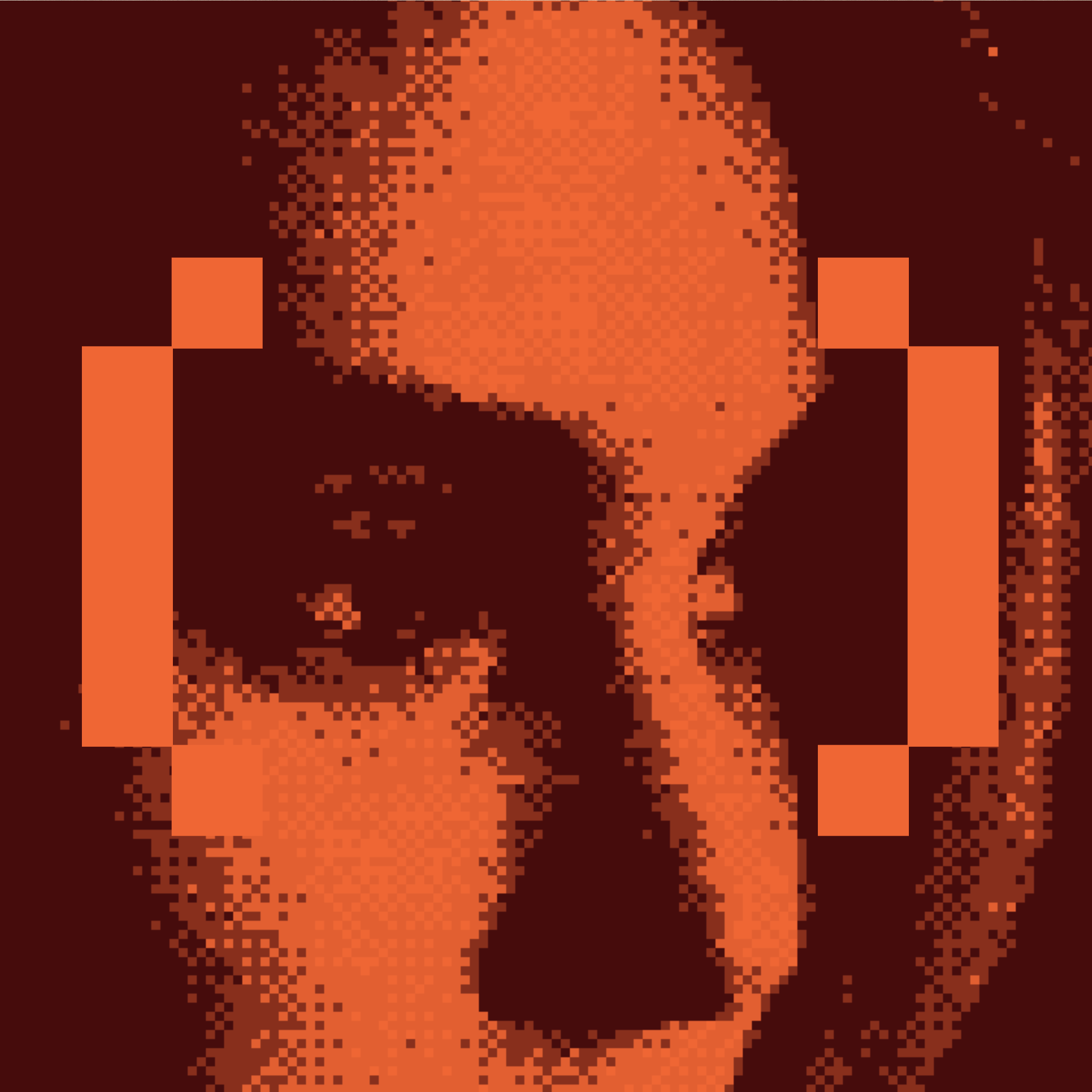
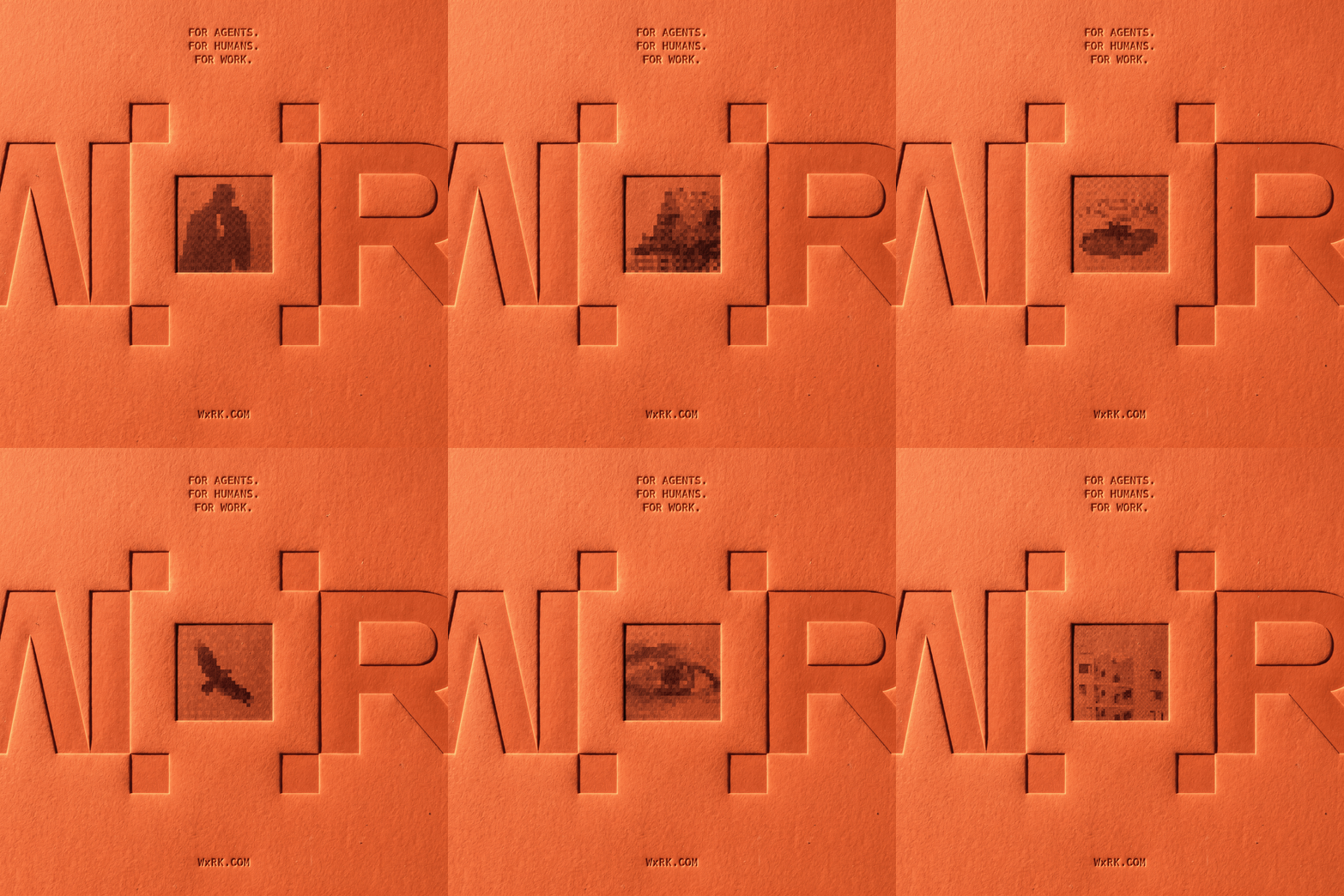
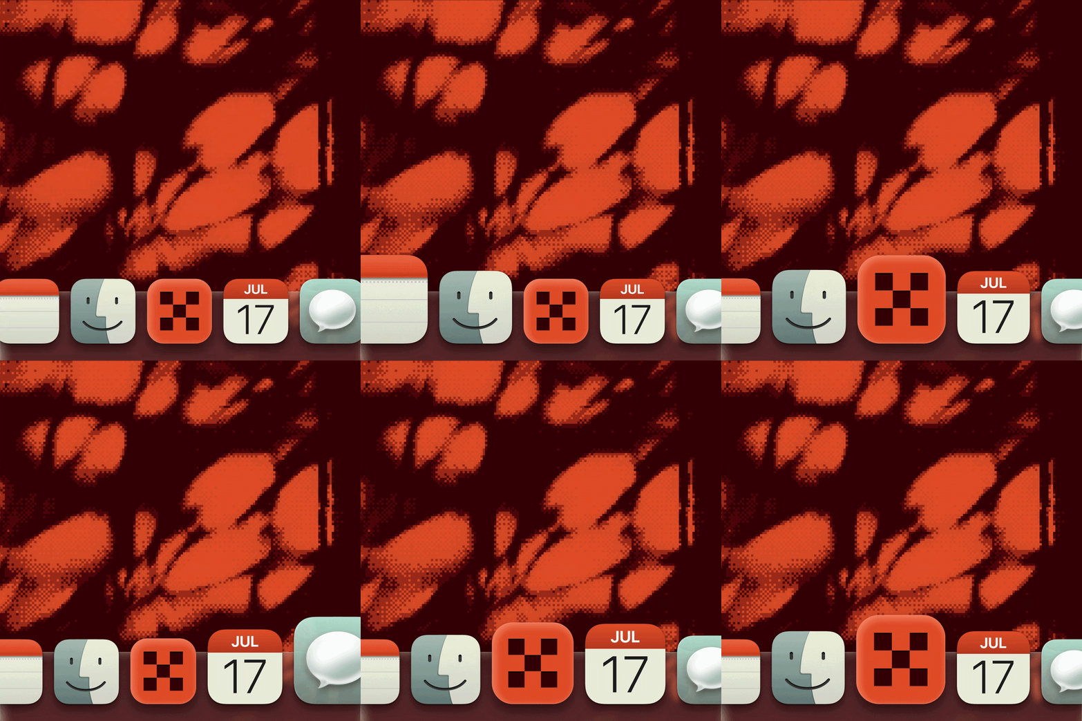
Every image resolves through a field of pixels: scattered data pulling together into something sharp. It is the product's story told as an image treatment.
Proof brings it into focus. The treatment runs at every scale, in stills, motion and small UI moments, so the brand never has to explain what dither means. You watch it resolve and you understand.


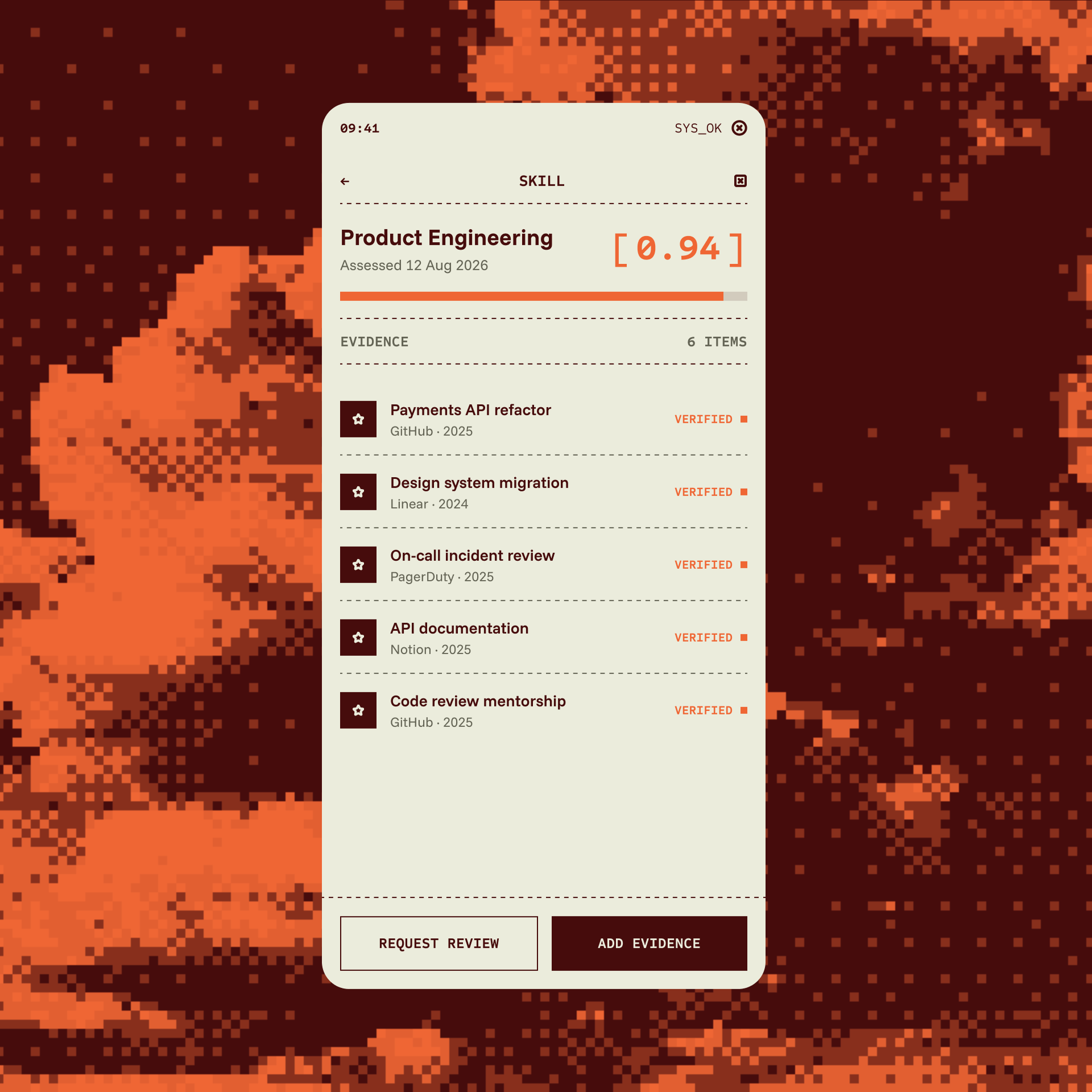
Verification needed a shape. We found it in the corner bracket: the frame a system draws around something it has locked onto.
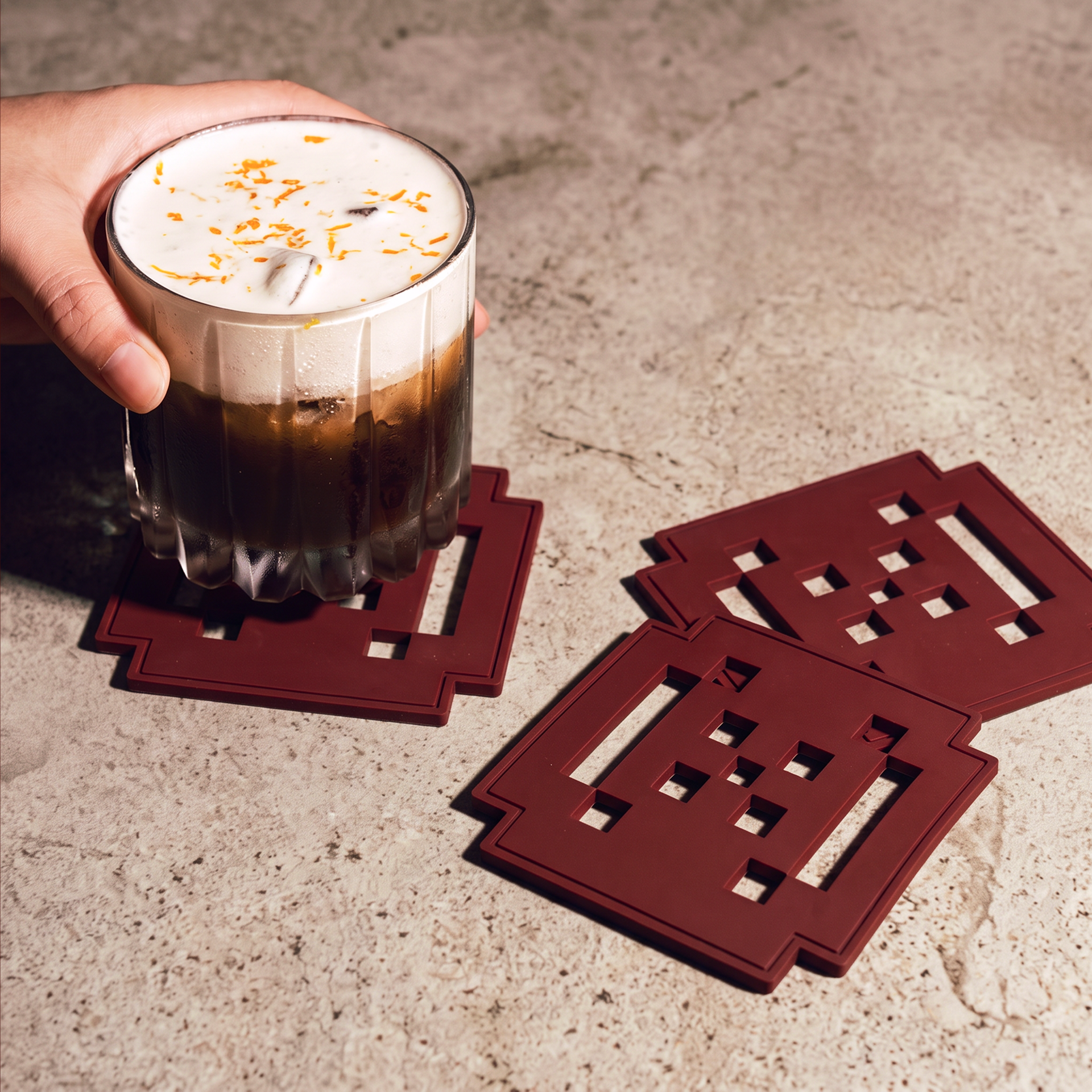
It started in the logo and became a system of its own, on the brand's pixel grid. It frames a hero image, holds a CTA, closes around a headline, marks an element the way the platform marks a verified human.
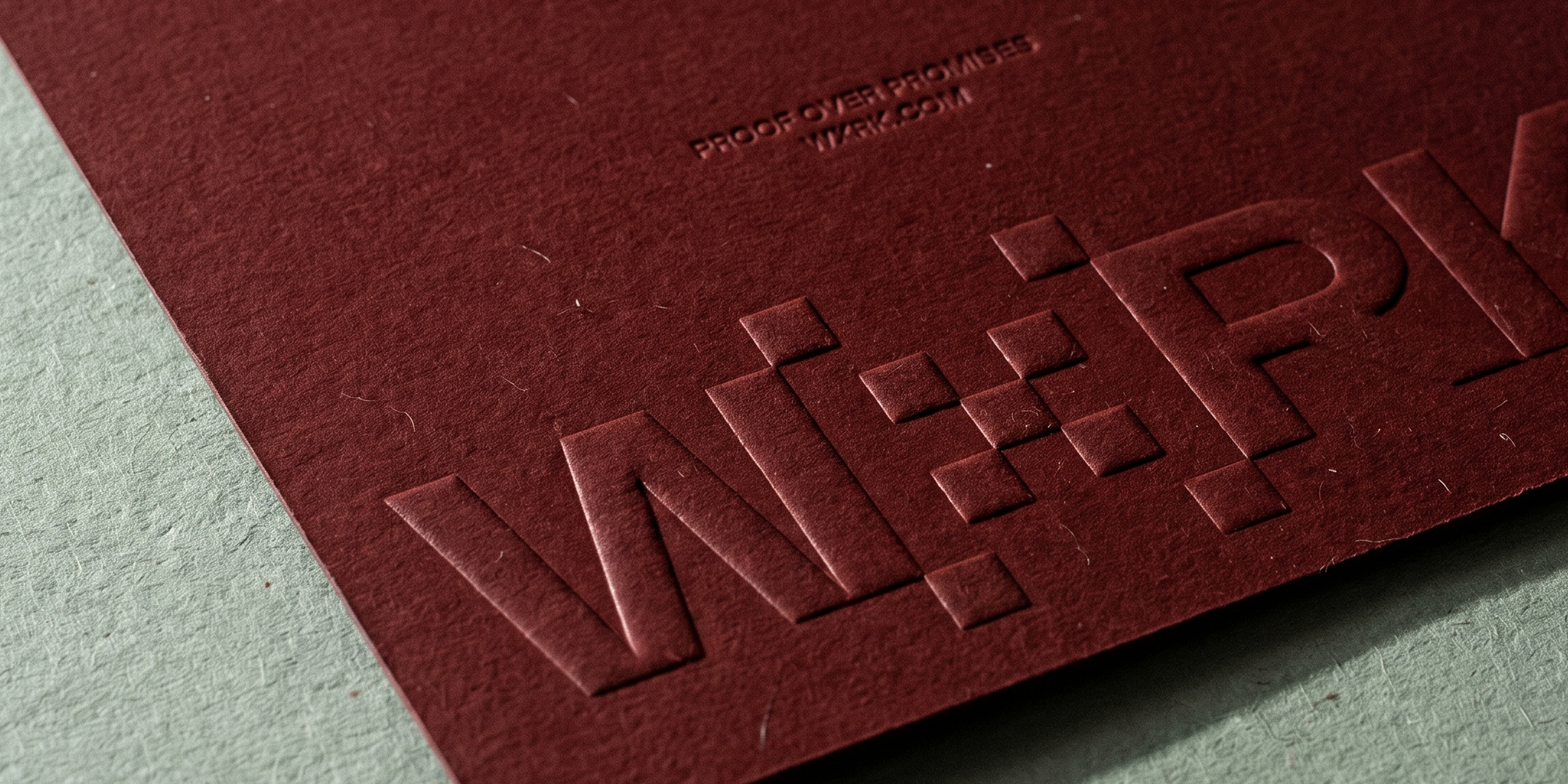
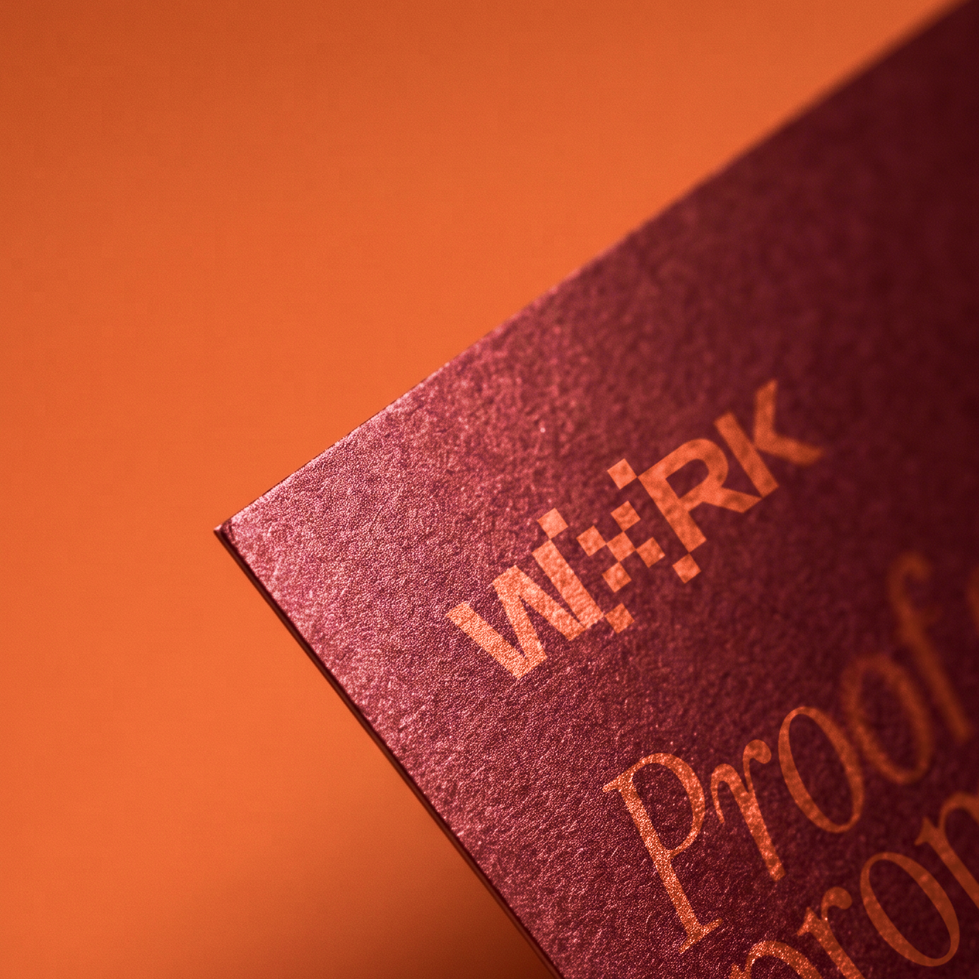
The X in WxRK is a bitmap mark, built on the same pixel grid as everything else. Flat, no glow, no shadow, holding from a hero header down to a favicon.
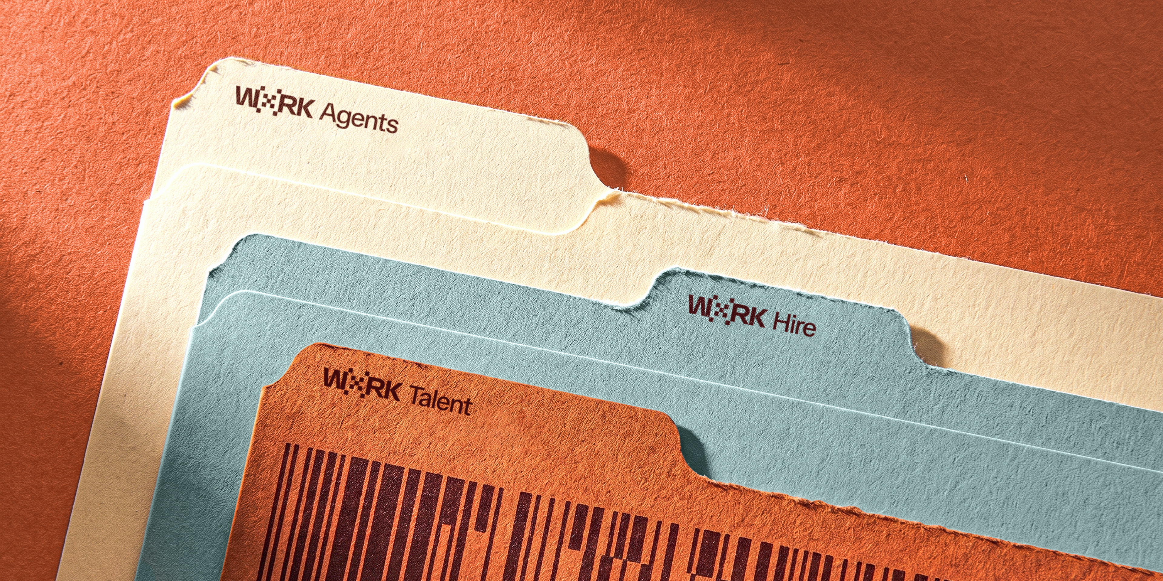
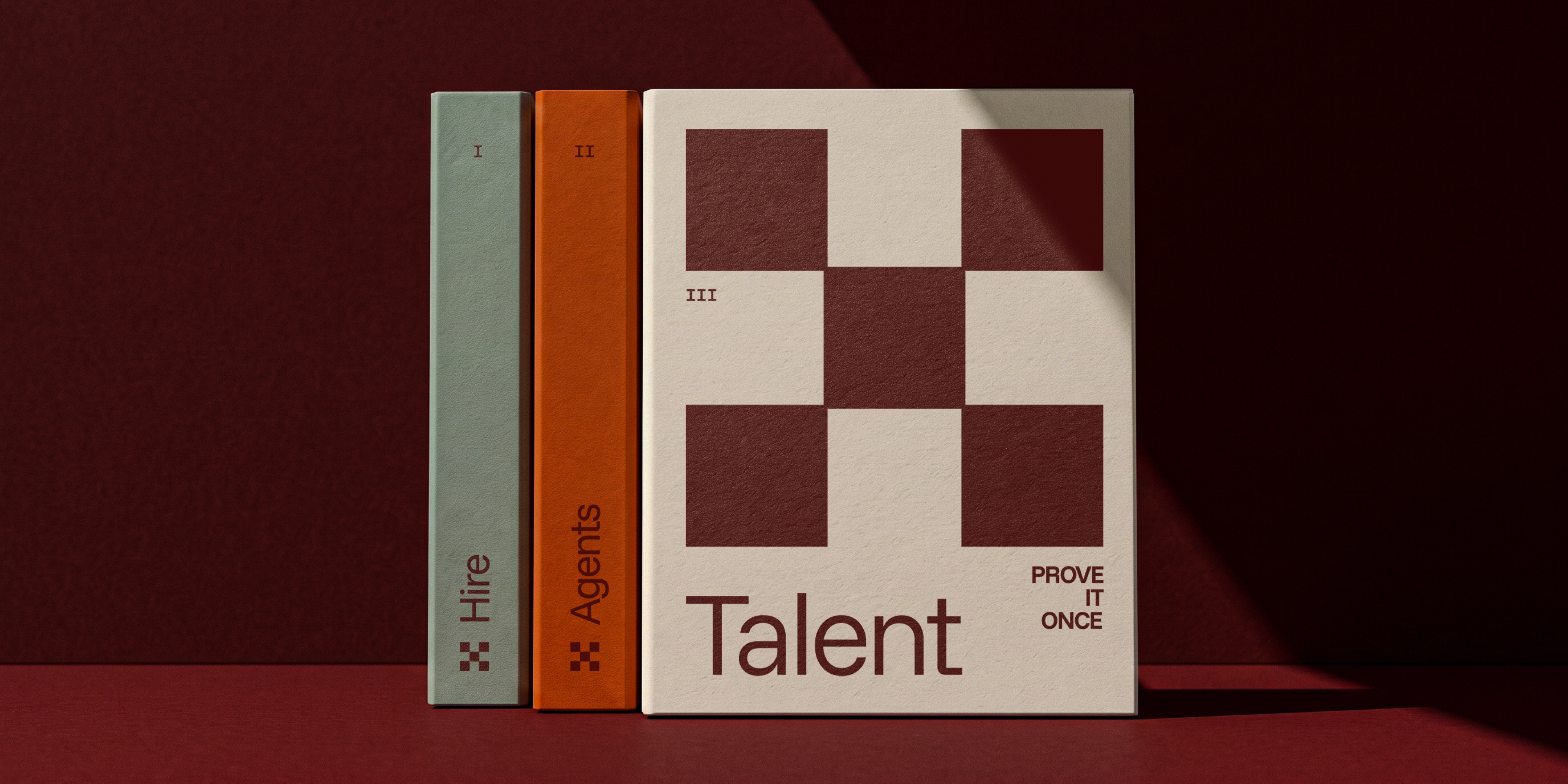
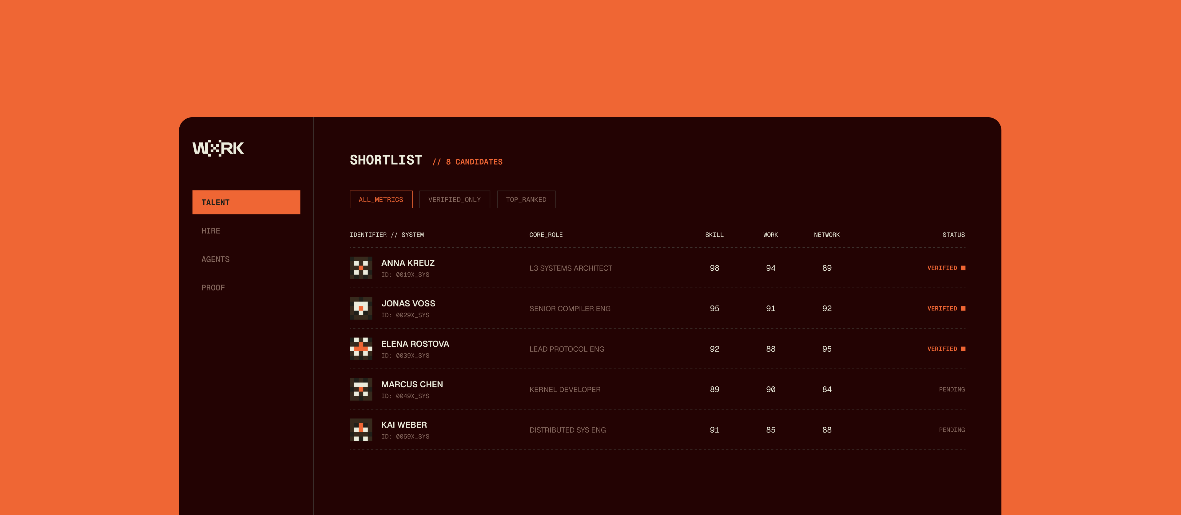
Talent, for the human getting seen. Hire, for the company hiring. Agents, the API layer agents call to trust a human.
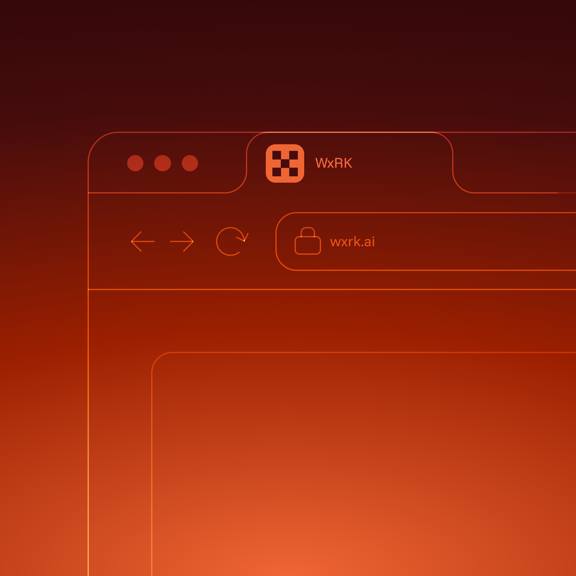

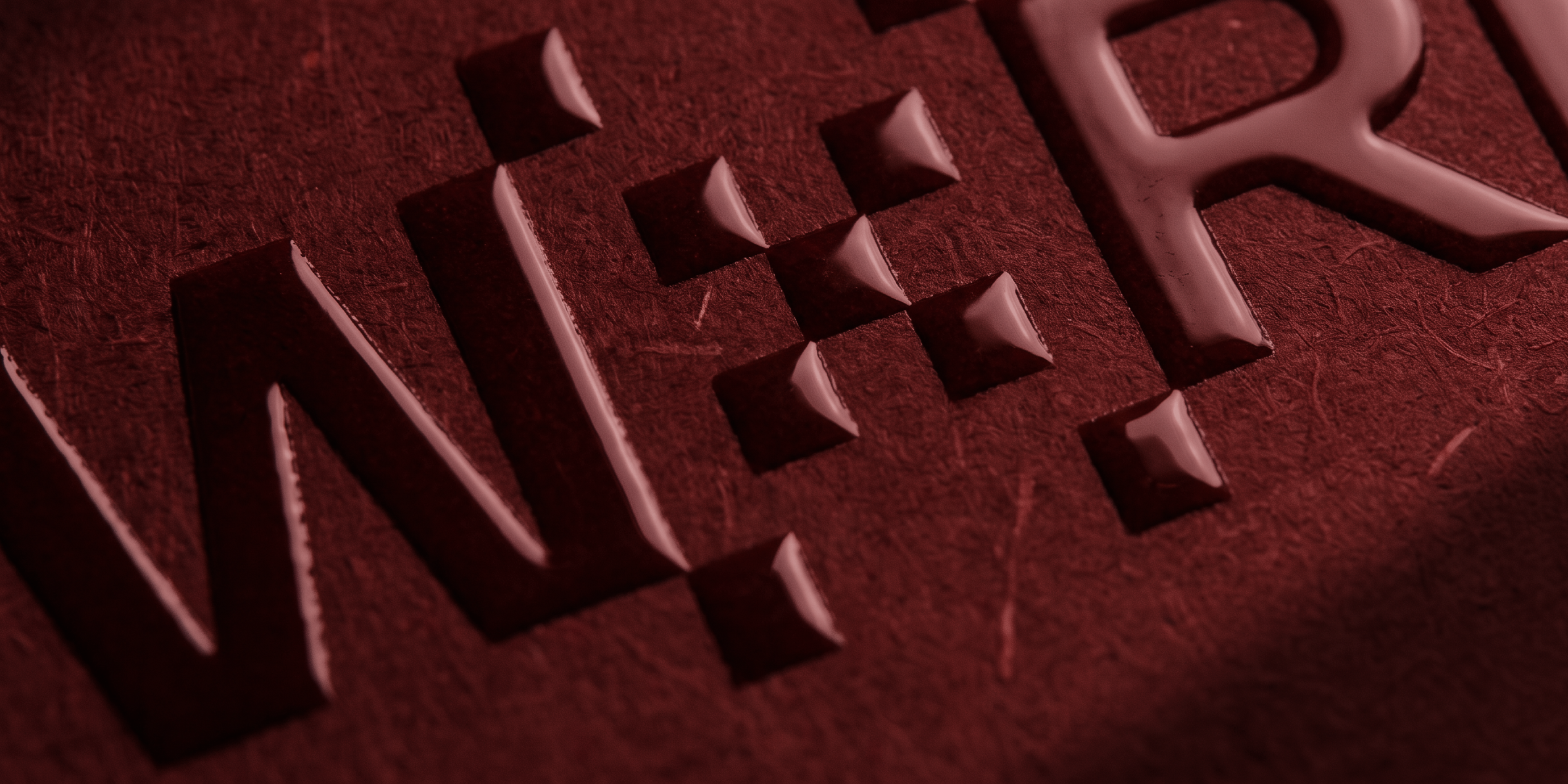
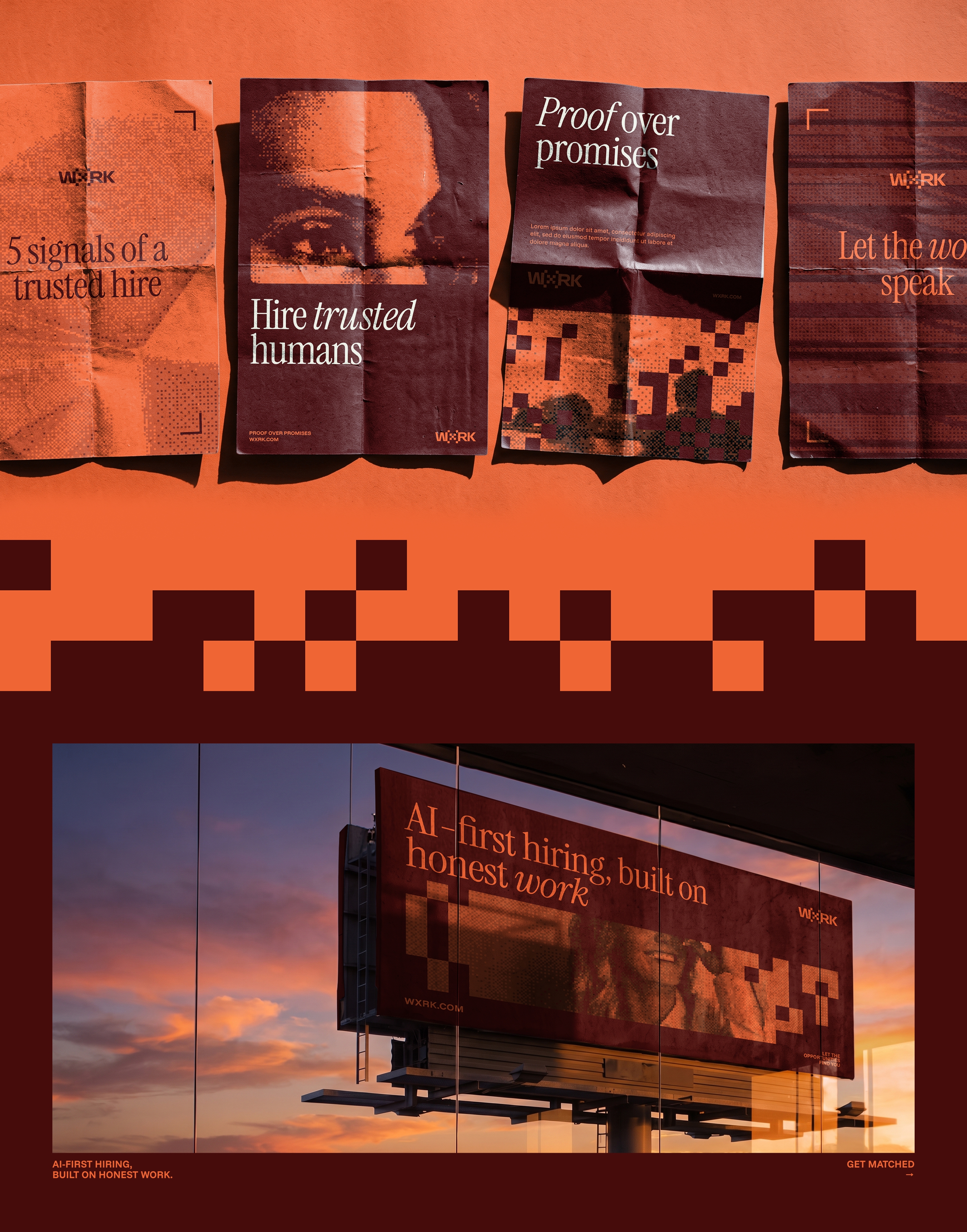
The site is where every part of the system meets. It leads with the serif and states its position:
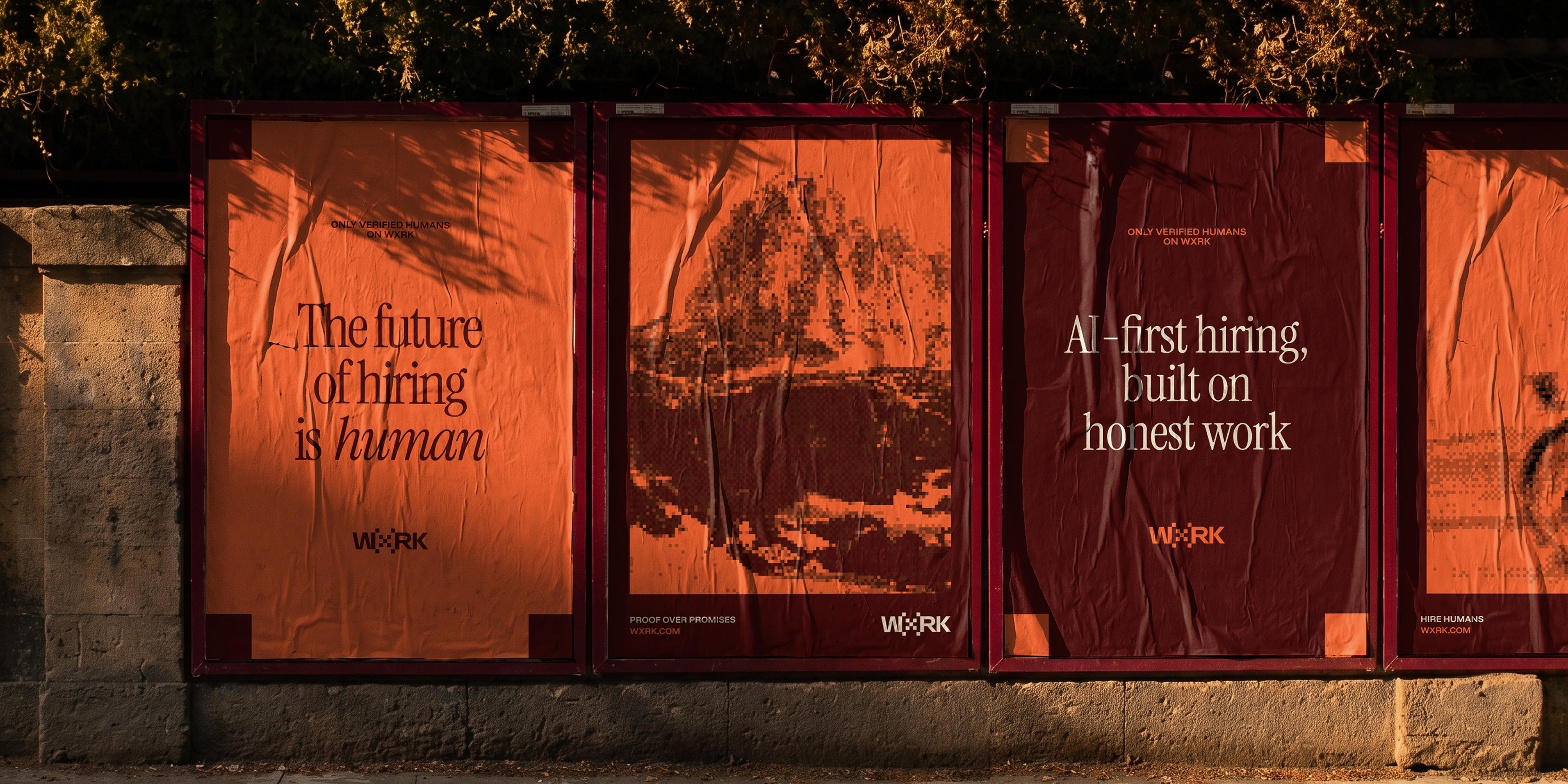
"The trust layer for agents to hire humans." "AI-first hiring, built on honest work."
Dither imagery, Barcode textures and bracket framing carry the pages, in light and dark. No gradient, no glow, no stock handshake.
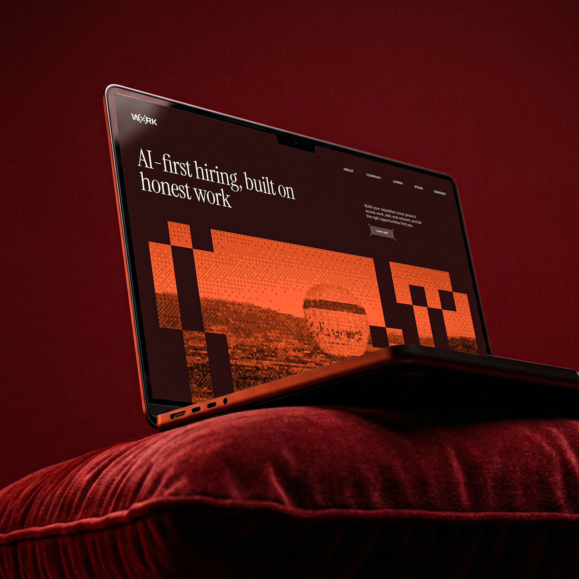
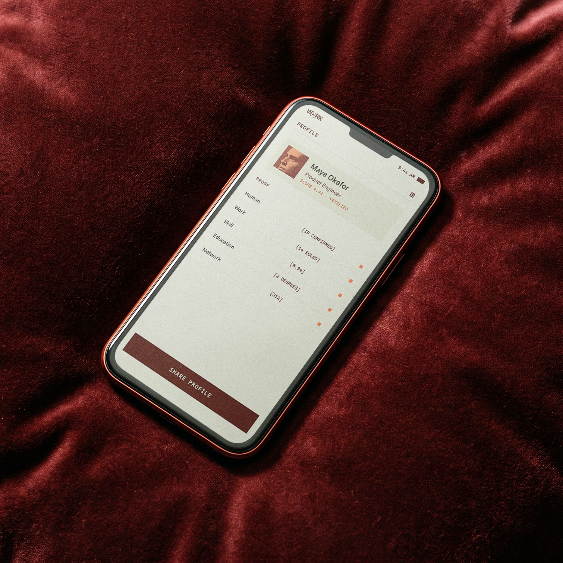
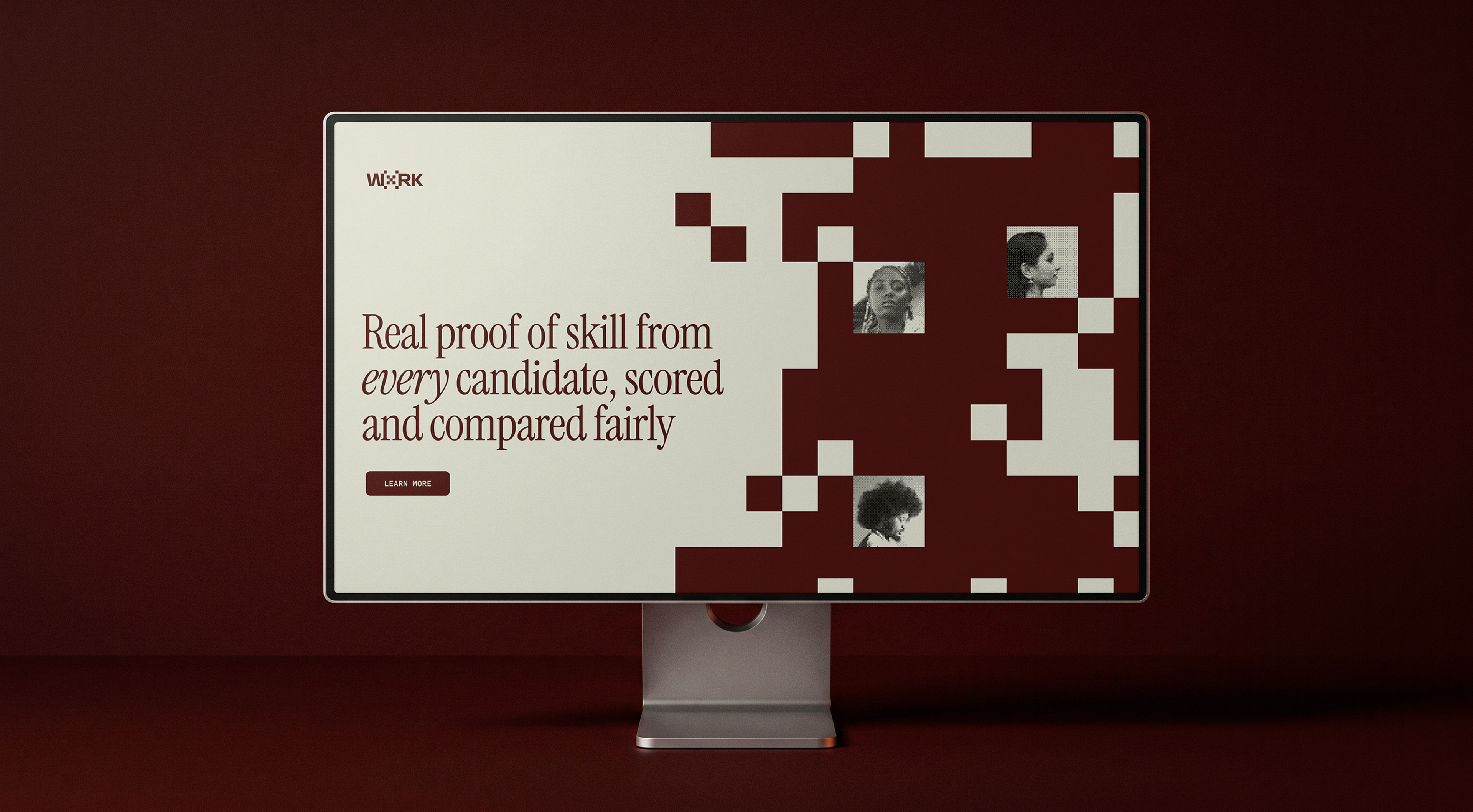
WxRK is a web product, so we did not design a brand and translate it into an interface later. The interface was a first-class surface from day one.
The same tokens drive both sides, in dark and light. Dashboards, CTAs and modals are drawn in the same language as the brand itself, down to the brackets that frame an element the way the system frames a verified human.

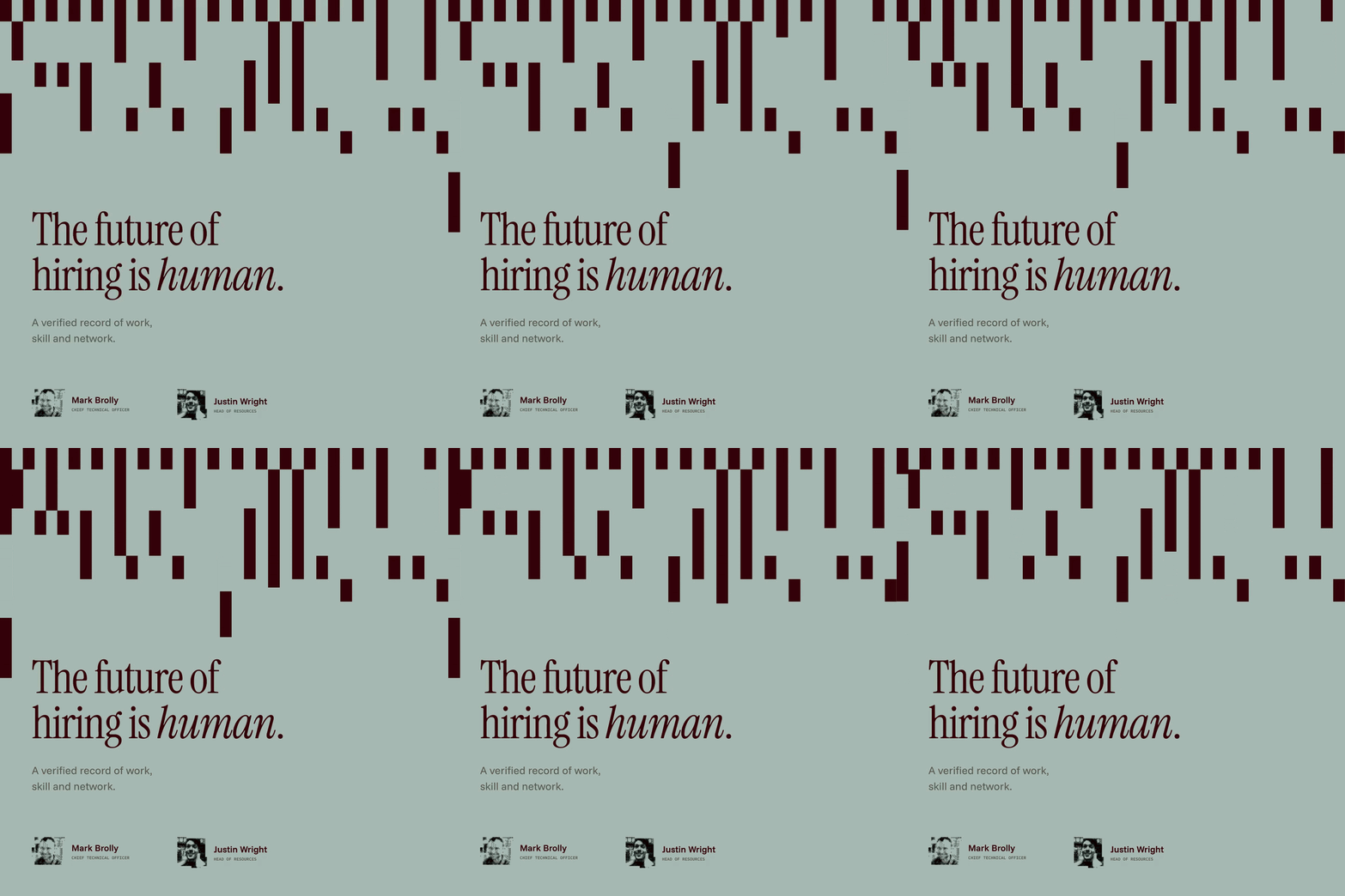
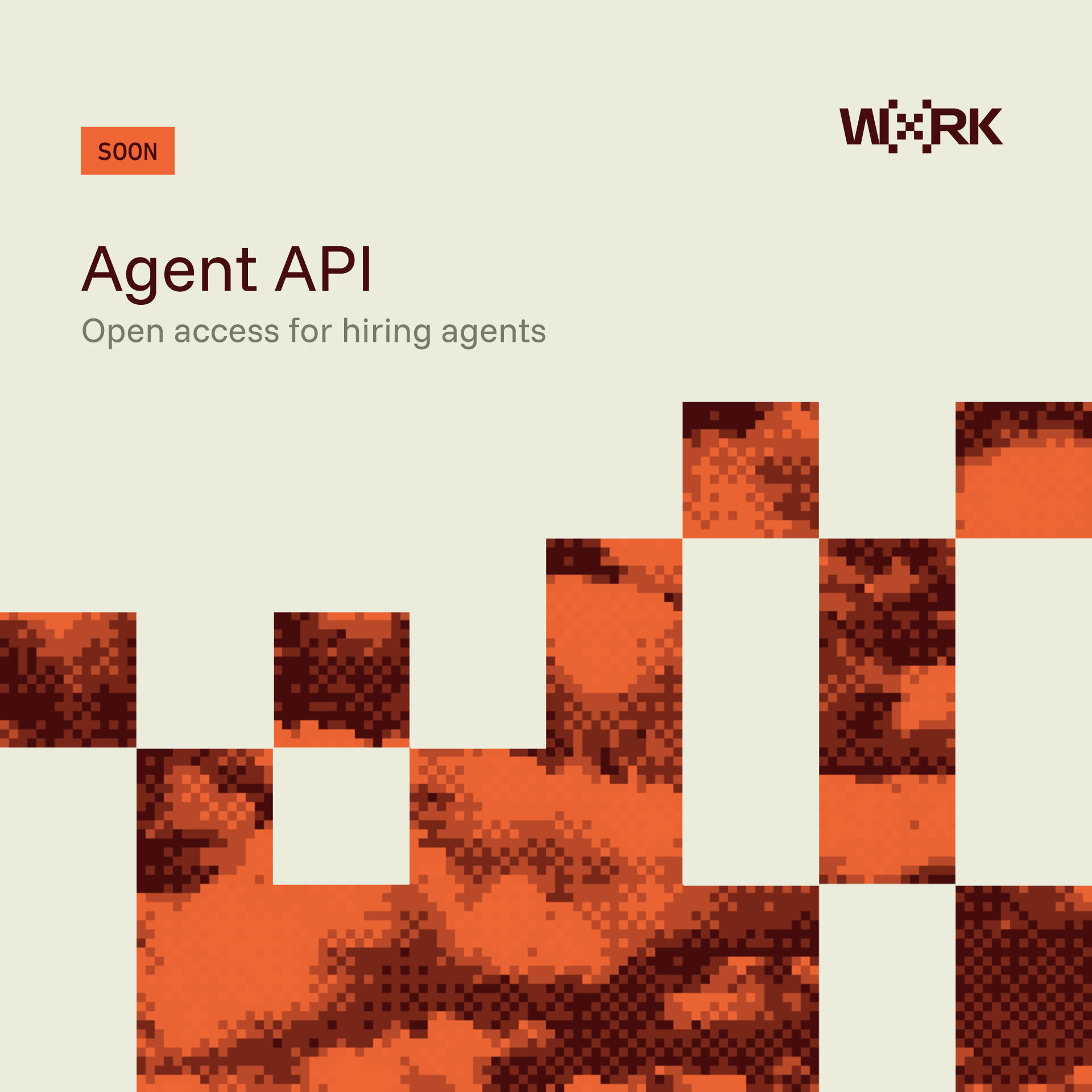
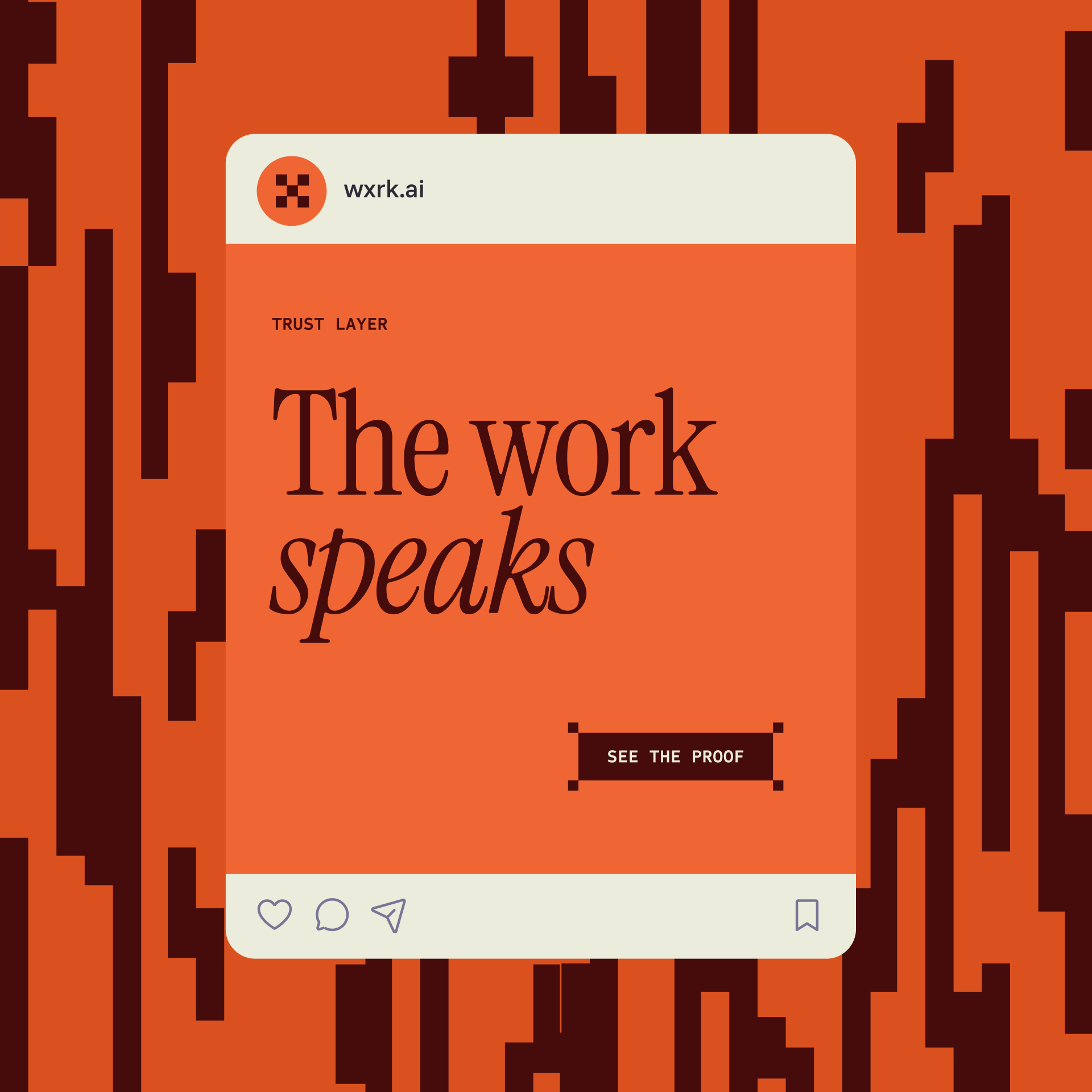
A brand only holds if it survives everyday use. So we built the surfaces the team reaches for most: social templates and a pitch deck, made from the same tokens, patterns and type.
The same system that talks to talent on a Monday post talks to investors in a raise, whether or not a designer is placing the type.
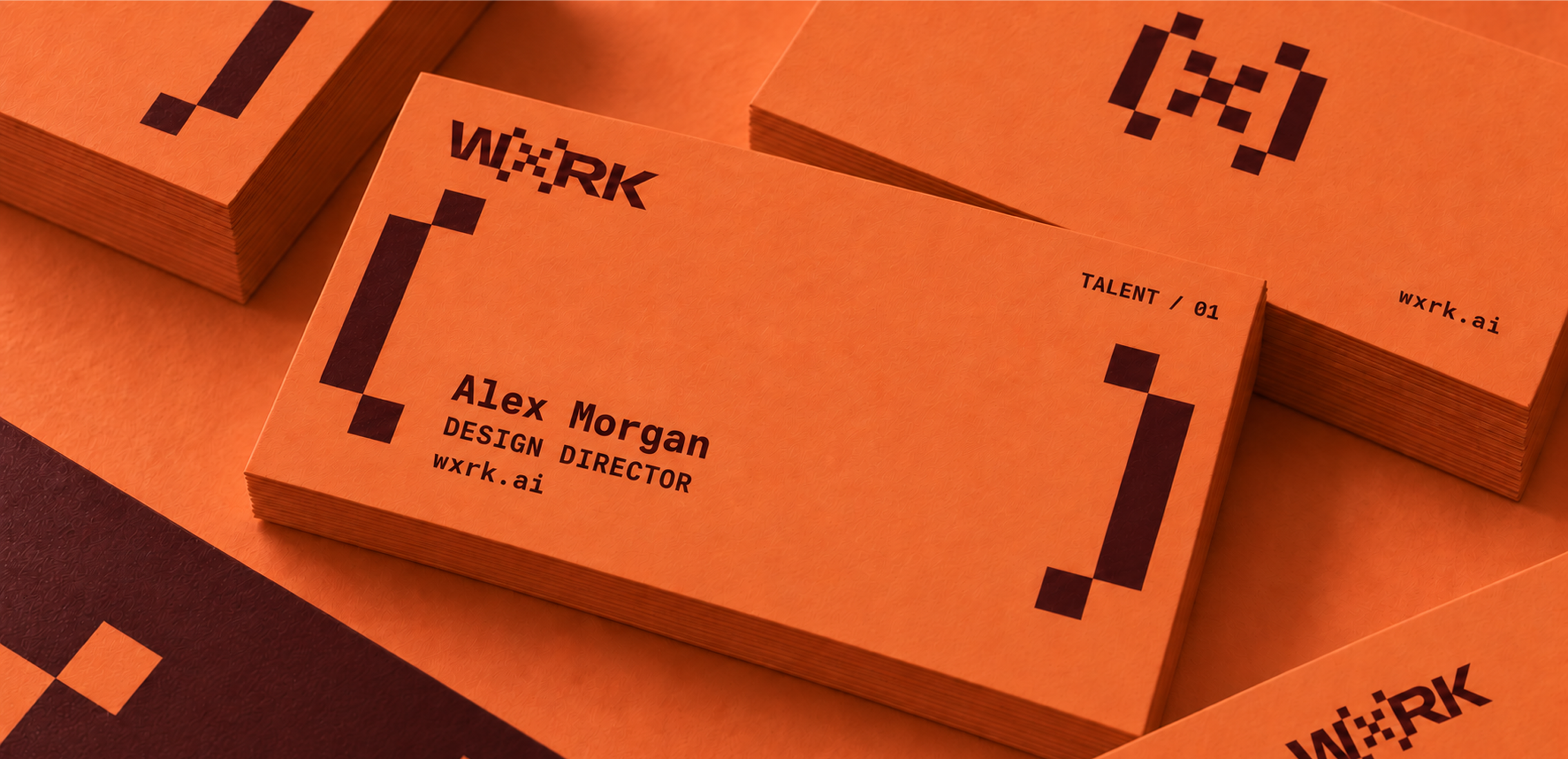
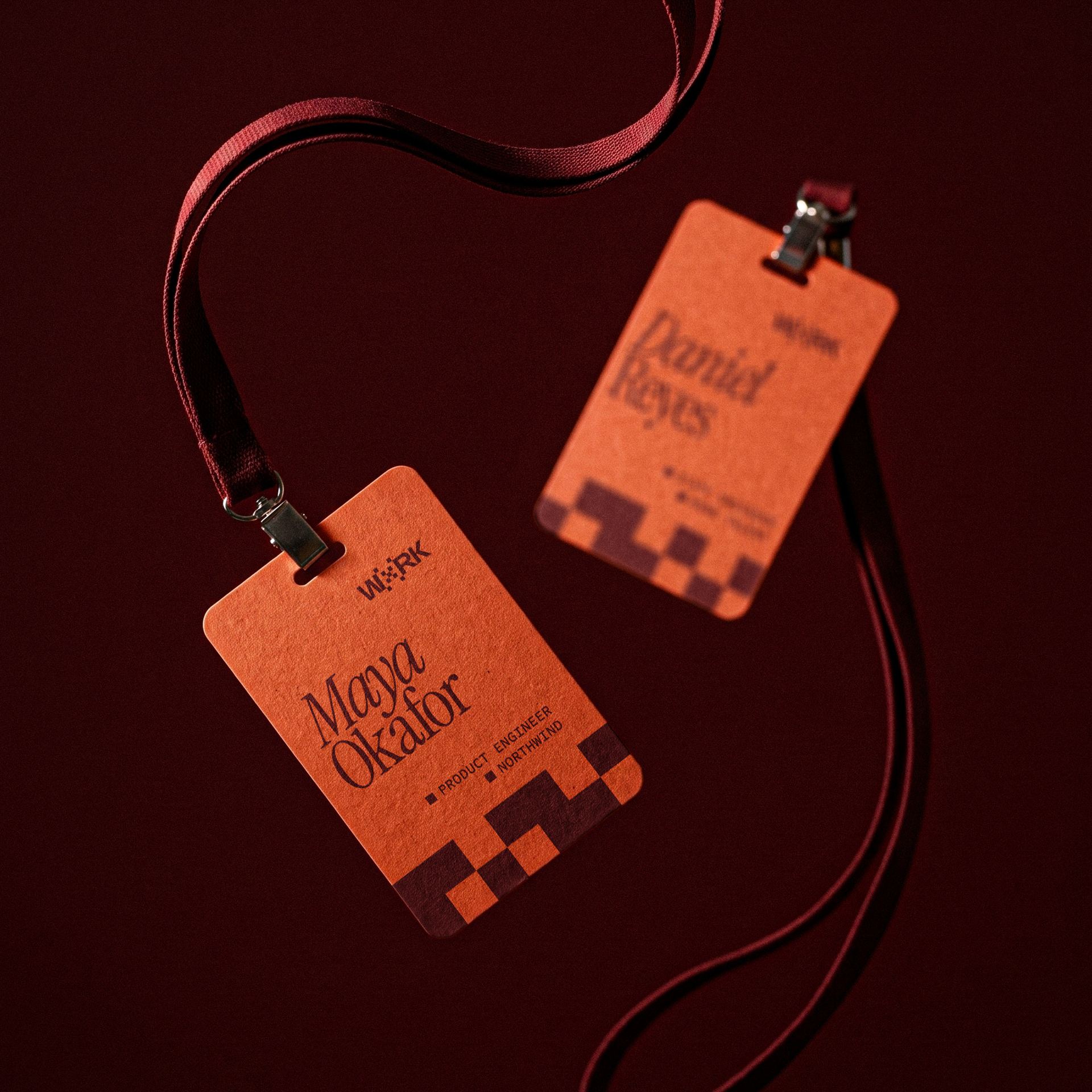
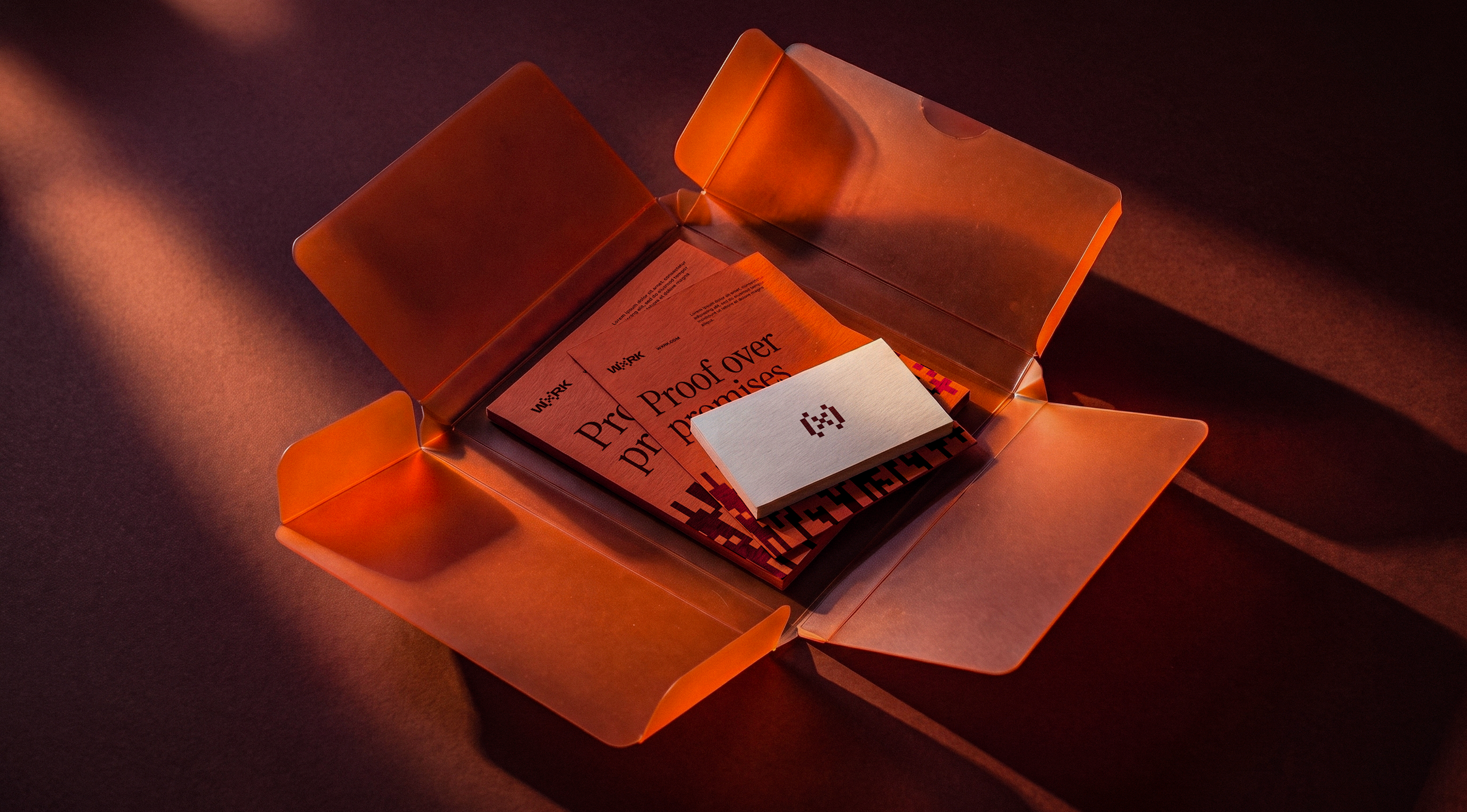
WxRK lives on screen, but the people it verifies do not. They show up at conferences, walk into interviews, hand over a card. So the brand needed a physical form for the places where trust is still exchanged in person: badges, cards and a mailer kit, in the same paper, the same palette, the same pixel grid.
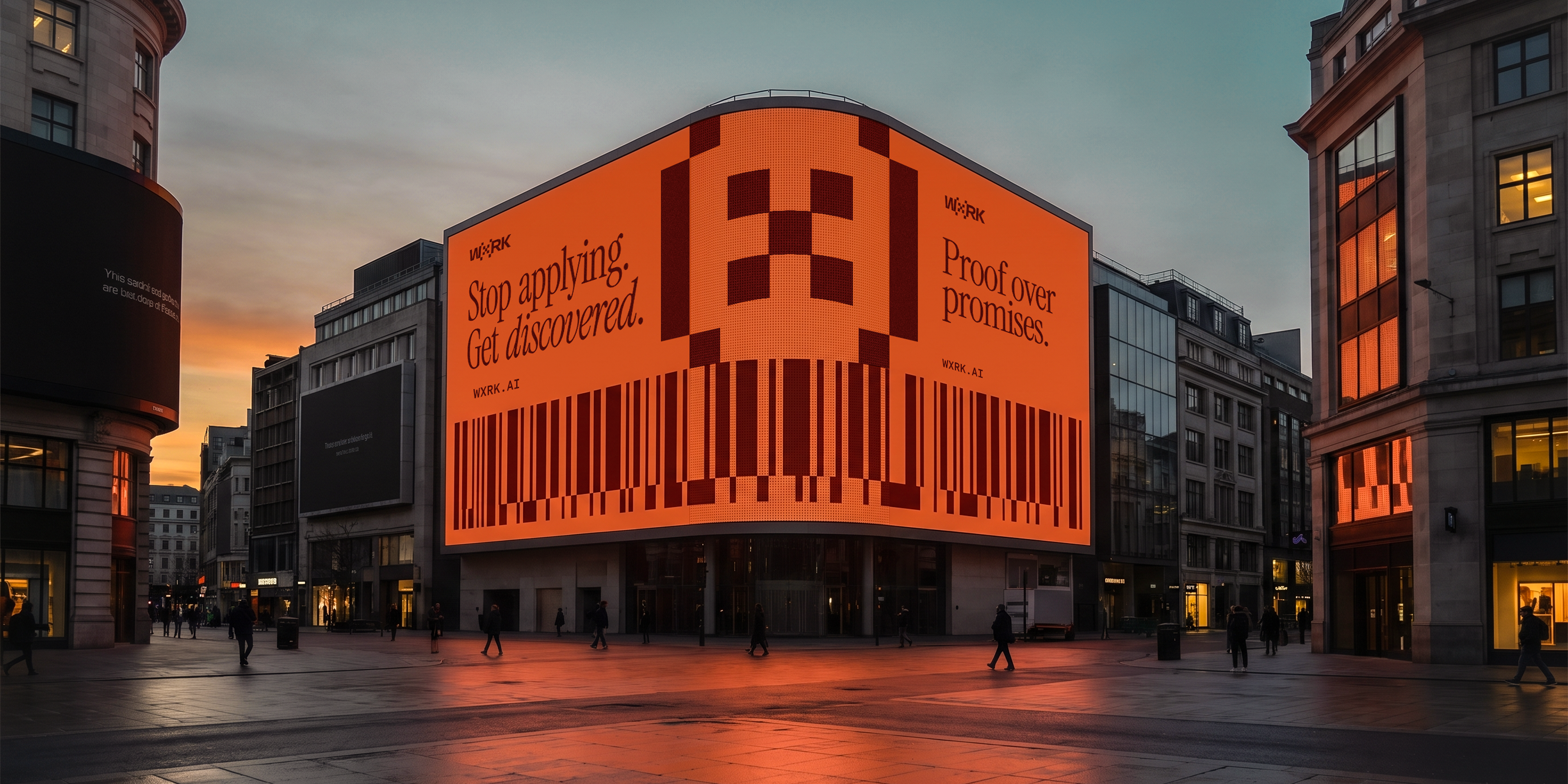
WxRK is an AI-era hiring platform built on one idea: as AI agents take over sourcing and screening, a polished CV stops meaning much. The platform verifies humans at the source and gives them a reputation that both people and machines can read.
The brief carried a contradiction. The promise is trust: verified, no fakes. The audience is enterprise buyers who pay for credibility, and tech talent who can spot a corporate brand from a mile away. Too clean and it disappears into a category of blue gradients. Too raw and the trust wobbles. We split the roles instead of averaging them: the Honest Work palette carries the human half, the treatment carries the technical one. Dither imagery that resolves from noise into focus, corner brackets that confirm whatever sits inside them, a bitmap X on a pixel grid, three type voices where the serif states, the sans explains and the mono reads the data.