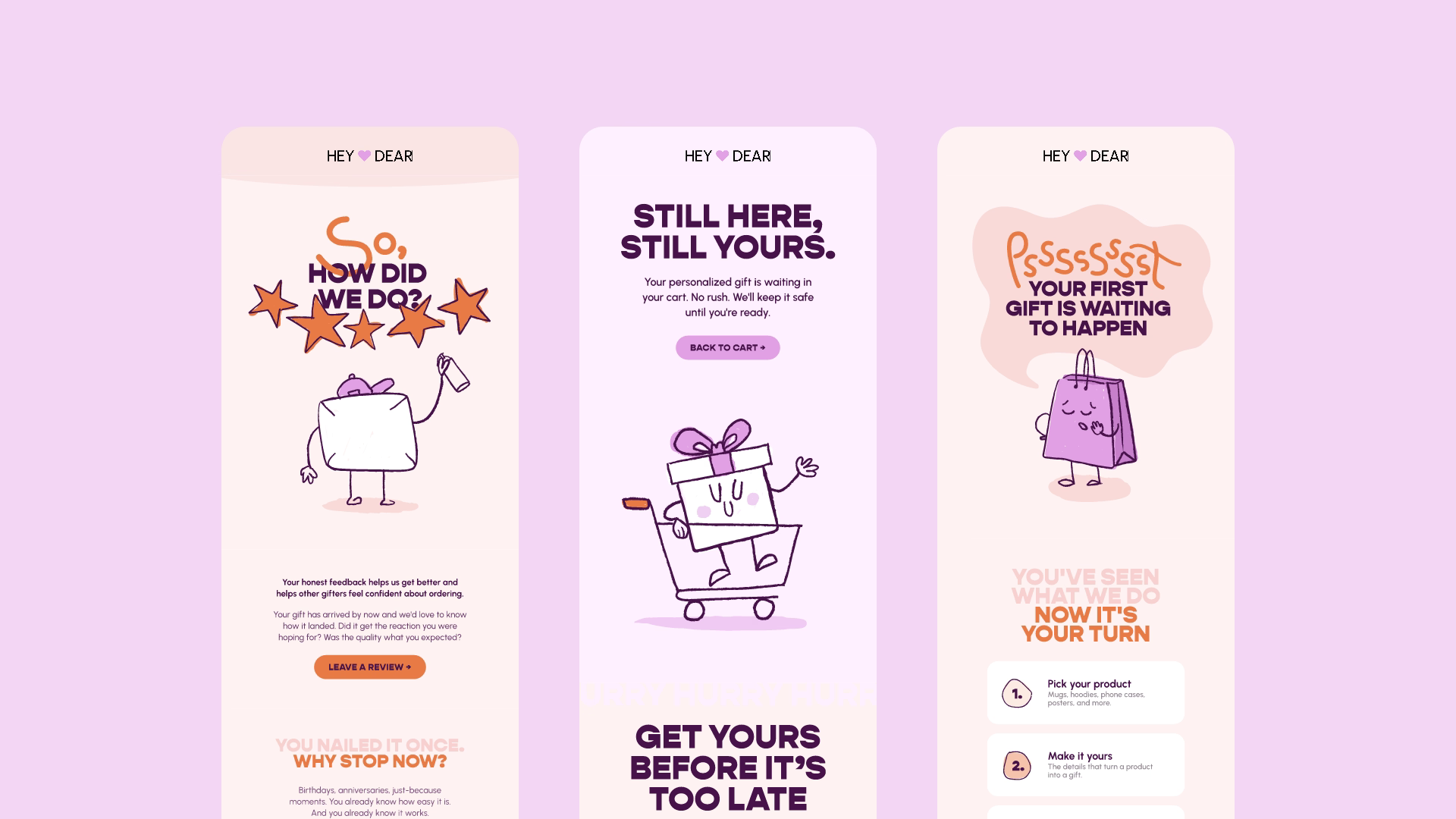
A gifting brand with 100K+ customers and no email system. Every send was a one-off. No reusable components, no visual consistency, no connection between the storefront and the inbox.
A modular visual system that supported email and beyond: custom hand-drawn characters that shift tone per context, and physical brand extensions that carry the same language from inbox to unboxing.
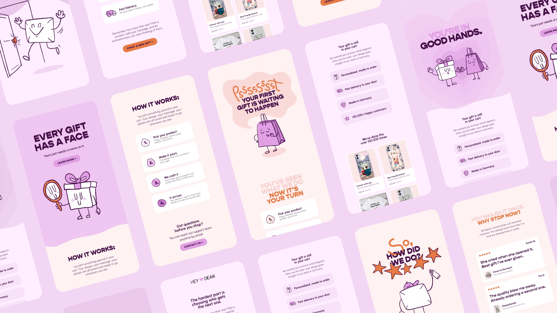
We approached the email design not as a collection of one-off layouts, but as a system. Every email is built from a set of reusable modules: hero sections, trust blocks, urgency elements, CTAs, support blocks, and footers.
This means Hey Dear can scale their email marketing without starting from scratch every time. New campaign? Pick your visuals, update the copy, and you have an on-brand email ready to go.
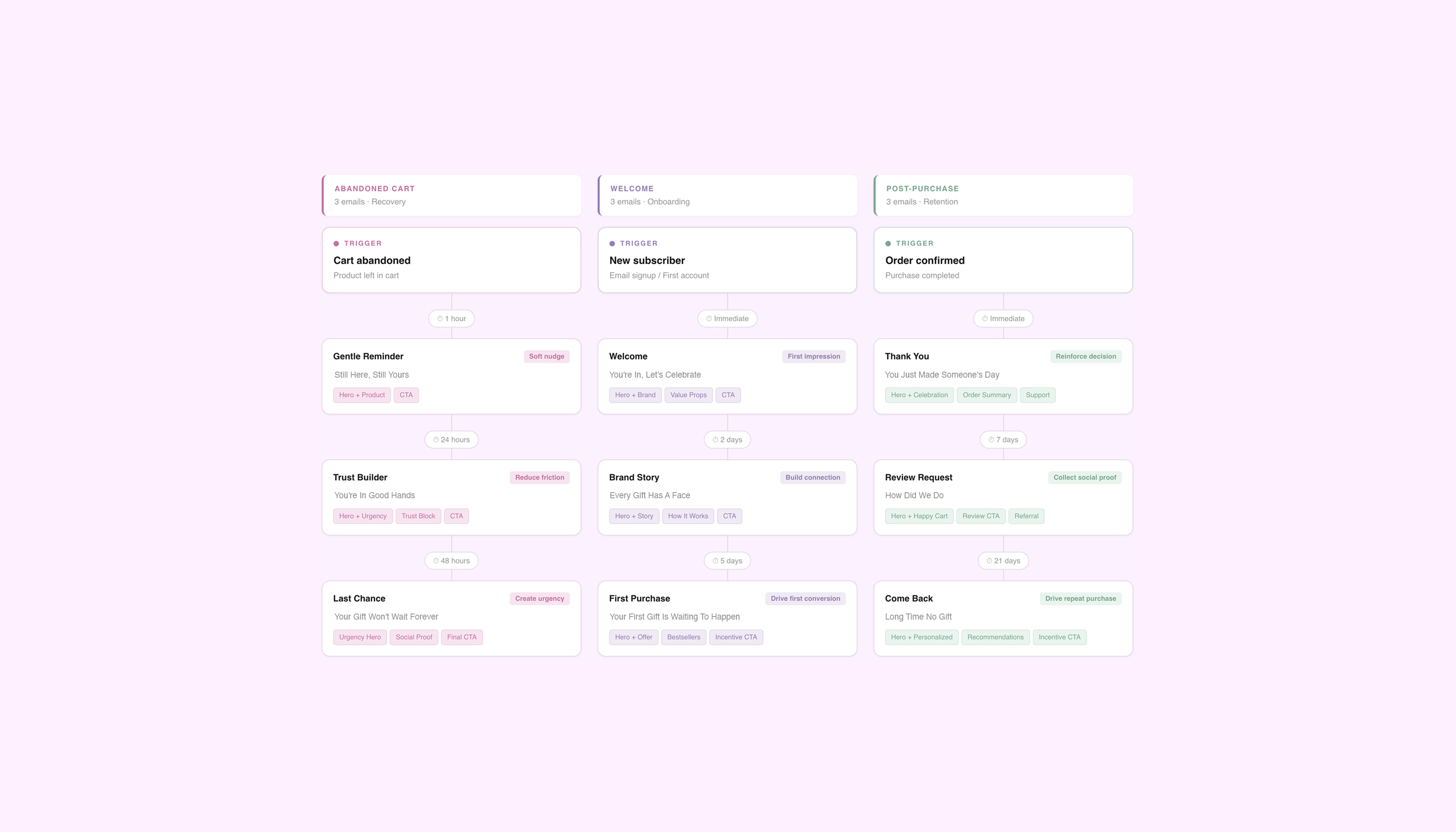
Each flow serves a different stage of the customer lifecycle, and the module hierarchy reflects that.
But the visual language stays the same across all of them. Same illustration style, same component logic, same spacing and hierarchy. The customer always knows they're in Hey Dear's world, whether it's their first visit or their third purchase.
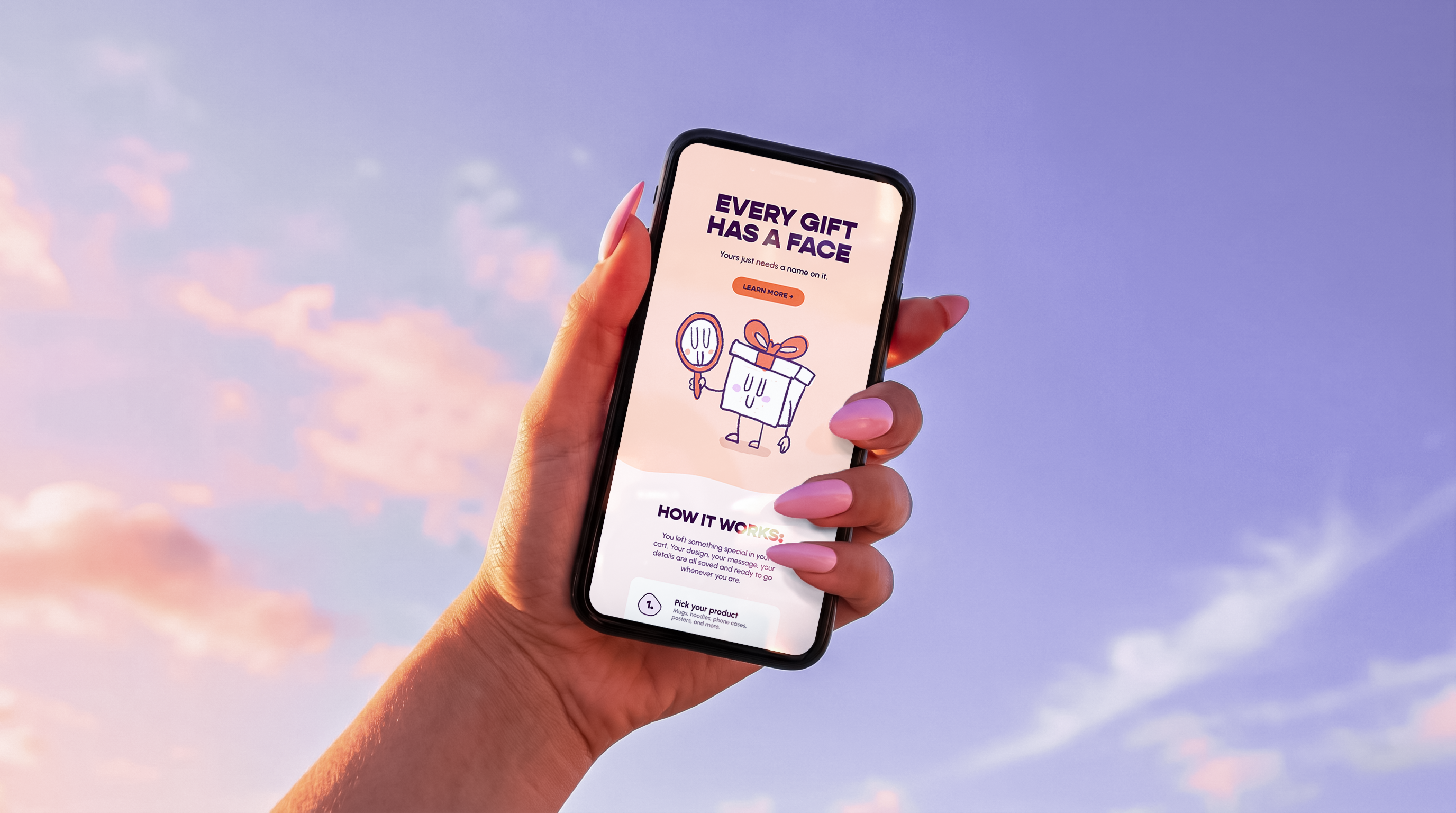
Hey Dear already had a playful, hand-drawn visual direction, so we decided to build on that and developed a custom illustration set designed specifically for the email system. We designed different characters, with expressions that shift based on context: neutral in welcome, anxious in abandoned cart, celebrating in post-purchase.
The characters aren't just brand assets. They're conversion tools. A nervous face next to a countdown creates more urgency than bold red text ever will. Emotion drives action faster than layout tricks, and that's what we optimized for.
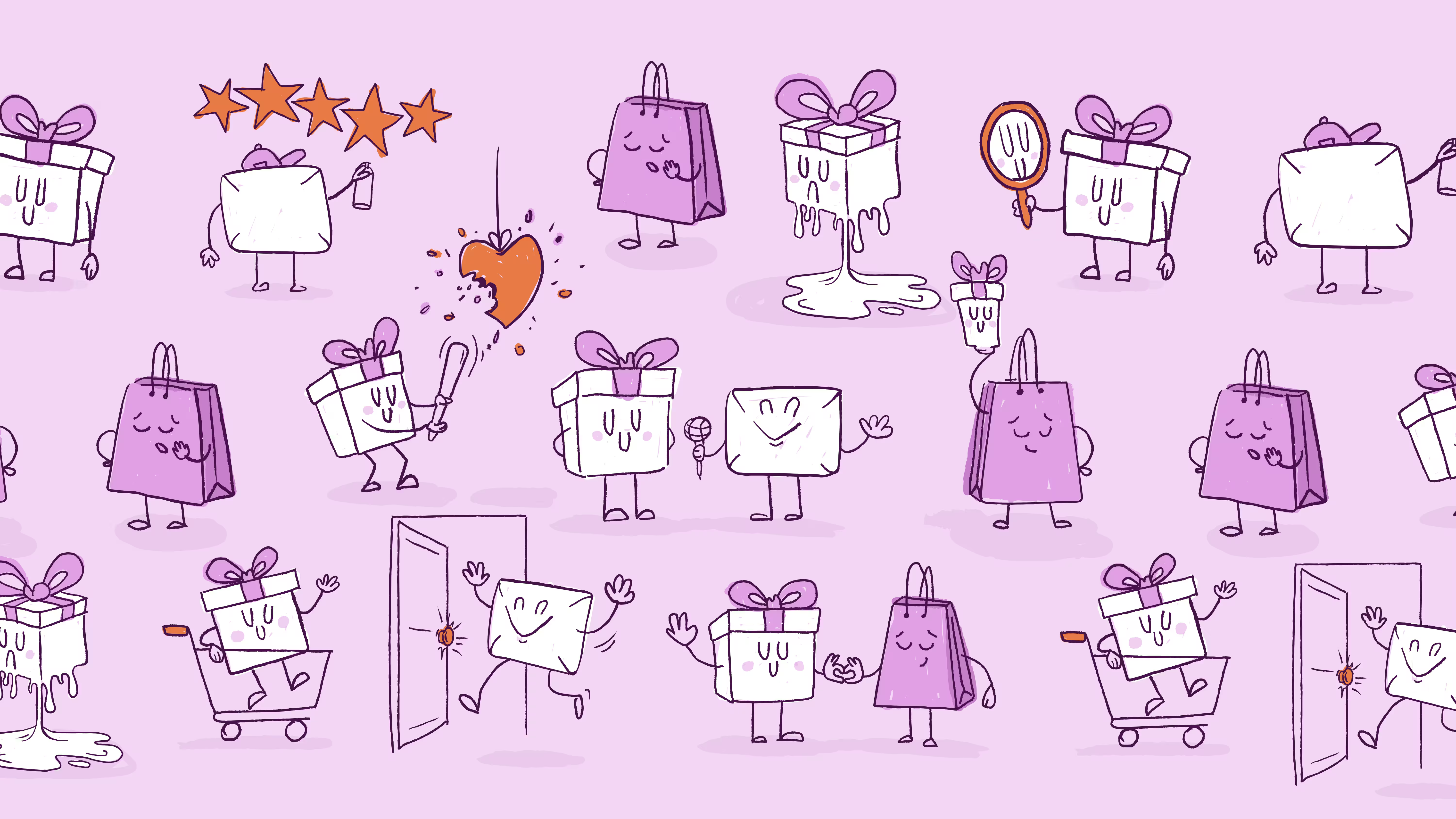
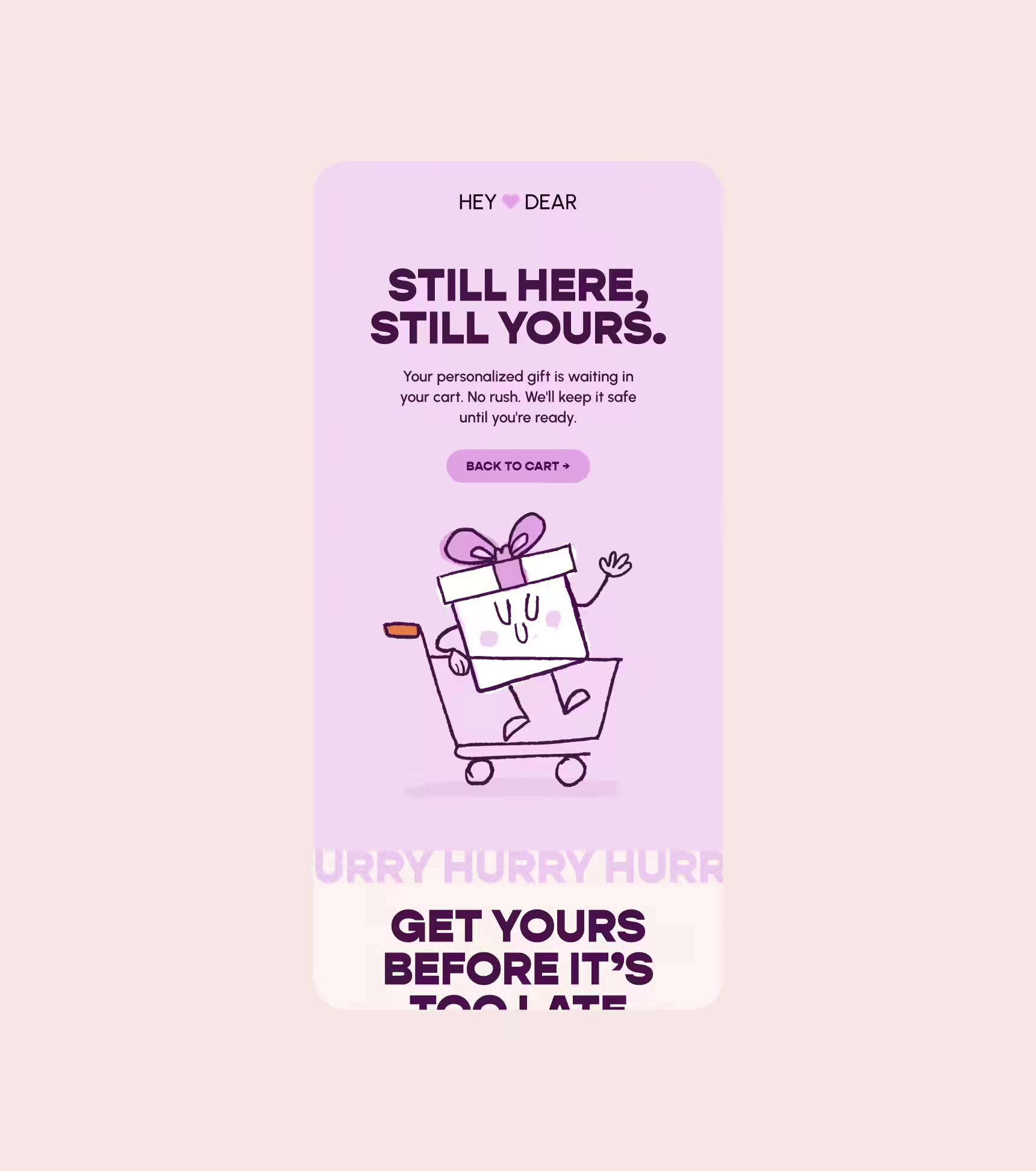
The illustration set is built for flexibility. Every character and icon is constructed to allow quick adaptation for seasonal campaigns or new flows without redrawing from scratch. Valentine's Day, Christmas, Singles Day: same characters, different context.
This keeps production fast and brand consistency tight. The visual system works like the modular email system: swap elements, keep the logic.
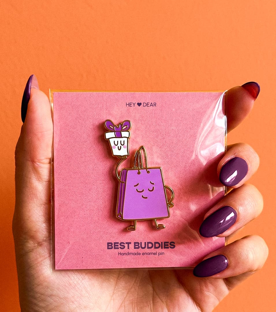
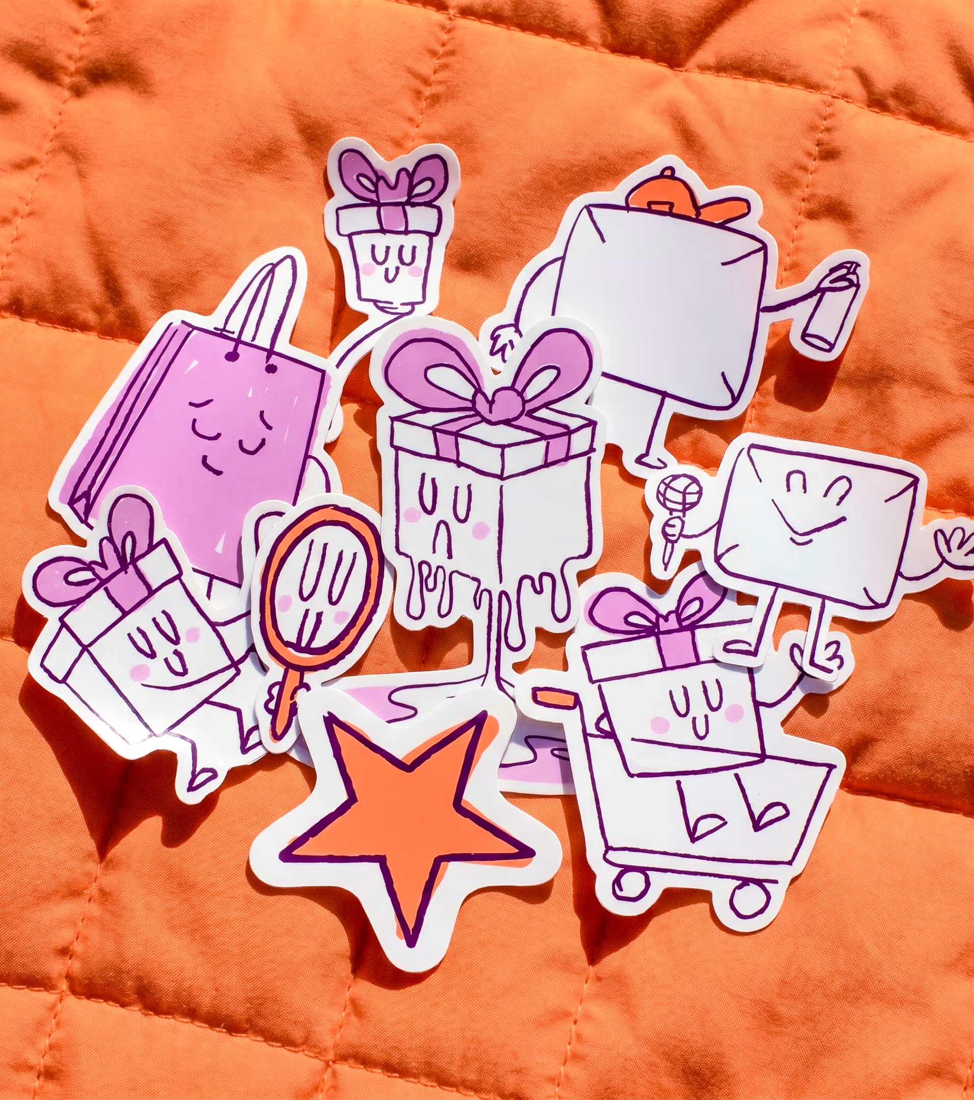
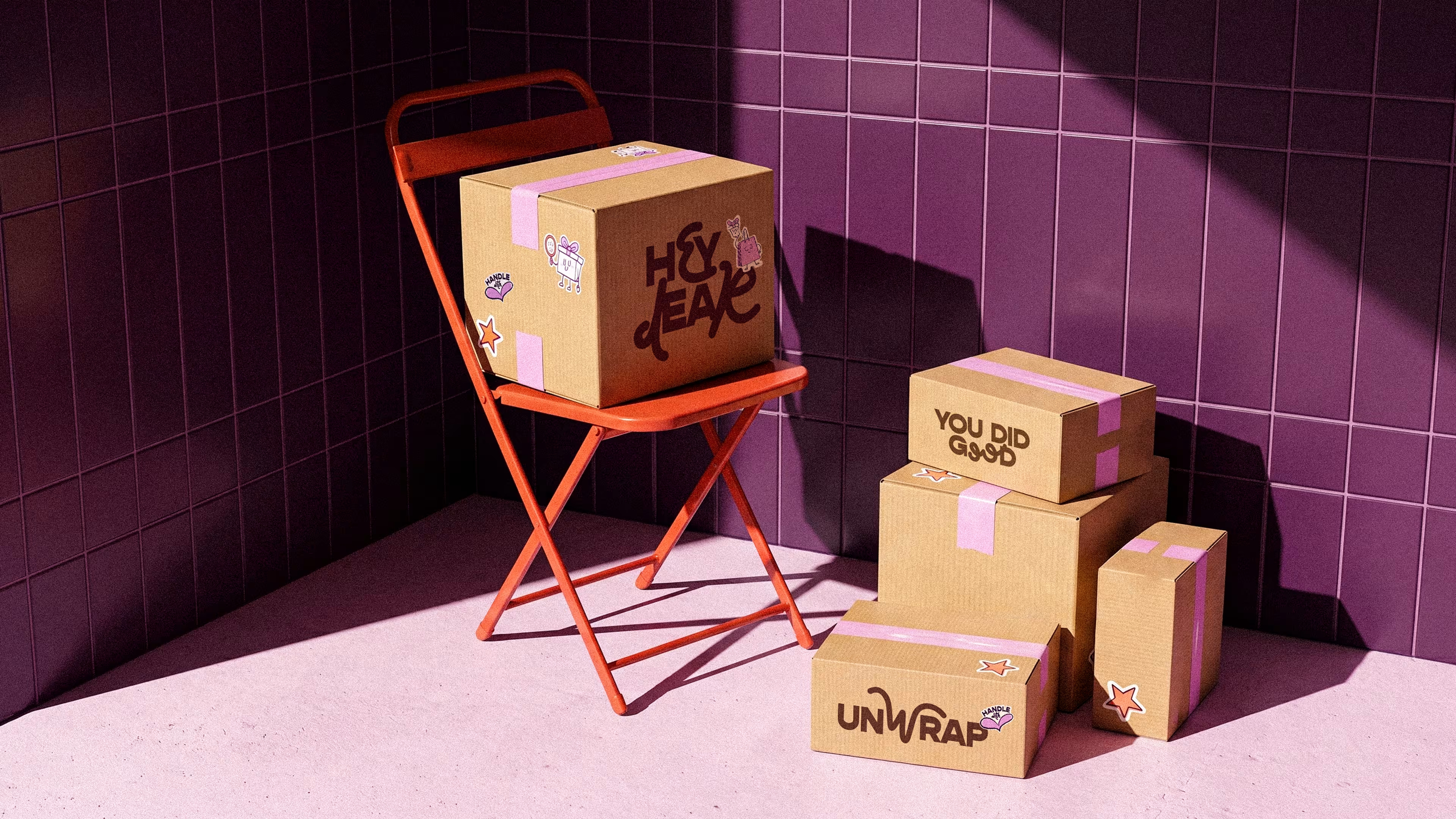
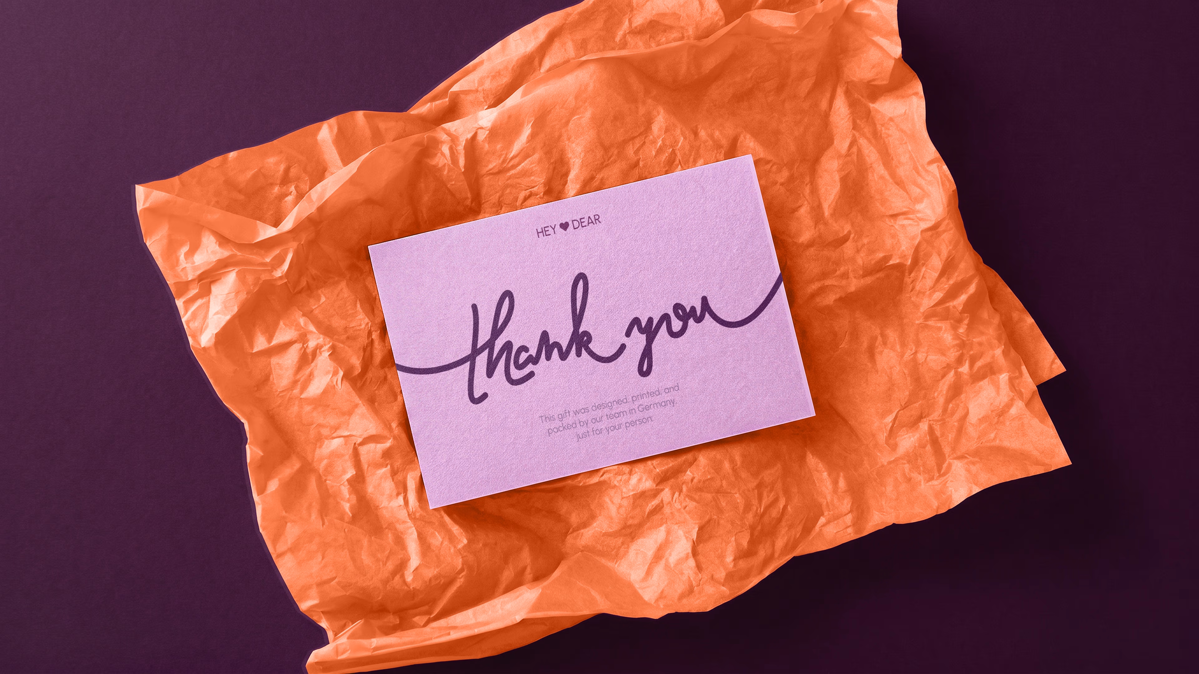
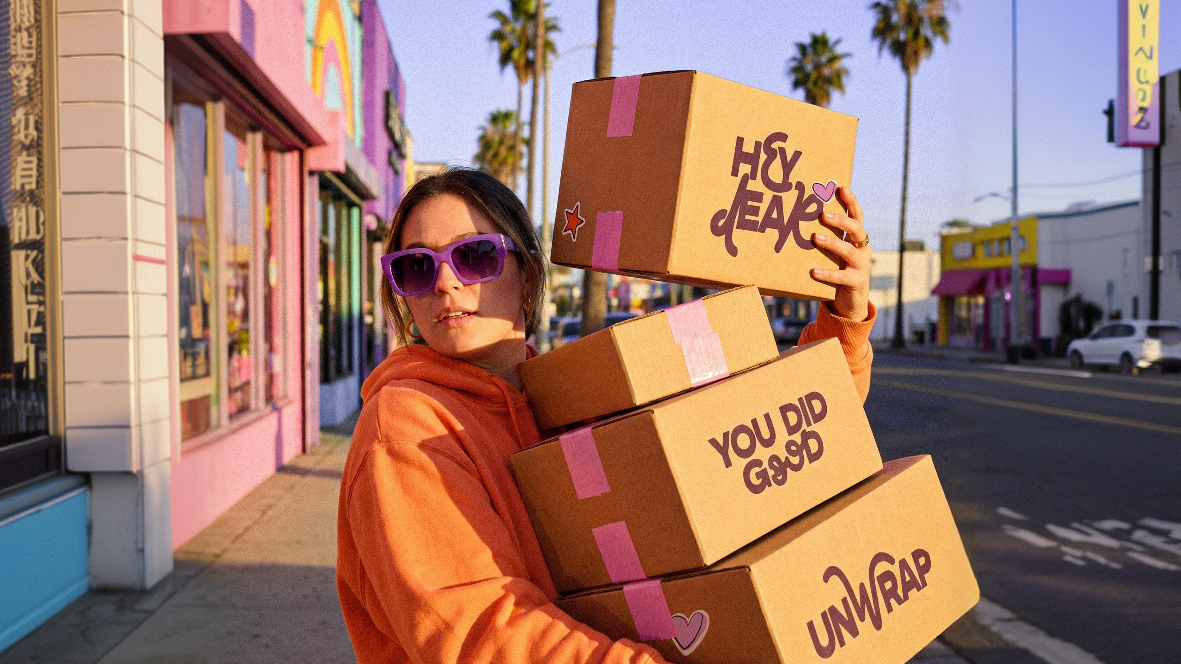
We extended the illustration set to physical moments: thank you cards that mirror the post-purchase email tone, branded stickers with the cart and gift characters, and custom tissue paper that turns every unboxing into a brand experience.

Hey Dear is a German e-commerce brand selling personalized gifts, from custom-printed apparel to engraved keepsakes. Over 100K happy customers, a playful illustration-driven identity, and a product people genuinely enjoy giving. Strong fundamentals, but the customer experience between purchase and delivery had room to grow.
The project started with their lifecycle email marketing. Cart recovery, welcome flows, post-purchase sequences. None of it was systemized. Every email was built from scratch, with no reusable structure and no consistency across touchpoints. The brand felt different in every inbox. The personality that worked on the storefront wasn't making it into the emails. The approach was to treat email design as a system, not a collection of one-off layouts. Every email is assembled from a set of reusable modules: hero sections, trust blocks, urgency elements, CTAs, support blocks, footers. New campaign? Pick the modules, adjust the copy, ship. No more starting from zero. Each flow serves a different stage of the customer lifecycle, and the module hierarchy reflects that. Abandoned cart leads with urgency and social proof to reduce drop-off. Welcome sequences prioritize brand affinity and perceived value before pushing for conversion. Post-purchase shifts entirely to retention and advocacy. Three different jobs, one visual language. The customer always knows they're in Hey Dear's world, whether it's their first visit or their third order.
Hey Dear already had a playful, hand-drawn visual direction. Instead of replacing it, the project built on top of it. A custom illustration set designed specifically for the email system, with characters whose expressions shift based on context: friendly in welcome, anxious in abandoned cart, celebrating in post-purchase. The characters aren't decoration. A nervous face next to a countdown creates more urgency than bold red text ever will. Emotion reads faster than layout tricks, and that's what the system optimizes for. The illustration set is built for flexibility. Every character allows quick adaptation for seasonal campaigns or new flows without redrawing from scratch. Valentine's Day, Christmas, Singles Day. Same characters, different context. Swap the elements, keep the logic. Production stays fast, brand stays consistent.
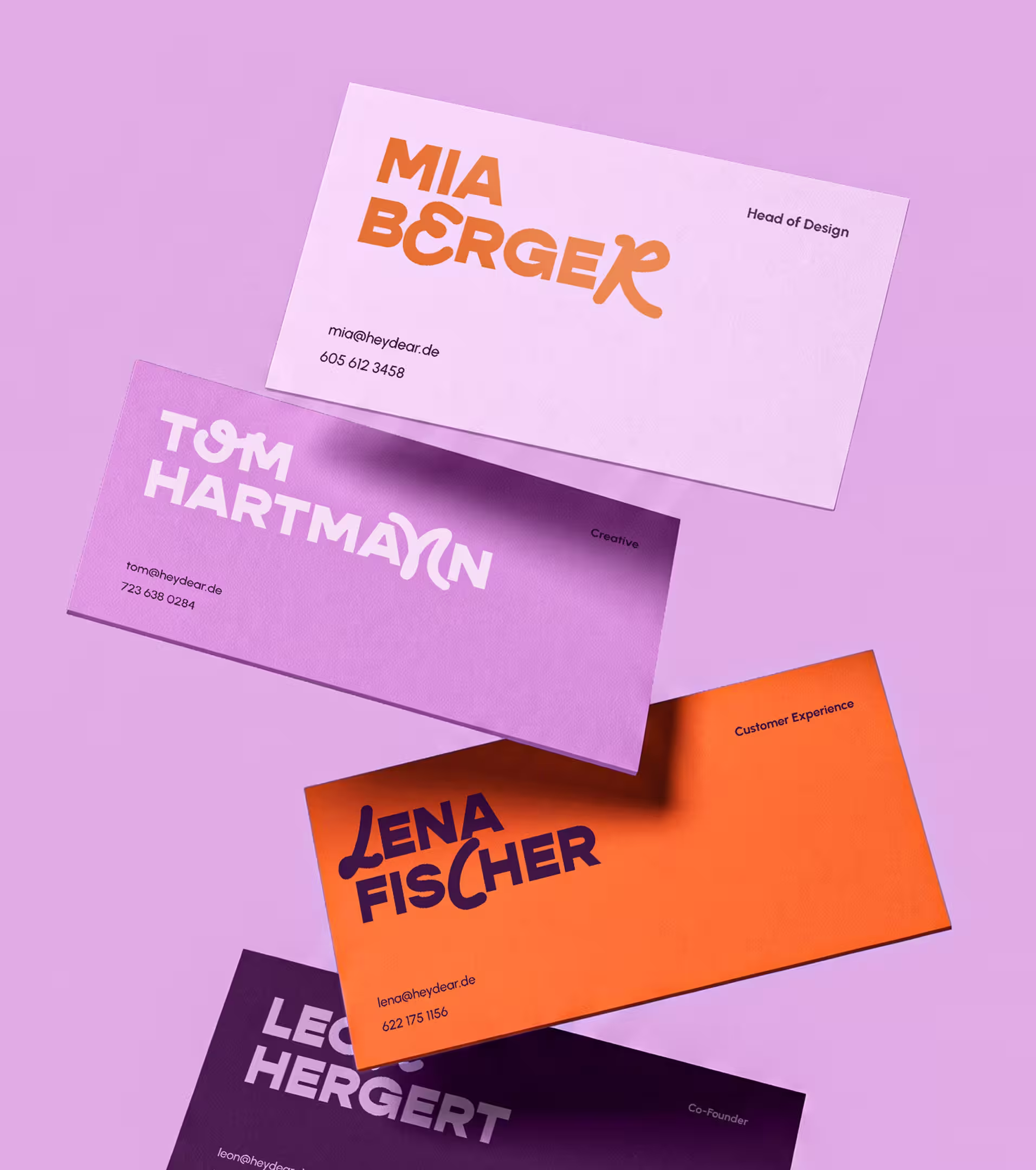
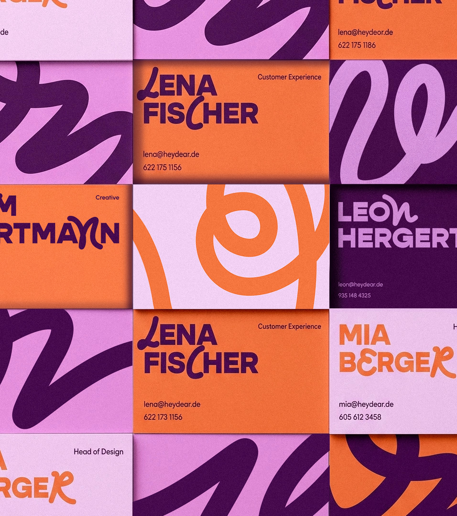
The system extends beyond the inbox. Thank you cards, branded stickers, custom tape, tissue paper. The physical touchpoints carry the same visual language as the emails. What someone sees in their inbox matches what they hold in their hands. One system, every surface.

Tags